

![]() Nando’s Logo PNG
Nando’s Logo PNG
The most important event in the Nandos logo history took place in 2016. Not only the logotype was modified, but the whole design approach changed, which let the restaurant tell its own story better.
Meaning and history
![]()
The first Nando’s logo ever was introduced in 1987. In fact, it looked very much like the current one, except for minor details. However, these details have affected the overall look of the emblem very much, making it more “African”.
What is Nando’s?
Nando’s is the name of a fast-food restaurant chain from South Africa, which was established in 1987, and today has more than a thousand locations all over the globe. The chain is specialized in grilled chicken, which is being cooked in peri-peri style.
1991 – 1998
![]()
The original logo for Nando’s was introduced in 1991 and featured a stylish minimalist emblem placed above the red logotype. The emblem depicted a red and black rooster, which had its contours strict and clean, and this gave it a resemblance to a wooden African figurine. As for the inscription, executed in a bold slightly italicized typeface, it added playfulness and energy with its curved tails and arched lines and the letters.
1998 – 2016
![]()
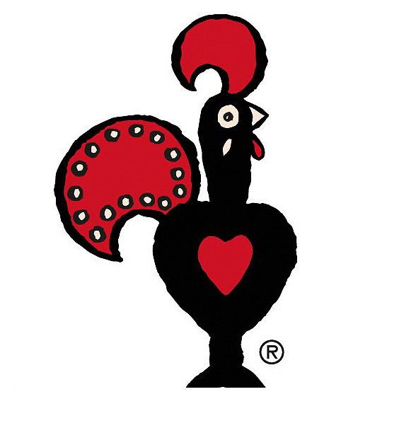
The redesign of 1998 refined the contours of both logo elements, making the emblem more ornate. The red heart on the rooster’s black body was now enlarged, showing the customer as the main value of the brand. The solid red tail of the bird was complemented by several white dots placed around its perimeter and adding freshness to the image. The red lettering was also enlarged and gained two green leaf ornaments on both sides.
2016 – Today
![]()
The latest major rebrand took place in 2016. It was performed by South African consultancy Sunshinegun, which worked with several local craftsmen and artists.
Some of the modifications included the new shape of the heart (it became more pronounced), the outlines on the chicken’s tail and head, as well as the altered leaves. The wormark itself was also udated, getting a more ragged and thus authentic look. We cannot but mention the so-called peri-apostrophe resembling the shape of the African bird’s eye chili.
Font
![]()
The typeface used the Southern African tradition of sign-writing as an inspiration. The author of the type was a sign-writer and artist Marks Salimu, who hand-painted all the glyphs onto wooden panels.
The company borrowed the type featured on road signs of South Africa as its secondary font, to be used in longer texts.
Color
![]()
The red color used on the Nandos logo was inspired by peri-peri, one of the sources of chili pepper. The exact shade was chosen by a specialist colorist Manie Pietersen. In addition to the red color, black, white, and neons were used.


