

![]() Mozilla Firefox Logo PNG
Mozilla Firefox Logo PNG
While the Firefox new logo is simpler than its predecessors, it’s still rather consistent in its core imagery.
Meaning and history
![]()
The visual identity of the famous browser has always been based on flame and its power, which started with the image of a Phoenix bird, a mythological creature, reviving from the ash, and turned into the iconic orange fox. The original name of the browser was Phoenix, which changed to Mozilla Firebird in 2003, followed by the current Firefox name in 2004.
2002 — 2004
![]()
The original logo, created for Phoenix, depicted a stylized red bird with its wings spread to the sides and curved up with delicate red petals above them, resembling a flame. The bird had its head turned to the left and looked very bright and friendly.
2004 — 2005
![]()
After the browser was renamed into Firefox in 2004, the new logo was introduced. It was a blue globe executed in gradient shades, with a stylized orange fox, curved along its bottom part, cuddling the globe. The fox had its long fluffy tail drawn in sharp shapes, resembling a flame.
2005 — 2009
![]()
The colors of the emblem were refined in 2005, along with the contours of both the globe and the fox. The bridge became brighter and more distinct due to the use of more contrast tones of blue and orange.
2009 — 2013
![]()
The globe gained lighter gradients in 2009, and this made the emblem three-dimensional and glossy, looking modern and trendy. Then overall composition and style haven’t changed, but the tail of the fox was redrawn and now looked even more similar to a flame.
2013 — 2017
![]()
In 2013 the Firefox emblem is being redrawn and simplified. The gloss has left the badge and now it looked simpler and flatter. The elements on the globe got minimized as well as the color, the same was with the fox, all accents were moved to its tail.
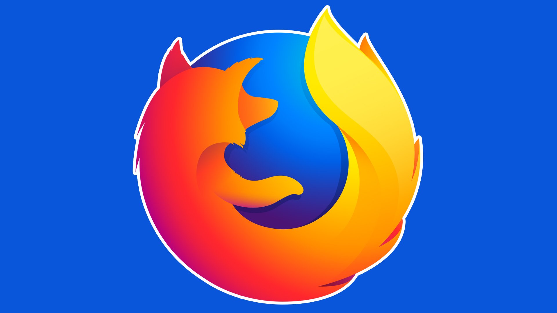
2017 — 2019
![]()
The redesign of 2017 brought a new smooth style to the iconic fox, which was now executed in smooth wide lines, with all the sharp triangular elements removed. As for the globe, it’s color became brighter, though the contours of the continents are not seen anymore, the background is plain and gradient.
2019 — Today
![]()
In 2019 the globe becomes smaller and its blue color is being replaced by light purple. The enlarged fox is now drawn in profile and looks tender and friendly, cuddling the circle of the globe. The lines of the creature’s tail are elongated and smooth, looking elegant and sleek.
Symbol
While the animal seen on the icon is undoubtedly a fox, in fact, the word “firefox” actually refers to the red panda. Why isn’t then a red panda featured on the logo? As Hicks explained, very few people know that a “firefox” means a panda.
Font
The type used for both the words “Mozilla” and “Firefox” in the previous version of the logo is called FF Meta Bold Roman. The font was developed by Erik Spiekermann.
Color
![]()
Optimistic and eye-catching, the combination of blue and orange seems quite natural, in this case. Orange is the color of the fox’s fir, while blue creates an appealing contrast to it.


