

![]() Keller Williams Logo PNG
Keller Williams Logo PNG
The history of Keller Williams, one of the most known US real estate franchises, started in 1983. Today it is an Inc. 5000 company with over 700 offices.
Meaning and history
![]()
The largest real estate franchise in North America, Keller Williams has a distinctive, eye-catching, and contemporary emblem. The only update it has gone through aligns with the minimalism trend that has dominated logo design for the last decades.
1983 – 2013
![]() If the original Keller Williams logo could speak, it would have said “tradition” and “reliability.”
If the original Keller Williams logo could speak, it would have said “tradition” and “reliability.”
The serif type used for the red lettering would have looked absolutely appropriate in any wordmark introduced in the first half of the previous century. By choosing this classic serif in 1983, the designers wanted to create an impression of a company proud of its roots.
The bold letters looked stable adding to the “reliability” concept.
The word “Realty” was also set in a serif type. While it was a different one, both in terms of the shape and the weight, it still had a classic style and supported the “tradition” (“heritage”) theme.
Nothing could make a better contribution to the theme than a monogram looking like a symbol of an aristocratic family of the past. Also, the way the monogram was drawn gave a dynamic touch.
While the red letters made the logo eye-catching, the gray elements kept it from being garish. Also, the shade of red grew somewhat nobler due to the addition of a bluish tint.
2013 – Today
![]()
The logo was introduced as part of the company’s 30th-anniversary celebration. The sleek minimalist emblem perfectly fits the modern design trends, which put simplicity over decoration
According to CEO Mark Willis, it is a “more relevant brand for … a company that’s attracting the next generation of real estate professionals.”
This “next-generation” idea can be clearly seen in the updated design. The classic type has been replaced by a modern sans, the Chantilly Serial font. Gone are the serifs and the softened ends. Instead, there are clean and angular glyphs.
While the words “Keller” and “Williams” are written without space in between, some type of border is created by the combination of bolder and thinner typefaces, which is one of the typical approaches in modern logo design. Also, this combination adds a dynamic touch.
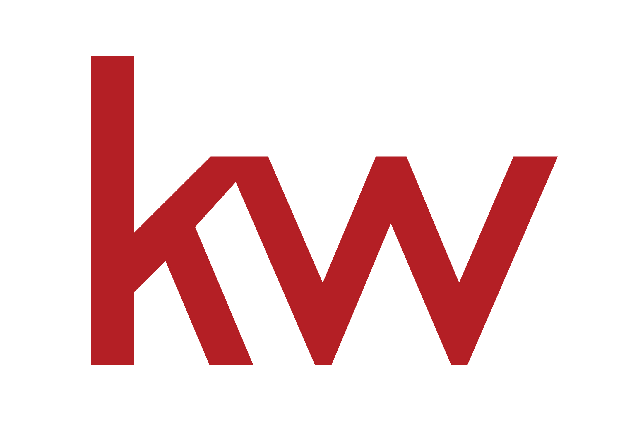
The “kw” monogram creates motion. The link between the two letters makes them look as if they have been formed by a moving ribbon.
The designers have stuck to the red-and-gray color scheme but used a classic red without the bluish tint. It is more like the color of the blood now.
The “kw” is more than just a combination of letters – it serves as an emblem making the logo highly memorable. While the previous monogram was more unique, it was too intricate to grasp and remember. So, unlike the current one, it failed to make the logo recognizable.
The features mentioned above reflect the company’s aim to establish itself as “an industry thought leader, a maverick,” according to President Mary Tennant.
Also, according to Ellen Curtis, executive director of marketing and communications, the updated Keller Willis logo showed the franchise “stands behind their agents, not in front of them.” This is why the logo has been simplified. Due to the simpler shapes, the logo complemented the logos of the agents and didn’t try to overshadow them.
Symbol

The tried-and-true old logotype was built around the name of the company given in red caps. The bolded serif typeface had a traditional feel. Above the wordmark, the intricate “KW” monogram could be seen.
Emblem
In late 2013, the franchise launched a rebranding campaign. According to the company’s director of marketing and communications, Ellen Curtis, the updated logotype was supposed to emphasize that Keller Williams “stands behind its agents, not in front of them.”
Font
![]()
The typeface that could be seen on the Keller Williams logo is called Chantilly Serial. The letters have been stripped of any fancy serif.
Color
![]()
The combination of colors the real estate franchise uses creates an impression of understated chic without sacrificing visibility. The “KW” monogram is given in a noble shade of red, while the words “Keller Williams” are grey.
![]()


