As a brand with a long history, Hennessy boasts a very old and meaningful logo. Although the design has its roots in the family coat of arms of the founder, it wouldn’t look so modern if it wasn’t tweaked by professional and highly skilled designers.
Meaning and history
The legendary cognac house Hennessy was founded in 1765 by Irishman Richard Hennessy, who served as an officer in the army of French King Louis XV. In 1806 the union of Richard Hennessy and Jean Filiu, who came to Hennessy as a cooper, and soon became the first Maitre de Ché at home, this union of two surnames of the company managed to carry through the centuries. Today, the eighth generation of Filho is already involved in the aging and assembling of the famous cognac.
The house logo – the iconic fist clutching an axe – was created in 1856 based on the family coat of arms of the house founder Richard Hennessy. This is a kind of tribute to Richard Hennessy’s 12-year service in the French army, which secured his French citizenship.
Today, the Hennessy brand accounts for 45% of all global sales and 66% of the US market. The cognac house produces more than 50 million bottles of cognac annually and exports to 120 countries. And Hennessy also became the only representative among all cognacs, which entered the top 10 best-selling spirits in the world.
Currently, the Hennessy cognac house, together with the French champagne wine producer Moet & Chandon, is part of the French holding Louis Vuitton – Moet Hennessy.
What is Hennessy?
Hennessy is the iconic brand of French cognac, which was established in 1765, and today is owned by the two largest companies in the beverage market, LVMH, and Diageo. The name of the brand has bovine synonymous with the cognac of the highest quality.
???? – 2022
The main Hennessy logo, which can be seen on every bottle, is called “Bras Armé” in French, which is loosely translated in English as “the Arm & Axe.” It was borrowed from the family crest of Richard Hennessy (1724-1800), the company founder. The military theme seemed quite natural for him, as he spent a lot of time in the war.
Interestingly enough, it was not Richard Hennessy who actually decided to use the arm logo, it was adopted long after his death, in 1856.
2022 – Today
The redesign of 2022 has refined both elements of the Hennessy visual identity, making the iconic Bras Arme emblem more element due to shifting the colors — now it is a white image with black contours, and a bit of liver lines than in the previous version. As for the lettering part, it was also rewritten, keeping the overall style, yet gaining taller letters with shorter serfs on the ends of the bars.
Symbol
The original coat-of-arms included a rather realistic depiction of a pig. Although the animal was lean enough to satisfy even modern taste, the brand owners decided to get rid of it. When all is said and done, a pig by any other name (and after a costly designer upgrade) would smell as disgusting.
Brand mark emblem
One of the designs used on the cognac package, is the letter “H” in a rhombus. The brand mark itself, as well as the pattern used on it, was developed by the creative studio NR2154. The firm established by Jacob Wildschiodtz and Troels Faber has offices in New York and Copenhagen. NR2154 listed creating identity codes for Hennessy among the projects it has fulfilled.
Font
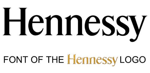
The typeface deserves special attention. It was created specifically for the company by the NR2154 studio, which also developed the “H” brand mark. The typeface is called NR2653 Hennessy. Actually, the project included several different fonts.
Color
The Hennessy logo can be given in a variety of colors. Typically, the symbol is given in golden or silver shades. The choice depends on the overall design of the bottle and package.


