Fendi is a renowned Italian fashion house founded by Eduardo and Adele Fendi. Founded in 1925, it produces handbags, apparel, wallets, sunglasses, perfumes, and other luxury stuff.
Meaning and history
The logo of the luxury Italian fashion house is well known all over the world, and its double “F” symbol has become iconic by today. Though the very first emblem of the label was very different from the bold solid inscription we got used to seeing.
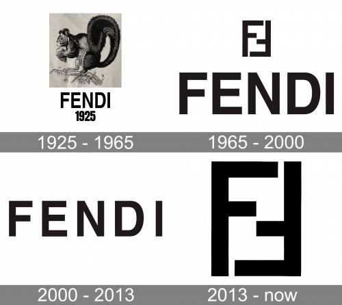
1925 — 1965
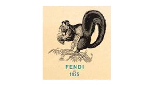
The original Fendi logo, introduced in 1925, featured an image of a very unusual for fashion animal — a squirrel, standing on a branch and holding a nut. It was a mascot, very important for the Fendi family, the painting of a squirrel was a gift from Eduardo Fendi to his wife, Adela, as he has always been saying she was too busy, like a squirrel.
The logotype was placed under the image in all capitals of a strict sans-serif typeface and had a “1925” date mark as a tagline. Both parts of the inscription were executed in a turquoise blue, which looked very sophisticated on a light yellow wrapping paper of the brand.
1965 — 2000
Karl Lagerfeld joined the Fendi label in 1965, and the logo was changed by him in the same year. The iconic “FF” symbol he created in seconds, and the black logotype, placed under it, was written in all capitals of a solid and straight sans-serif typeface, which its letters tall.
2000 — 2013
In 2000 the “FF” symbol was removed from the official version of the Fendi logo and started being used mainly for prints on the fabrics and leather. As for the visual identity of the brand, it was now composed of a single capitalized inscription in a refined sans-serif typeface with its letters placed on a big space one from another, which made the logo airy and light despite the thickness of the letter-lines.
2013 — Today
The redesign of 2013 changed the typeface of the Fendi logo into a rounded one, and today its capital letters are written in a font, which is very similar to Basic Commercial Soft Rounded Pro Bold, with sleek smooth lines, yet solid classic shapes.
The massive inscription is complemented by a delicate tagline, “ROMA”, in the same typeface, but smaller size. It is a celebration of the home city of the brand and its main inspiration.
Symbol
In addition to the “double F” logotype, which is also known as inverted “Zucca”, the brand has a script logo. The font featured on the wordmark is Helvetica Bold. This is a grotesque sans serif typeface developed by Eduard Hoffmann and Max Miedinger and published by the Linotype type foundry. Interestingly enough, the letter “F” on the “double F” emblem is different than the one sported on the script logo.
Logo bags
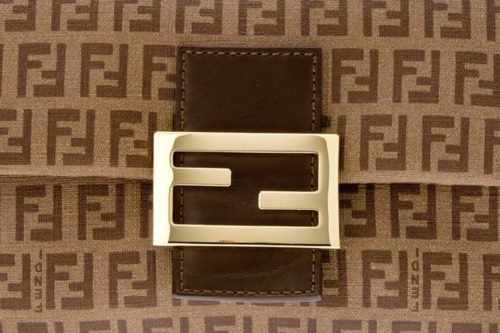 There are several ways the Fendi logo can be featured on the bags. The most obvious one is on the clasp. Being the most eye-catching place for the logotype, it is not the only one. There are quite a few bags sewn from the material, where the letters “FF” create a pattern. In this case, it is even hard to calculate how many times the logo is replicated. And, of course, we should mention the inner lining of the bags.
Logo bracelet
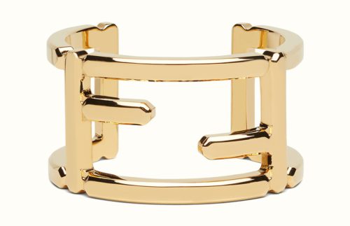 Fendi logo bracelets vary in the width, structure, and material. Wide metal bracelets with a big “FF” logotype are rather popular. One could also find a wide white bracelet with a black wordmark reminding a stencil. The company also sells chain bracelets, where letters of the brand’s name can be seen on the charms. In case of leather bracelets, the emblem is often placed on the clasp.
Font and color
The bold uppercase logotype from the primary badge of the luxury Italian fashion house Fendi is set in a custom sans-serif typeface with extra-bold capital letters executed in softened lines. The heavy font from the Fendi insignia looks pretty similar to such typefaces as Bondan Regular Bold, or Innovate P Rounded Bold, but with some minor modification. Also, the letters in the inscription are set at a pretty large distance from each other, which makes the contours of the characters look slightly different from the commercial analogs.
As for the color palette of the Fendi visual identity, it is set in the most frequently used shade of the fashion industry — black and placed on a plain white background. The emblems in black and white are timeless and stylish, wherever they are placed, and whatever is drawn around them.


