Oysho is a fashion brand, which specializes in leisure and underwear. The company was established in 1977 in Spain and today is a part of Inditex Group, with more than 600 stores all over the globe.
Meaning and history
Oysho, established by Inditex in 2001, specialized exclusively in lingerie and underwear for women for the first few years of the company ‘a existence. A bit later lounge and homeware were added to the range of Oysho products, and then the brand introduced a collection of sportswear and accessories, which today is the main specialization of Oysho.
As a part of Inditex, Oysho from the beginning has followed the same philosophy and strategy in the fashion world as the other brands of this concern. Namely: to provide the consumer with all the latest novelties of the fashion world in the shortest terms. That is why Oysho collections are renewed every season thanks to a team of creative designers, each of them is an expert in his sphere.
What is Oysho?
Oysho is a Spanish brand of women’s underwear and sportswear, created in 2001 as part of the world-famous Inditex Group, the official owner of such famous Spanish brands as Zara, Bershka, Massimo Dutti, Pull and Bear, and Stradivarius.Today the brand includes more than 600 stores in 44 countries, of which 190 stores are open in Spain.
2001 – 2011

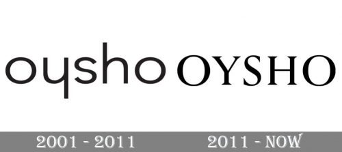
The Oysho visual identity has been always based on the brand’s name inscription executed in a monochrome color palette.
The old version was minimalist, yet memorable. It was a perfect example of a typographic logo with a pronounced pictorial quality. If you try rotating the wordmark 180 degrees, you will see that it has remained the same: you can still read the name of the brand. The symmetry and rhythm have appeared due to the slightly modified shape of the “y” – it looks like the “h” turned upside down.
2011 – Today

With the latest brand’s redesign, the logo was modified in order to look sharper. It did lost the “rotating” quality of its predecessor, though.
The current Oysho logo, designed by the Clase bureau, based in Barcelona, looks strong and reflects the Oysho innovative approach.
The wordmark in all capitals is executed in a stylish serif typeface with confident neat lines and enough space between the letters, which makes the logotype look light and fresh.
The font of the Oysho logo was designed by a Spanish typographer, Iñigo Jerez, and it was based on the original brand’s logo, but many details were softened and modified in order to create a perfect typeface.
The monochrome color palette remains untouched, yet now black is the main color for some product lines of the brand. The Oysho packaging now can also be seen in both white and black colors, which adds style and makes the brand more recognizable.
The Oysho logo is minimalist and laconic and executed with great attention to detail. It looks modern and confident, showing a powerful brand, which values progress and innovations.
Font and Color
The elegant uppercase lettering from the primary Oysho brand is set in a bold and modern serif typeface with thick bars and delicate triangular serifs on the ends of the lines. The closest fonts to the one, used in this insignia, are, probably, Perpetua Std Titling Roman, or Agatho Medium, but with some minor modifications of the characters’ contours.
As for the color palette of the Oysho visual identity, there is nothing shocking — the brand uses black as the Major shade, and the inscription is usually set against a plain white background. This timeless powerful color palette makes the badge look confident and strong, showing it as a progressive and a high-quality one.


