Brioni is a luxury Italian brand of men’s clothing and accessories, which was established in 1945 and today is one of the most famous high-end men’s fashion brands, popular for its made-to-measure suits. Brioni is a part of Kering holding.
Meaning and history
Brioni brand is high-end. It is one of the milestones of men’s fashion history and is highly respected in the industry. The brand provides the best quality of materials and silhouettes possible.
The Brioni logo is an elegant instantly recognizable wordmark, which was changed just once in its history, when the label invited Justin O’Shea as a head designer. He changed the iconic logo to a bold Gothic nameplate, but it didn’t last long.
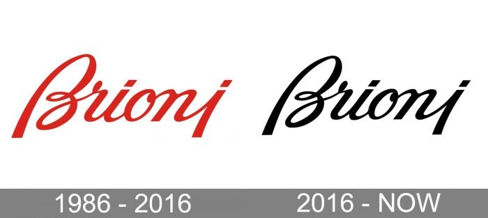
1986 – 2016

The logo used during this period looks almost exactly like the current one, but it is red. The red wordmark isn’t as universal as black. The black is a sort of a “default” color that can be changed to any other one depending on the visual context. Taking this into consideration, it’s perfectly natural that eventually, the company opted for a more flexible color scheme.
2016 – Today
The current logo is a traditional Italicized Brioni name in monochrome. The custom handwritten typeface is all about elegance and sophistication. The letter “B” is smooth and curvy, but doesn’t look feminine.
The Brioni logo is a perfect representation of how the prime men’s brand should look – fine and confident, chic and masculine.


