The Future Business Leaders of America is a Virginia-based career and technical student organization. It has two emblems. One of them depicts a flag, while the other one is a crest with an eagle.
Meaning and history
Future Business Leaders of America (FBLA) was founded in 1940 by Hamden L. Forkner of Columbia University. This organization was established to create a bridge between education and business careers for students, preparing them for the corporate world. Throughout its history, FBLA has seen numerous significant achievements, notably in its expansive growth and influence in the educational sphere. It has established itself as a leading student business organization, reaching over 250,000 members across thousands of chartered high school and college chapters. Key milestones include the development of innovative programs and partnerships with major corporations, contributing to its reputation as a premier organization for student leadership development in business and entrepreneurship.
In the current landscape, FBLA holds a prominent position, continually adapting to the evolving business world. It offers a wide range of programs, competitions, and educational resources, focusing on areas like business ethics, entrepreneurship, technology, and leadership skills. Its impact is not just national but global, with an expanding international presence. This enduring success underscores FBLA’s commitment to nurturing future business leaders and entrepreneurs, cementing its role as an integral part of the educational and business communities.
What is FBLA?
FBLA is a non-profit educational association preparing students for careers in business and business-related fields. It fosters practical business skills and leadership abilities, with a focus on community service, academic competitions, and career development.
1946 – Today
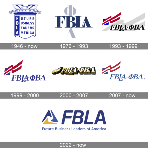
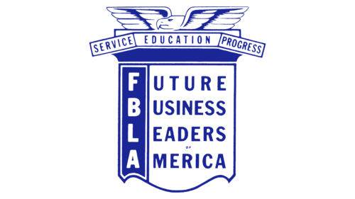
The inaugural emblem of the organization featured a majestic eagle perched atop a capital, embodying the United States’ spirit of leadership, liberty, and vigor. These traits were core to the founders’ vision for nurturing future generations. Encircling the column, a ribbon bears the inscription of the organization’s primary objectives: service, education, and progress.
A unique flag scroll, vertically bisected, adorns the capital. This element intricately reveals the roots of the organization’s moniker. On its left, against a deep purple backdrop, the acronym’s letters ascend vertically. The right segment unveils their meaning: future, business, leader, America, coalescing into “Future Business Leaders of America,” abbreviated as FBLA.
1976 – 1993
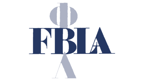
In 1976, a simplified logo emerged, focusing on the abbreviation. This version incorporated the names of three sub-divisions – Phi Beta and Lambda – and cleverly decoded the acronym: P(hi), B(eta), La(mbda). The FBL divisions, primarily for university students, began with the first at the University of Northern Iowa in 1958. Notably, this iteration used the Cyrillic alphabet for the group designations – ФВЛ – arranged vertically to symbolize growth. The FBLA name ran horizontally, with the ‘B’ shared between both words, indicating educational advancement and progression.
1993 – 1999
The 1993 redesign followed the inauguration of The FBLA National Center in Virginia, a project realized on land gifted by The Conrad N. Hilton Foundation. This version infused American symbolism to reflect the organization’s patriotic ethos, focused on cultivating successful leaders and entrepreneurs dedicated to national prosperity. The emblem showcased a blue square with a corner-emanating red and white striped flag, reminiscent of the American flag and a ballot box. It symbolized members’ potential political aspirations and commitment to national service. The combined FBLA ФВЛ inscription, set against a gray backdrop, mimicked the flag’s wave, punctuated by a dot. An enlarged ‘L’ underscored the emphasis on ‘leaders,’ conveying lofty aspirations and patriotic fervor.
1999 – 2000
1999 brought a palette shift in the logo, aligning with the American flag’s colors. The letters, previously black, adopted a blue-violet hue, symbolizing self-discovery, in-depth learning, and personal growth. The gray backdrop was removed, leaving a pristine white field to represent the youthfulness of its members.
2000 – 2007
With the new millennium, FBLA’s identity evolved further. The logo now featured bold, gold letters, symbolizing the organization’s role in elevating its members to unparalleled heights. The design, viewed from a lower perspective, included a sunlit, unfurling flag. This imagery, coupled with the metallic sheen, spoke to the ideals of a brighter future, resilience, and intellectual strength. The gold accentuated the notion that knowledge is a vital asset.
2007 – Today
The latest emblem, more approachable and inviting, reflects the FBLA’s growth into America’s largest youth organization, with a national and regional presence. While retaining the classic elements of a square and flag, it now features refined details to represent the youthfulness and budding careers of its members. The logo’s colors, slightly divergent from the organization’s primary palette, carry deep meanings: blue for logic and structured knowledge, red for leadership and innovation, and white for purity and integrity. The CG Times Italic-like font underscores the importance of individuality and character development in achieving success.
2022 – Today
In 2022, a new emblem was introduced, complementing the existing one. This design features a triangle composed of three checks, rich in symbolism:
- It represents the Greek letter delta, signifying ‘door,’ metaphorically opening pathways to success and prosperity.
- It encompasses the organization’s three educational levels: middle school, high school, and university.
- It illustrates essential qualities for members: leadership, liberty, and strength, aligning with key leadership traits of service, education, and progress.
Below the triangle is the blue abbreviated name, with its full expansion underneath, creating a dynamic and thoughtful emblem.
Flag symbol
The primary FBLA logo consists of the name of the organization itself and a stylized graphic element that is most often called just the “flag.”
Crest emblem
The flag logo is placed into the center of the crest logo, where it is surrounded by the words “Service”, “Education”, and “Progress”. These elements are put into a shield shape topped by a gold eagle.
Font
The FBLA logo with a flag features an italic all-cap serif font. It would have looked absolutely regular and traditional if not for the letter “L”. The vertical bar in it is longer than it should be, while the letter itself goes slightly out of the line, so its horizontal bar is placed below the letter “A”.
Color
The “flag” logo contains two colors: red and blue. The dark, but saturated shade of blue used in the emblem goes under #286 in the Pantone system, while the shade of red goes under #193.
The eagle logo, which is also called the FBLA crest, is built around a completely different color scheme. It includes a darker shade of blue (Pantone #274) and a rather discreet shade of gold (Pantone #7404).
In cases when the two-color palette is impossible, the emblems may be printed in black or white. In case the original color schemes are used, they require white or light backgrounds to ensure legibility. If the background is dark or black, the emblem should represent a single-color white print.


