Virginia Tech, also known as Virginia Polytechnic Institute and State University, is not a company but a prestigious public research university. It was established in 1872 and does not have an ‘owner’ per se, as it is a public institution. Virginia Tech operates primarily in Blacksburg, Virginia, with numerous satellite campuses spread across the Commonwealth. Renowned for its strong engineering, business, and agriculture programs, the university stands as a beacon of innovation and learning in the higher education landscape. Its sprawling campus and extensive research facilities contribute significantly to both the local and global academic community.
Meaning and history
Virginia Tech was founded in 1872 by the Commonwealth of Virginia, initially named Virginia Agricultural and Mechanical College. Since its inception, the university has undergone significant transformations, both in its structure and its contributions to education and research. A key achievement of Virginia Tech was its evolution into a comprehensive university, marked by its official renaming in 1970 to Virginia Polytechnic Institute and State University. The university has earned a reputation for excellence in engineering, agriculture, and business programs, among others. It has also made notable strides in research, particularly in areas such as aerospace, environmental sciences, and cybersecurity. Currently, Virginia Tech stands as a prominent public research university, recognized globally for its commitment to academic excellence, innovation, and community engagement. It continues to expand its influence and offerings, adapting to the evolving educational needs of the 21st century.
What is Virginia Tech?
Virginia Tech is renowned as a public research university, celebrated for its robust academic programs in engineering, business, and agriculture. As a center of innovation and learning, it plays a pivotal role in advancing research and education, shaping future leaders and thinkers.
1896

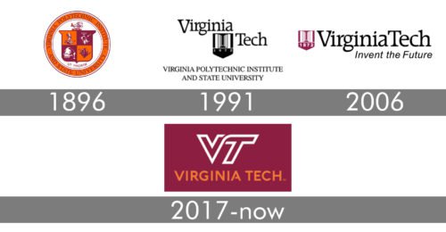
The very first logo for the Virginia Polytechnic Institute was created in 1896 and stayed unchanged for almost a century. It was a traditional heraldic badge, executed in a timeless and elegant burgundy and gold color palette, looking Royal and sleek and evoking a sense of professionalism, wisdom, and attention. It was a classic crest with the four-squares pattern, where each square had a separate image drawn over it. The crest was placed on a light sand background and enclosed into a circular gold frame in a thin burgundy outline, with the uppercase serif logotype written around its perimeter.
1991 – 2006

The redesign of 1991 was held right after the name of the institute was changed to Virginia Tech. The new concept featured a bright strict emblem inscribed into a bold black logotype and underlined by a two-leveled “Virginia Polytechnic Institute and State University” lettering. The main logo boasted the “Virginia Tech” in the title case of a fancy and modern serif typeface, and the emblem — a sharp geometric crest in burgundy, with white geometric pattern and the “1872” datemark placed on the bottom of the crest, under a thin white horizontal line.
2006 – 2017

The Virginia Tech logo was refined in 2006, keeping the elements from the previous version, but straightening the badge up, making it look more professional and confident. The new badge had the burgundy and white crest drawn in a slightly smaller size and set in the left from the main logotype, which was now written in one straight line. The badge was underlined by a title case italicized “Invent The Future” motto in a simple sans-serif, which reflected the main values of the university.
2017 – Today
The new modern and cool style was brought to the Virginia Tech logo in 2017. Keeping the burgundy color from the previous versions, but replacing black with orange, the badge was redrawn and rebuilt. It was now set in two lines, with the stylized contoured “VT” monogram in burgundy and white, placed above the bold and stable sans-serif “Virginia Tech” logotype, executed in a fancy custom sans-serif typeface, with just one designer detail — a shortened horizontal bar in the letter “A”.
Emblem
The centerpiece of the Virginia Tech logo is the so-called flying “VT” in white with a maroon outline. The “Virginia Tech” wordmark in orange can be placed either below (on the primary logo) or to the left of the “VT” emblem (on the alternative logo). There’s also a version, in which the background is maroon, while the outline of the “VT” is white.
The motto, Ut Prosim (That I May Serve), has remained unchanged.
Font
The custom typeface featured on the “Virginia Tech” lettering seems to have been inspired by the distinctive curve joining the letter “V” and “T” on the flying “VT” monogram. The curve was applied to all the glyphs in the full name, apart from the straight letters, “I,” “T,” “E,” and “H.”
Athletic logo
The athletic teams of the Virginia Tech have been using the flying “VT” since 1983. The letters themselves are maroon, while the outlines are white and orange. One of the reasons why the university decided to develop a new academic logo was to align the academic and athletic brand identities. That was quite an unusual move as traditionally most universities have a clear distinction between the logos they use for their sports teams and academic purposes.
While the academic logo has been inspired by the university’s athletic emblem, it looks a bit different. On the academic logo, the “V” fuses into the “T” through a soft curve, while the same element on the athletic logo features an angle. As the result, the academic emblem actually looks a bit more dynamic and sporty than the sports one.
Colors
The primary palette includes Chicago Maroon, Burnt Orange, Yardline White, and Hokie Stone.


