

![]() QUT Logo PNG
QUT Logo PNG
The Queensland University of Technology (QUT) has a stylish and contemporary logo in dark blue and white.
Meaning and history
The university in its current form appeared in 1989 when the Queensland Institute of Technology got the university status and merged with Brisbane College of Advanced Education. However, the school’s history goes back to 1849 when the Brisbane School of Arts was established.
Primary symbol

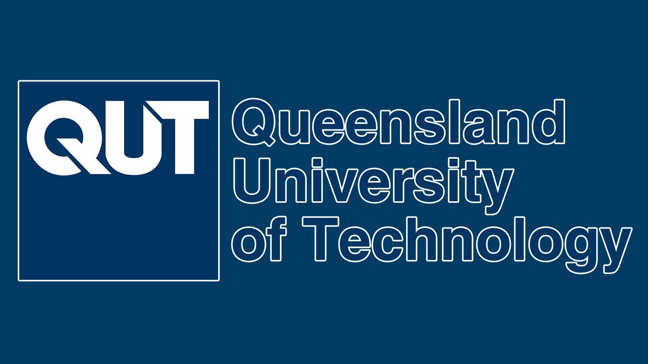
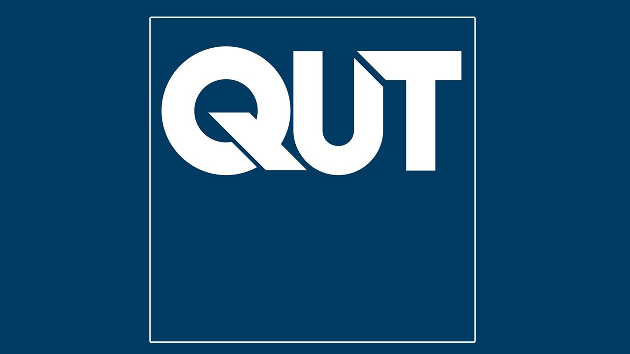
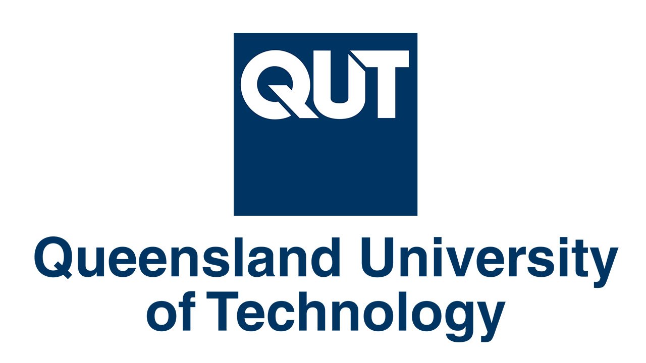
Simple and at the same time memorable, the primary QUT logo comprises only the short name of the university. The letters “QUT” are given in blue over the white background. While it’s just a wordmark, you can feel the letters have a pictorial quality to them. The “tail” of the “Q” creates a parallel with the left end of the “T,” which helps to make a visual connection between the letters.
In addition to the main version, the logo can be also given with a reversed palette where the letters are white and the background is dark blue.
Emblem with the tagline
Here, in addition to the word “QUT,” you can see the lettering “a university for the real world.” It’s given to the left of the wordmark.
Font
![]()
Helvetica Neue is the QUT’s corporate font. While the word “QUT” on the logo uses a completely different type, Helvetica Neue in its bold weight can be seen on the extended version of the main logo. Here, it’s used for the tagline “a university for the real world.”
Colors
The main corporate color is a rich and saturated shade of blue, which goes under # 541 in the Pantone Matching System (RGB 0 59 113, HEX #00407a). The brand guidelines also mention metallic silver as a so-called embellishment color (PMS 877, RGB 142 144 144, HEX 8A8D8F). The official palette includes a vivid sky blue tint as a support color (80% tint of Process Cyan). You can’t see the metallic silver or sky blue in the main QUT logo, though, just the dark blue and white.


