Caterpillar is The name of the American manufacturer of construction machinery, which was established in 1925 in California. Today the company is one of the world’s leaders in its segment, distributing its products across the globe. Being one of the Fortune100 lists, the corporation also provides its customers with insurance and financial services.
Meaning and history
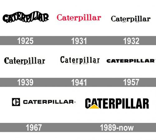
The visual identity of the machinery producing company has a long and colorful history. The evolution of its logo reflects the progress and growth of the brand, showing how it developed from a small business to a huge international player.
Some of the logos were a graphical interpretation of the company’s name, while others were completely name-unrelated, but represented a powerful and professional brand.
1925 — 1931
The very first logo of the company was composed of a wordmark in two color variations — black on white, or red on gray. The inscription was waved, resembling a silhouette of a caterpillar and the split ends of the letters stood for the legs of the creature. The logo stayed with the company for quite a short period and was just the first try in the list of numerous logotypes and emblems.
1931 — 1932
The first redesign was held by the company in 1931. The wave logotype was replaced by a stricter and a more traditional one. The red title case inscription in a stylish serif typeface with rounded horizontal bars of both letters “R”, was based on a traditional font, such as NoraPen Medium or Gianotten Pro, but with some lines modified.
The red and white color combination symbolizes the power, passion, and energy of the young company, showing its willingness to grow and provide their customers with new products.
1932 — 1939
The color of the logotype was changed to black in 1932. And since that time until 1957, the company has had about three different versions of the inscription, all of them in monochrome and more or less the same style, but by 1957 the inscription gained a narrower and more compact sans-serif font, which looked modern and strong. The font was close to Polyphonic condensed, but with all the horizontal bars shortened.
1939 — 1941
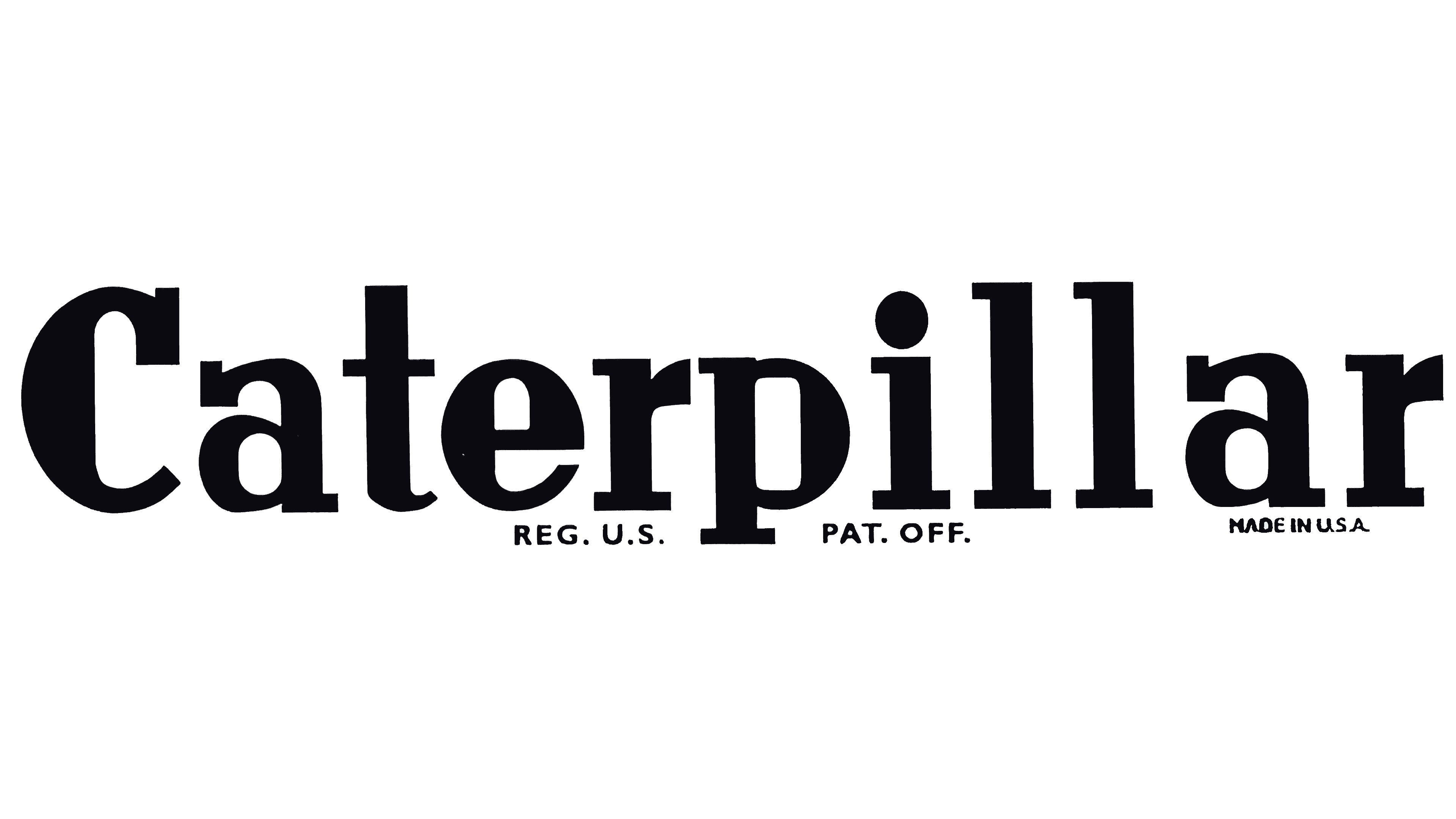
The majority of the customers probably wouldn’t have noticed the update unless they compared the two versions side by side. To begin with, the proportions of the letters were slightly different. What was even more notable was that the rounded ends were replaced by squarish ones in many cases.
1941 — 1957
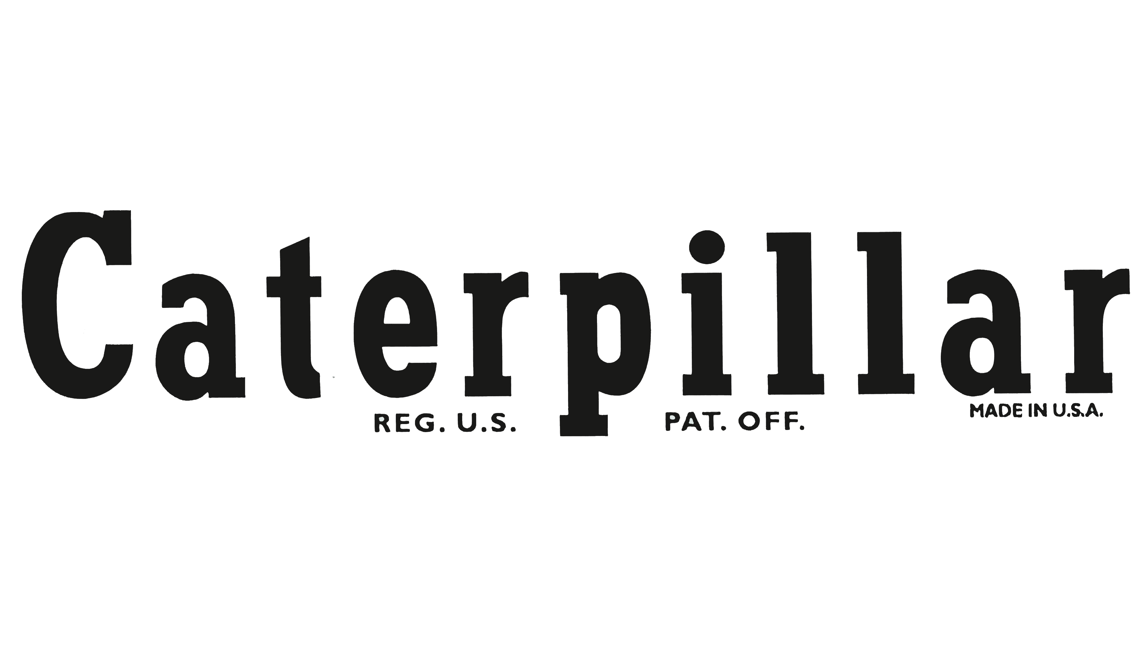
Once again, the overall style remained unchanged, but the shape of the glyphs was modified. The letters were now narrower, and there was more breathing space between them.
1957 — 1967
The redesign of 1957 completely changed the style of the Caterpillar logo. The black inscription in all capitals was now written in an extra-bold sans-serif typeface, which is very similar to Filmotype Ford, with its thick lines and distinct contours. The lettering looks powerful and professional, reflecting the authority and expertise of the company, while the monochrome color palette symbolizes the traditional approach and values of the group.
1967 — 1989
The redesign of 1967 brought the first emblem to the company’s visual identity. Now the logotype was accompanied by a moss-green square with a white circle on it. The circle had two lines, touch through it — one vertical, dividing it into two equal parts, and the horizontal one, splitting the right half in two. Three white segments in the green background formed a stylized letter “C”.
As for the wordmark, it is still written in all capitals, but in the different typeface. Now the inscription is executed in a smooth and sleek sans-serif font, similar to Eurostile Unicase Pro Regular.
On some versions the emblem, placed on the left of the logotype, was executed in a black and white color palette, perfectly balancing the lettering.
1989 — Today
The logo we all know today was designed in 1989. It is composed of a completely new wordmark with a delicate yet strong graphical element inside. The inscription in all capitals is executed in a bold and neat sans-serif typeface, which is very close to CG Triumvirate Inserat and Nimbus Sans L Cond black.
The wide yellow triangle is covering the bottom parts of the first three letters, creating a bright accent and making the logo unique and recognizable.
For the icon the company uses only “CAT” lettering with a triangle, executed in a black, white and yellow color palette, symbolizing strength, confidence, and energy.
Emblems
One of the most attractive logo concepts was created more than a decade before the “crawling” Caterpillar logo was introduced. It featured the word “Tracklayers” inside a caterpillar track. Why “Tracklayers”? This is exactly how the C. L. Best Tractor Co. called their machines, while Hold called theirs “Caterpillars.”
Corporate symbol
Interestingly enough, the company did not have an official corporate logo until 1967. It was then that the so-called Block C emblem was introduced. It did not comprise the company name, just a stylized white “C” on the black background. The letter consisted of three parts (half a circle and two quarters of a circle).
Shape
Today’s Caterpillar logo is the same old company name with a yellow triangle buttressing the letter “a” (the first one). Another version features just the first syllable – “CAT” featuring the triangle. The memorable “CAT” logo appears on the company’s products and it has pretty much contributed to its success.
Colors
The yellow triangle expresses optimism, support, energy, and joy. The black color symbolizes perfection, elegance, and power.
Font
The logo uses ahevletica font., which has undergone a minor modification.


