Are you fond of rock and roll? Then you definitely must love Aerosmith, one of the greatest bands that has gained popularity more than 40 years ago and is still on the Olympus of its fame. There are many things associated with Aerosmith, but the main and most iconic thing that characterizes the band is its logo.
Meaning and history
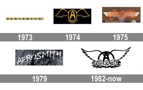
Aerosmith is one of the bands, who had several dramatic changes to its logo throughout history. From ornate badges to sharp and minimalist logotypes, the band tried different styles and designs, though eventually came back to the idea, used for the emblem in the middle of the 1970s, refining and modernizing it.
1973 – 1974
The very first Aerosmith logo boasted a bright yellow horizontally stretched emblem with nine stylized white wings in a blue outline placed in one line. Each of the wings had one of the band name’s letters on it. Written in black sans-serif typeface the lettering looked bright, due to a strong contrast of colors and an interesting composition of the badge.
1974 – 1975
In 1974 the logo was redesigned for the second album if Aerosmith, “Get Your Wings”. The new badge in black and gold color palette featured an oval frame with two bat wings. The stylized furry letter “A” was placed in the middle of the frame, and the full inscription, consisting of the band’s name, was arched along its bottom line, having two five-pointed stars on the sides.
1975 – 1979

With the release of the new album, another logo was created in 1975. It featured a bold and smooth orange lettering in a custom typeface with elongated and curved lines of the letters, creating an interesting image. The wordmark was placed in a V-like silver badge, which looked like an aviation pin.
1979 – 1982
The redesign of 1979 brought a new minimalist concept to the Aerosmith visual identity. On this version of the logo, the name of the band in thick white lines was written on a structured carbon background, executed in gradient black and gray shades. It was a stylish and very laconic logo, which evokes a sense of confidence, seriousness, and a fundamental approach to music.
1982 – Today
The logo we all know today was introduced in 1982 and built around a combination of the logo versions from 1974 and 1975. The fancy smooth lettering in black is placed over a black steering wheel with a white five-pointed star on it. Two white wings in a black outline spread to the sides, make the main part of the logo, being a graphical representation of the band’s name and a tribute to one of its initial emblems.
Symbol
What does this logo look like? There is hardly a person, who hasn’t noticed this black and white winged-A emblem with the stylized band name and a star over it. The widely spread wings have blue shades on the edges, while the main colors have their meaning: white is associated with harmony, wisdom and confidence, while black represents power, energy and elegance.


