

![]() Slayer Logo PNG
Slayer Logo PNG
One of the pioneers in extreme metal, Slayer has always opted for symbols connected with sinister and even satanic themes.
Meaning and history
![]()
The visual identity of Slayer hasn’t changed much throughout the years, though there were six logo redesigns made for the band, all the versions look similar and brilliantly reflects the genre of music and the character of the iconic band.
1983 — 1986
![]()
The original Slayer emblem was introduced in 1983 and boasted a dark color palette and evokes symbols. The red stylized inscription was placed on a background of an unfinished pentagram, formed by four swords, enclosed in a gradient red circle. The whole composition was placed on a black square and looked a bit spooky, reflecting the music of the band.
1986 — 1995
![]()
The redesign of 1986 changed the color palette of the emblem and refined its contours. The circular frame of the sword structure was colored yellow, as for the lettering, in gained a brighter shade of red and became enlarged. The contours of the swords were also cleaned and made more distinctive.
1995 — 1998
![]()
In 1995 the band starts using simply its logotype, executed in white and red, and placed on a black background. The straight thick lines of the narrowed geometric letters looked sharp and edgy, showing the individuality of Slayer and its unique style.
1998 — 2001
![]()
The redesign of 1988 brought a completely new wordmark to the band’s visual identity. The sans-serif typeface of its capital letters was complemented by a gradient white color and a grain texture of the letters, which had a gray shadow, making the emblem three-dimensional and airy.
2001 — 2009
![]()
The original style of the inscription came back in 2001, though the contours were similar to the first versions of the logo, its execution was completely different — its thin lines were scratched on a white background and featured a black color. It looked like it was colored by a pencil, though it was a professional and very stylish logo.
2009 — 2015
![]()
The scratched logotype became lighter and wider with the redesign of 2009. The renewed color palette now featured white and gradient gray, and the uneven contours looked messy yet cool, and were the most recognizable part of the band’s visual identity for six years, until the next redesign.
2015 — Today
![]()
Slayer comes back to its original logo, and its version, introduced in 1986. The combination of yellow and red make it bright and eye-catching, and the refined contours of both graphical and text parts point to the confidence, stability, and professionalism of the band and its music.
Pentagram symbol
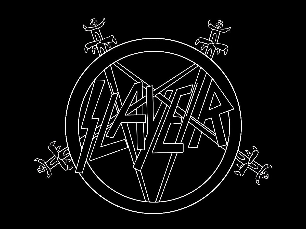
The incomplete pentagram motive has been a distinctive feature of the Slayer album covers ever since, including the album “Repentless” released in 2015.
Eagle emblem
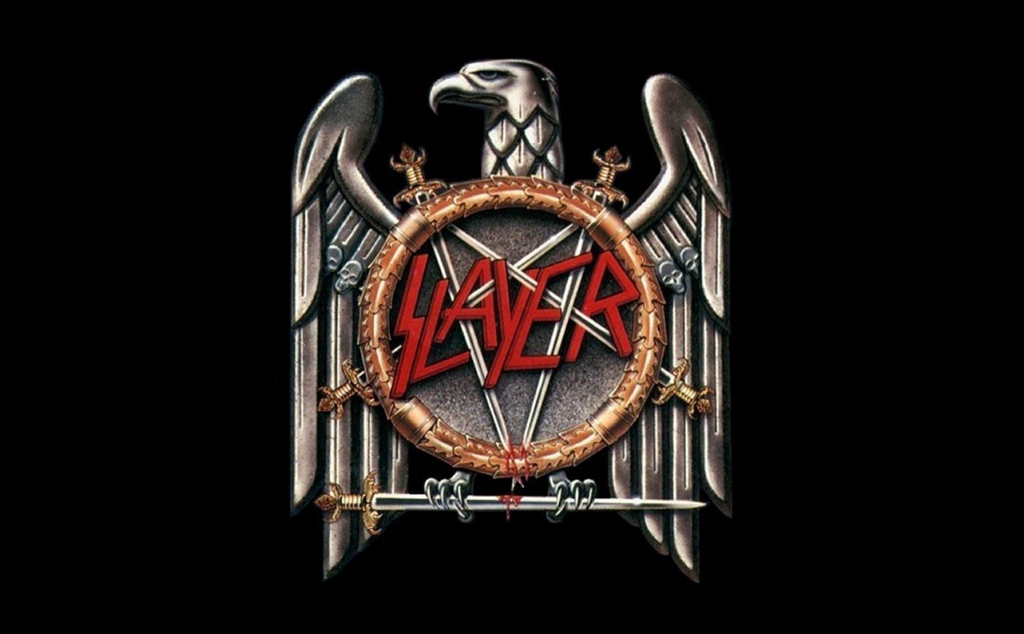
The Slayer logo depicting an eagle appeared with the release of the “Seasons in the Abyss” album in 1990. Because of the emblem, the band had to appear in court. It turned out that the logo resembled the Eagle atop swastika, so Slayer was accused of holding Nazi sympathies. However, the band members have denied any interest in Nazism quite a few times.
Font

The wordmark made its debut on the cover of the “Show No Mercy” album (1983). The sharp angles and unusual lines of the letters emphasize the emotional temperature of the music.
Color
![]()
In most cases, the wordmark is red. Other colors may be used, depending on the visual context surrounding the Slayer logo.


