The 21 Pilots logo is quite a controversial one. Even when one of the band members gave an explanation about the emblem, it did not actually stop the disputes around its meaning.
Meaning and history
The well-known American musical band appeared in 2009 in Columbus, Ohio. It was created by three college friends, Tyler Joseph among them. Today, 21 Pilots consists of the lead vocalist Tyler Joseph and the drummer Josh Dun.
What are 21 Pilots?
21 Pilots is the name of an alternative band, which was created in the United States in 2009 and consists of two musicians, Tyler Joseph, the vocalist, and Josh Dunn, the drummer. Since 2009 the band has released six studio albums in different musical styles from rock to hip hop.
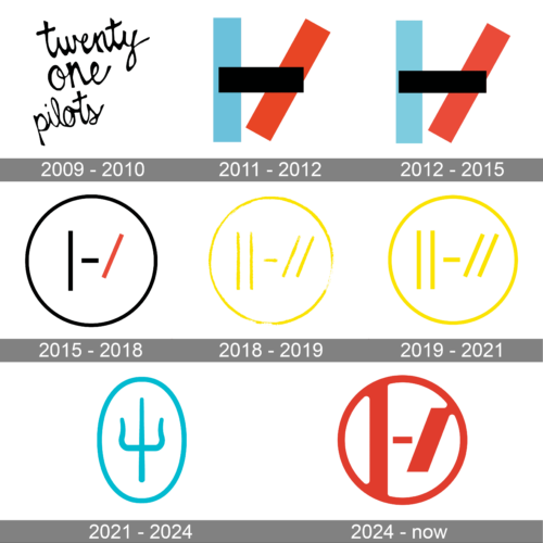
2009 – 2010
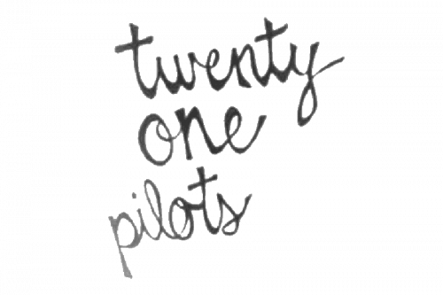
The original logo showcased only the name of the band written casually in a cursive script. While the script imitating handwriting added personal touch, it lacked meaning and individuality.
2011 – 2012

A year after the band was created, they adopted a logo that, in a modified form, has been with them ever since. There were two slashes: a vertical one (blue), a diagonal one (red), and also a black bar that was placed over them. The result looked like the capital “H” with its right side tilted.
2012 – 2015
The logo maintains the same fundamental elements but reverses the color scheme to a lighter background. This switch possibly indicates a shift in theme or era for the band, yet the continuity of design elements ensures brand recognition. The use of contrasting colors remains, keeping the visual impact strong and memorable.
2015 – 2018
The vertical and the diagonal slashes were drawn farther from each other. The horizontal bar grew smaller and now looked like a hyphen between them. The design was placed inside a circle.
There’ve been many rumors about the meaning of the old logo, yet Tyler Joseph said it was “something that only I understand.” According to Tyler’s explanation, the logo is somehow linked to the song Kitchen Sink. He claimed that the emblem is “something that only I understand”, and in this way, it gave him purpose. For Tyler, purpose starts when “you create something and only you know the meaning of it.” He designed the logo as an encouragement for people to create.
The most popular explanation provided by the fans has been that this symbol is just another way of depicting the “Ø” symbol. It is the so-called “o” with a stroke, a Norwegian letter called “slashed o” or “o with a stroke.” If you are going to type the “Ø” symbol in Microsoft Word, you will need to use the following combination: Ctrl-/ followed by “o”. Quite a few fans were sure that this could be the reason why the musical duo chose such an emblem. This hypothesis makes sense as the “Ø” glyph is used in the name of the band, where it replaced the “o’s” in the words “one” and “pilots” (TWENTY ØNE PILØTS).
Yet, this leaves another question: why, for one, they had replaced the “o’s” with the Norwegian alternative? As Tyler gives us a chance to invent any theory, we’d like to suggest a romantic one. Long ago, he fell in love with a girl from Norway. Although they parted, he wanted to always have something near him to remind her. He chose the letter that she sees every day reading newspaper, books, or signs in her language – the letter that he also often saw, when they were together. The following version can be interpreted as an indication that he forgot the girl but instead fell in love with twins – apparently, again from Norway (why not?).
2018 – 2019
In the summer of 2018, the band released a new emblem giving their fans another message to decipher. This time, the vertical and the diagonal slashes were replaced by a pair of parallel slashes. The image was now yellow.
2019 – 2021
Two more versions of the 21 Pilots logo were introduced. In one of them, the previous logo but without the “blurred effect.”
2021 – 2024
The redesign of 2021 brought us a completely new badge, in a different color palette and style. We have never seen a famous band like this before. A very simple yet bold emblem is composed of a minimalist image of a trident, placed inside the vertically oriented oval frame. Both the trident and the framing are executed in a calm and intense turquoise shade, and the main color of the medallion is white, which creates good contrast and evokes a sense of motion and energy, at the same time, following the sea theme of the new band’s identity.
2024 – Today
The image is the recognizable logo of the musical duo Twenty One Pilots. The logo consists of a bold, red set of bars and a solid line that form the characters “|-/”. These are arranged within a circle, with the central figure resembling a simplistic, abstract rendition of an aircraft’s cockpit, which can be seen as a nod to the band’s name. The logo is set against a black background, creating a striking visual contrast that makes the red elements stand out prominently. This logo has become an emblematic symbol for the band, representing their unique sound and the close-knit community of their fan base. It’s a simple yet powerful image that encapsulates the essence of Twenty One Pilots’ identity in the music world.
Font
The most unusual feature of the type sported in the 21 Pilots logo is the presence of two slashed “o’s” instead of the regular ones. Other than that, the font is a fairly generic one.
Color
In the old version, the white emblem is placed against the black background. The simple black-and-white color scheme was a bit jazzed up by a red slash. In the current version, only black and yellow are used.


