Zomato is a restaurant search app and food delivery service. Its history started in India, but it later conquered many other markets, from the US to the EU to Australia. The brand has been known for changing its emblem often.
Meaning and history
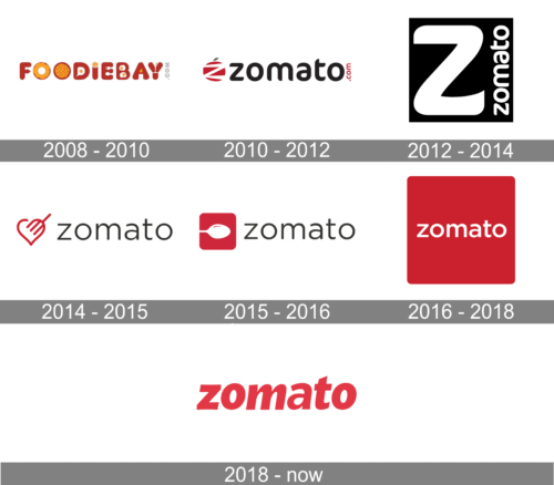
Sometimes the Zomato logo was modified as often as three times within three months. And they have had good reasons for this, which lie in the company’s specific mergers and acquisitions politics, as well as in its overall approach to gaining and retaining customers.
What is Zomato
Founded in 2008, Zomato is a technology platform connecting customers, restaurant partners, and delivery partners. It can be described as a way to search and discover restaurants, as well as a food delivery company.
2008 – 2010
The first name of the online platform, known today as Zomato, was FoodieBay, and the original logo of the service was built around it. The badge, created in 2008, featured a red and yellow composition where each letter of a smooth uppercase inscription was stylized as a symbol or a food product. It was a very intense and interesting logo, which stayed with the company for two years until it was renamed Zomato in 2010.
2010 – 2012
The badge, designed for the rebranded service in 2010, boasted a sleek modern lowercase lettering in a fancy sans-serif font, with the dark shade of gray used for the lines, and a small “.com” in red, set vertically along the right side of the “O”. On the left of the logotype, there was a stylish minimalistic emblem with the solid red apple having a white “Z” cut out on it, and decorated by a tiny green leaf on top.
2012 – 2014
The redesign of 2012 has introduced a very strict and brutal version of the Zomato logo, executed in a black-and-white color palette with no graphical elements. It was a solid black square with the enlarged white “Z” placed in its left part, and the white lowercase “Zomato” written vertically along the right side. This badge stayed with the service for another two years.
2014 – 2015
In 2014 the Zomato badge gets one more redesign. This time it is something different: the lowercase logotype is written horizontally in thin black lines against a plain white background, on the right from the lightweight red emblem, with the stylized fork overlapping the top right part of a contoured heart symbol. It was a very friendly and fresh badge, which had its mood diametrically opposite to the one in the previous version of the logo.
2015 – 2016

Those who have been tracing the history Zomato logo might have noticed that at certain periods the company would replace its logo very often. It was done in an effort to preserve the customers of the brands Zomato acquired.
For instance, when they purchased Urbanspoon, they modified their logo to resemble the iconic Urbanspoon logo. Otherwise, when Urbanspoon users updated their app, they might have got a feeling that they installed Zomato by mistake. Another example of such a temporary logo was a heart with a fork used after the acquisition of Cibando in Italy.
2016 – 2018
The Zomato logo, introduced in 2016, was all about current trends and readability. The bold white lettering in the lowercase of a traditional sans-serif font was set across the solid red square, drawn in a dark, pinkish shade. It was a full-fledged mobile app icon, which was used by the company for different needs, looking strong, welcoming, and professional.
2018 – Today
The basic version has remained the same through the years. Its main (and sometimes only) element is the name of the brand in red. The letters are lowercase and belong to a moderately bold sans serif typeface. The weight and the lack of serifs play a crucial role in making the wordmark quite legible and minimalist.
When it comes to conveying speed, it is the fact that the type is italicized that gets the job done. It is common knowledge that italicized letters are often used to add implied motion.
The “secret” behind this mechanism is simple. Imagine the letters that were flexible started moving to the left. As a result, their lower parts would be positioned slightly more to the left than their top parts – the illusion that the tops of the glyphs are tilted as they started their motion slower.
Another distinctive feature of the type is the pronounced variation in the stroke thickness in some of the glyphs, for instance, the “m” and “a.” We can assume that this approach symbolizes the “tasty” business, which Zomato is into, as well as the “tomato” origin of the name. Come to think of it, the appetizing curves of the “a” have something vaguely similar to a ripe fruit or vegetable.
This assumption is justified by the company’s brand guide, which states that the logo “stands for the love of good food.” By the way, the guide also claims the wordmark “symbolizes the connection with those who share a passion for food.” That said, we cannot clearly see how the idea of connectedness is conveyed in the design.
In addition to the main logo described above, there is also a version with reversed colors. Here, the wordmark in white is placed inside a large red square. The wordmark may appear too small in comparison with the square – there’s a lot of free red space left above and below. While it doesn’t look as visually appealing as a large “Z” inside a red square would look, the full wordmark offers 100% brand recognizability – you don’t have to wonder what this lonesome “Z” on your screen stands for.
Colors and font
The Zomato logo combines Cranberry red (#E23744) with a shade of white known as Feta (#FFFFFF). The brand’s primary type is Metropolis.


