Zippo is an iconic American label of lighters manufacturer, which was founded in 1932 by George Blaisdell. Today it is the most popular name of lighters across the globe, in which visual identity is instantly recognizable.
Meaning and history
The first Zippo lighter appeared on the American market in 1932. The model was called Phantomand cost 1.95 USD. In the first month, only 82 lighters were sold, and the profit was 69 dollars 15 cents. Although, it did not scare the founder of the company, and he decided to keep doing his thing. And by the end of 1940 Zippo has already sold more than 300 thousand lifters.
The design of Zippo lighters has remained virtually unchanged over the past 70 years. Zippo lighters do not go out in the wind and work in all weathers. In addition, thanks to the endless imagination of the designers, for many this lighter has become an object of art and a collector’s item. Zippo is not just another brand, it’s a true legend.
What is Zippo?
Zippo is the name of the world’s most famous company manufacturer of lighters. Zippo Manufacturing Company was and remains a privatefamily business. Its sole owner today is George Duke, grandson of Zippo founder George Blaisdell. All the Zippo Lighters are produced at one plant in Pennsylvania.
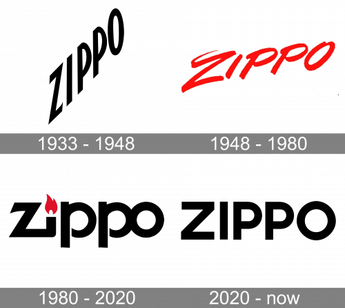
1933 – 1948

The first Zippo lighter was manufactured in early 1933, while Zippo Manufacturing Company was founded a bit earlier, in 1932.
The original Zippo logo had a totally austere style. To begin with, there was nothing but the name of the brand. The letters were truly minimalist: classic proportions, no serifs or decorative details. Simple as it was, this wordmark did its job perfectly – due to the plain shape it was highly legible and easy to reproduce on various surfaces.
1948 – 1980
The design forces behind the brand decided to add a creative touch. This time, the letters looked as if they had been written by hand in a casual, relaxed style. The most casual letter was probably the initial “z” with its unnecessary stroke at the top.
1980 – 2020

This is when the current logo with its iconic flame was born. The second letter, the “i,” represents a zippo lighter. In addition to having the shape of the lighter, it is topped with a flame, which reinforces the similarity.
While the letters feature a customized style, they are better legible than those on the previous Zippo logo. They also seem calmer and heavier.
2020 – Today
The redesign of 2020 has simplified and strengthened the Zippo visual identity, writing the logotype in the uppercase of a geometric sans-serif typeface, with massive stable letters set in black, contours of the lines clean and distinct, and the cues of the ends — straight and sharp. The inscription now has no graphical elements or color accents.
Font and color
The iconic Zippo logo is executed in a custom typeface, which was created for the brand in 1980. The double “P” with thin stencils, “Z” with diagonal cuts of the lines and sharpened angles, and a perfectly round “O”, glued to the “P”, all these small details complement the recognizable flame “I”, making the brand’s badge outstanding and remarkable. The Zippo lettering is written in a font, which is close to Yaro St Bold and Full Sans LC Bold, but with the contours modified.
The combination of red and black in the Zippo visual identity is a reflection of the strength, confidence, and passion of the brand, along with its professionalism and willingness to grow, invent, and change.


