Petronas is a state-owned petroleum company, established in Malaysia in 1974, which is in the global Fortune 500 ranking as one of the biggest gas and oil companies across the globe.
Meaning and history
Petronas is among the largest Fortune Global 500 corporations in the world. Since its founding (1974), the organization has become an integrated multinational corporation with business interests in 35 countries.
The Petronas Group is engaged in a wide range of oil and gas activities, including oil and gas exploration and production through to downstream; petroleum product marketing and distribution; trading; gas processing and liquefaction; gas pipeline network operations; liquefied natural gas marketing; petrochemical manufacturing and marketing; shipping; automotive; and real estate investment.
The history of Petronas lubricants international began in 1912 when the internal division of Sezione Lubrificante company was created within FIAT to meet the growing needs of car manufacturers in lubricants.The leading position of FIAT as the largest company in Italy required the newly created division to develop new materials and introduce innovative additives.
In 1976, Sezione Lubrificante becomes an independent company called FL (Fiat Lubrificante). In the same year, FL for the first time in the world develops special oils for diesel engines.In 2008 the Malaysian state oil company Petronas acquires FL Selenia, all Petronas departments dealing with oils are united in a newly created company, Petronas Lubricants International or PLI.
Today Petronas is one of the world leaders in the production of lubricants and operating fluids for all kinds of machinery from motorcycles to heavy marine engines.
What is Petronas?
Petronas is a Malaysian oil and gas company founded in the middle of the 1970s. The corporation, wholly owned by the Malaysian government, owns all of the country’s oil and gas resources and is charged with developing and adding value to these resources.
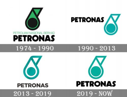
1974
According to the company, the shape of the Petronas logo represents “metaphoric and alpha glyphic nuances of an oil drop.” In addition to the oil drop, the emblem also symbolizes the letter “P” (the initial of the company’s name). The glyph is formed by the left side of the drop in combination with the triangle at the top.
The triangle also introduces “directional movement and dynamic.” The circle symbolizes “the wheel of the oil and gas industry” or “complete cycle or value chain of the oil and gas industry,” while the black trim of the emblem represents “a driving system, the energy which is to be derived from oil.”
The original color, emerald green, was inspired by the sea and land that hides oil and gas.
1990
The emerald green of the emblem was replaced by teal. Frankly speaking, both the colors are equally capable of representing “the sea and land.” Apparently, designers revisited the emblem just to make it simpler. This explanation can be supported by the way the updated lettering looks – it is also simpler than in the previous version because the writing “Petroleum National Berhad” has disappeared.
2013
The updated logo represents “the growth and progression of the Petronas brand,” according to the company. In fact, the design does not differ too much from its predecessor. You can notice the 3D effect and the slightly softened curves.
The wordmark has changed its position. From the top right corner, it has moved below the emblem to “enhance visibility and give prominence to the oil drop.” The type was simplified for the same purposes.
2019
The Petronas logo has become flat once again. The softened shape of the drop and the size of the circle have preserved the same.
Font and color
The strong and laconic Petronas emblem has its lettering executed in a simple yet modern and stylish sans-serif typeface, which has quite a lot of analogs — Organetto Ultra Bold, Heavitas Neue Black, and Nexa Rust Sans Black. The traditional contours of the wordmark’s letters and the clean thick lines with classy geometric cuts make the name of the brand look solid and serious, and the dark gray color adds a sense of timeless elegance to the logotype.
The calm sea-blue shade of the light and modern Petronas emblem stands for tranquility and safety, showing the company as a responsible and trustworthy brand, which values quality and aims to provide its customers with only the best. The dark gray color of the lettering only elevated this look and point to the professionalism and authority of the brand.


