Saudi Aramco is a Saudi Arabian petroleum and natural gas company. Its roots can be traced as far back as the 1920s, when US companies, including Standard Oil of California, were actively looking for new sources of oil in other countries. In 1932, Standard Oil of California struck oil in Bahrain. The following year, California-Arabian Standard Oil was established as a subsidiary of Standard Oil of California. In 1944, the name of the subsidiary was changed to Arabian American Oil Co. (or Aramco).
Meaning and history
Over the last decades, the Saudi Aramco logo has been based around a bold and futuristic emblem in blue and green. It was only slightly tweaked even when the typographical part went through a complete overhaul.
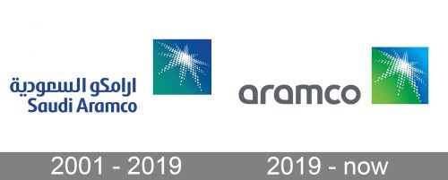
2001 – 2019
The older version of the logo already features the recognizable star emblem. The star is built up of multiple white circles of various sizes. In the center, it is solid white. The star has ten rays of varying lengths. All of them are rather long.
The white symbol is placed inside a square box breaking it into two triangular parts. The top part is blue and symbolizes the sky. The lower part is green and symbolizes the earth. The star, in its turn, apparently stands for oil deposits or oil rigs. Its white color and rays evoke the energy and light spread over the globe with the local oil. The white dots show that the company owns multiple oil rigs.
The name of the company can be seen to the left of the emblem. The top part is in Arabic, whereas the English version comes below. Both of them are of a rich and saturated shade of blue. The size of the glyphs in both the lines is the same.
2019 – present
While the emblem seems to have been redrawn, the modifications are very subtle. The most notable of them is the shift in the color palette. The blue of the “sky” has grown lighter and brighter. It looks a little more like the real sky now. Also, it adopted a gradient, which added some depth.
The color of the “earth” has also grown lighter and brighter. The overall result is that the Saudi Aramco logo has grown more vivid and shiny.
The wordmark is placed to the left of the emblem, like in the previous version. This time, though, the color of the letters is a calm gray shade. Apparently, the designers who worked on the logo wanted to put the emphasis on the emblem. Had they left the wordmark bright, it could steal the limelight.
Another update that took place in the typographical part of the design was that all the letters were lowercase. By contrast, in the previous version, the initials were capitals.
What is Saudi Aramco
The Saudi Arabian Oil Company is a Dhahran-based public company working in the petroleum and natural gas industry. It’s among the biggest companies in the world by revenue, which also operates the biggest single hydrocarbon network in the world.
In the full bilingual version, the two names are placed one above the other. The English name reads “Saudi Aramco.” There is also a truncated version with only the lettering “Aramco” in English. Here, the word “Saudi” is dropped.
Colors and font
The blue and green colors are used as the most obvious colors to symbolize the sky and the earth. White, in its turn, is used to convey shining light and energy. This is also a more or less apparent connotation.
The typeface in the Saudi Aramco logo is highly legible, yet with a unique touch. It is also meaningful. For instance, you may notice that many glyphs are based on the drop shape (the “a’s” and the “d”), which create a link with the oil the company sells.
Saudi Aramco icon
The famous blue and green Saudi Aramco emblem are also used as the icon for the company’s needs. Its colors stand for the sky and the earth, and in the newest version, they are more intense and gradient, which only adds a resemblance to the meanings.


