Zenith electronics is the name of the company, which was established in the United States in 1918 and acquired by LG in 1999. The brand is widely known all over the globe and is considered to be one of the world’s pioneers in the production of remote controls and HDTV (they were first in North America).
Meaning and history
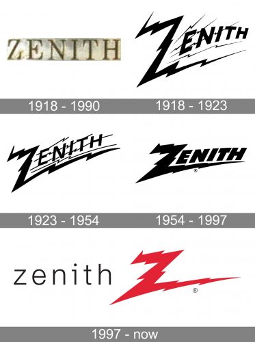
The visual identity of the famous electronic brand has been pretty constant throughout the years, although there were several logo redesigns, held by Zenith, the main theme has stayed untouched — the Zorro-like lighting bolt “Z” with elongated lines and sharp distinct peaks. The color palette, used by the company, is also very stable, as based on the monochrome combination. And only in 1997 the scarlet-red shade was added to the composition.
What is Zenith Electronics?
Zenith Electronics is an American company, which was established in 1918 and has always specialized in the production of electronic items. In 1999 the company was acquired by the world’s famous LG corporation, and today Zenith Electronics is a global brand, which is mostly known for its HDTV products.
1918 — 1990
The very first visual identity try the concept of the brand was built around simple elegance — its capitalized serif-style logotype was placed on a light rectangular badge, having its confident yet elegant lines perfectly balanced in terms of spacing. There was also a metallic version of the logo when the wordmark was engraved on a thin silver banner.
1918 — 1923
Another version of the Zenith visual identity, created in 2018, featured stylized black lettering, drawn against a white background in a lighting bolt styled lines, and decorated by numerous thin bolts, placed diagonally, coming out from the left, at the thick bar of the capital “Z”. The badge looked very sharp and cool and became a basis for several future redesigns.
1923 – 1954
The redesign of 1923 completely changed the style of the Zenith logo, stylizing its wordmark as a “Zorro mark”, with the lines of the “Z” elongated and drawn as lighting bolts. There were also four thin lines crossing the inscription, which balanced the “Z” and added more sharpness to the image.
1954 – 1997
The additional lines were removed and the letters of the wordmark — emboldened in 1954. The diagonal orientation of the logo was changed to a horizontal one, and the letters got placed closer to each other, creating a sense of solidness and fundamental approach.
1997 — Today
The flash “Z” was kept as the emblem of the brand, after another redesign, held in 1997. The new logo is composed of a lightweight gray, almost black, “Zenith” lettering in the lowercase sans-serif typeface and is placed on the left from a bold red “Z” lighting bolt with its tail elongated to the right. There is quite a lot of space between the two elements of the company’s logo, which allows using them separately without losing recognizability and that power feeling they evoke together.
Font and Color
The lightweight lowercase lettering from the primary Zenith badge is set in a classic sans-serif typeface with thin clean lines of the characters and distinctive cuts of the bars. The closest fonts to the one, used in this insignia, are, probably, Friends Normal, Dopis Light, or Neue Helvetica Pro 45 Light.
As for the color palette of the Zenith visual identity, it is based on a powerful and elegant combination of red and black, with a plain white background. This scheme stands for strength, determination, and style, showing the brand as a powerful and reputable one.


