Zendesk is an American company, known for its client-support apps and software. The company was established in 2007 and today operates in more than 100 countries across the globe and has more than 100 thousand audiences worldwide.
Meaning and history
Zendesk, a significant player in the customer service software industry, was founded in 2007 by Mikkel Svane, Morten Primdahl, and Alexander Aghassipour. Born out of a vision to simplify customer support, Zendesk started as a small Copenhagen-based company but rapidly evolved into a global entity. Its journey is marked by innovative strides in enhancing customer service experiences through technology.
Central to Zendesk’s achievements is its pioneering role in cloud-based customer support. The company revolutionized how businesses interact with their customers by offering scalable, easily accessible, and integrative software solutions. This approach democratized access to high-quality customer service tools for companies of all sizes, from startups to large enterprises. Zendesk’s expansion included significant acquisitions and continuous product innovations, positioning it as a leader in the customer service tech landscape.
Today, Zendesk stands as a beacon of successful SaaS (Software as a Service) business models. Its current position is characterized by a wide-ranging clientele, global reach, and a reputation for reliable, user-friendly, and innovative customer service solutions. As of my last update in April 2023, Zendesk continues to evolve, adapting to the ever-changing demands of digital customer interactions and maintaining its commitment to simplifying and enhancing the customer service experience.
What is Zendesk?
Zendesk is a renowned software development company specializing in customer service solutions. Founded in 2007, it offers innovative, cloud-based tools to help businesses enhance their customer support. Known for its user-friendly and integrative software, Zendesk caters to a diverse clientele worldwide, shaping modern customer service practices.
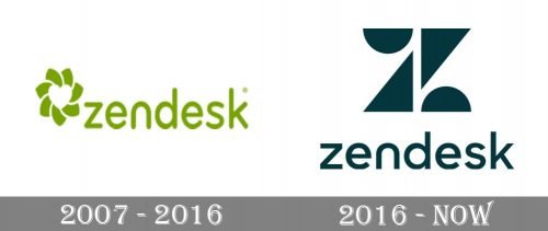
2007 – 2016
The original Zendesk logo had nothing in common with the version, created in 2016. It was a light green lowercase inscription placed on the right from an abstract circular emblem executed in the same color palette. The sans-serif lettering had slightly narrowed contours and smooth rounded lines, which balanced the flower-like graphical elements, composed of seven petals and a white heart placed in the center of the composition.
2016 – Today
The Zendesk logo is confident and stylish. It is composed of a wordmark and a brand’s symbol above it.
The Zendesk wordmark in all the lowercase lettering is executed in a simple rounded sans-serif typeface with bold strong lines. The letter “n” of the nameplate is drawn simply as an arch, which adds softness to the distinct and straight lines of the Zendesk emblem.
The Zendesk symbol is a stylized letter “Z”, which consists of four geometrical shapes — two triangles, placed vertically and pointing to the center and two semicircles, placed near the triangles’ basements.
It is a strong and confident emblem, which evokes a sense of stability and professionalism, and the dark green color of the Zendesk logo only adds a stable and strong feeling to it.
The dark green color palette is a reflection of a powerful and energetic brand with its unique philosophy and strong principles. The company, which aims to provide the best service and puts its customers in the center of its value system.


