Debian is the name of the software, which was developed by Linux in 1993, which makes it one of the first Linux-based operating systems created. The software is available in more than 70 languages and is updated on a regular basis.
Meaning and history

Debian was started in August 1993 by Ian Murdoch and his girlfriend (later wife, now ex) Debra Lynn. The operating system was named after the creator (Ian) and his wife Debra (Deb). The project was initially run by a small tight-knit group of free software hackers that gradually grew into a large, organized community of developers and users. Debian developers decided to take an unusual path and began to call releases (versions) by code names. The names are taken from the Toy Story cartoon. For instance, Debian 1.1, which was released on June 17, 1996, was called Buzz. Since then, over ten releases have been made. The founder of this project died in December 2015.
1993 – 1998

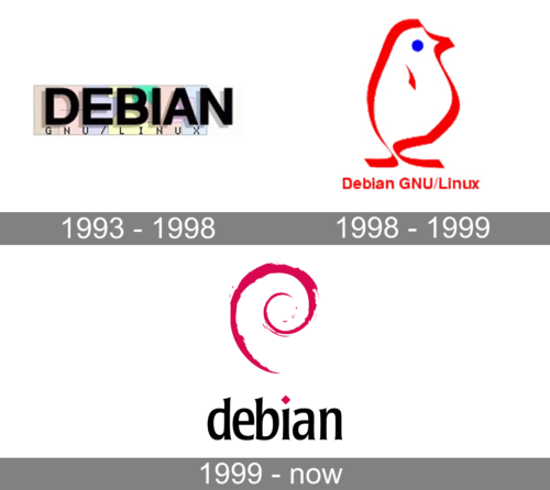
For the first five years of its existence, Debian had a colorful design with a bold name inscription. The name had clean and bold lines, straight cuts, and a very light shadow behind it. Underneath, it said “GNU/Linux” in fine print with widely spaced lettering. Behind almost the whole inscription, there was a colorful rectangle the colors, though, were light and muted and did not attract much attention.
1998 – 1999

A new symbol of the software was quite unexpected as it was a bird icon. The outline of the bird and its wing seemed to be drawn using a red marker. The eye was just a small blue circle. The red inscription “Debian GNU/Linux” was placed underneath. It featured a traditional sans-serif typeface with only first letters being capitalized. The red color gave the logo a powerful, energetic look and reflected the passion of the software developers.
1999 – Today

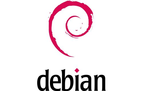
The Debian logo was created by Raul Silva in 1999 and is composed of a light modern emblem placed above an elegant logotype. The bright and intense fuchsia-pink and black color palette of the Debian visual identity make the logo stand out on the list of the software’s competitors and adds a sense of style and progressive approach.
The Debian emblem features a stylized pink swirl, which has its tail pointing down, and finishing above the letter “I” in the lowercase logotype of the software. The swirl is executed in one bold line with uneven and slightly torn contours, which makes it look hand-drawn and very expressive. This feeling is elevated by small and thin lines and dots in the same shade of pink, placed around the swirl, like drops of paint.
As for the logotype, it is written under the light and cool emblem in the lowercase of a bold but a bit narrowed typeface with the letters executed in thick lines with playful slightly flared ends and sharpened angles. The main eye-catching detail here is the dot above the letter “I”, which is replaced by an elegant rhombus in the same fuchsia-pink color, which is used for the graphical part of the Debian logo.


