ZDF is a public-service television broadcaster headquartered in Mainz, Rhineland-Palatinate, Germany. It was established by Bundesländer as an independent nonprofit organization. Some of its best-known programs included its newscast and entertainment show Wetten, dass..? broadcasted until 2014.
Meaning and history

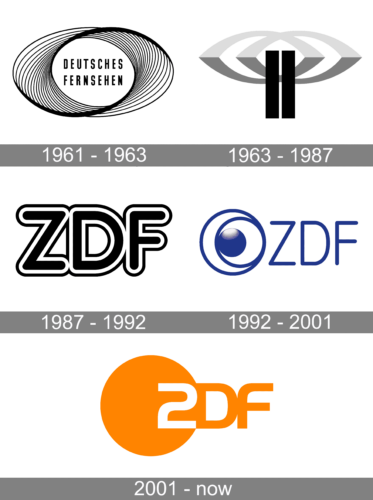
The ZDF logo has gone through several complete overhauls. We can hardly name this an evolution – rather a series of revolutions.
What is ZDF
Zweites Deutsches Fernsehen (branded 2DF) is a Germany-based television broadcasting company. It is financed by ads and TV license fees. It was launched in 1963.
1961
1963 – 1987 (Zweites Deutsches Fernsehen)
The original logo was rather abstract. Its centerpiece was an emblem in gray and black over the white background.
The emblem was formed by two overlapping shapes that can be described as eyes. In the middle, there was a pair of parallel vertical lines. The overall design resembled a telecommunication tower sending signals.
And yet, you would hardly have this assumption unless you were familiar with the company’s specialization. So, we can’t say that the old logo was very successful.
1987 – 1992 (ZDF)
After the company was rebranded and adopted its current name, a new logo was introduced. It was more meaningful than the previous one, yet lacked a unique touch.
The logo was made up of the abbreviation “ZDF” in black and white. The letters belonged to a pretty regular sans with classic proportions. The ends were rounded. The only features that made it somehow stand out were the white and black border around the glyphs and the rounded ends.
1992 – 2001
Here, the ZDF logo adopted a unique touch without sacrificing its legibility and clarity.
The name of the company was still there, albeit in a different type. This time, the letters were by far lighter and narrower. They didn’t lose their readability. That’s because, while the previous version was bolder, the border was somewhat misleading and didn’t let you grasp the design at first glance.
What was the highlight of the logo was certainly the combination of circles. In the middle, there was a 3D blue ball with white highlights. It was placed inside a larger circle with a thin blue border and white filling. This circle, in its turn, was placed inside an even larger circle. Its border was also thin and blue, while its filling was white. The emblem resembled an eye of a fantastic creature.
2001 – present
The company got rid of both the old palette and the old shapes introducing a dramatically new visual brand identity. It was brighter than its predecessor. The only thing that was borrowed from the previous version was the ring theme. You could still see one in the logo.
This time, however, the circle was solid orange. In its right part, there was a white figure “2,” which replaced the letter “Z.” To the right, outside the circle, the letters “D” and “F” could be seen. The left side of the “D” touched the border of the circle. We can’t say it improved the legibility, but generally the logo remained readable.
The design is the result of collaboration between Razorfish of New York and Das Werk of Frankfurt.
Colors and font
The palette of the 2001 ZDF logo combines a rather muted shade of orange with white. It is quite warm but not too noisy. The typeface is Handel Gothic EF Bold.


