Wrigley is the name of an American chewing gum manufacturing company, which was established in 1891 by William Wrigley. Today the company is one of the world’s leaders in its segment and is owned and managed by Mars.
Meaning and history
The founder of the company – William Wrigley – was not even 30 when the desire to open his own business prompted him to move from Philadelphia to Chicago. His father was a soap manufacturer and William, as a child, began to learn the art of sales, selling Wrigley Scoring’s cleansing soap. Wrigley started his own business by selling his father’s soap. To increase the sale of goods, he offered buyers a variety of bonuses, including baking flour. Soon, he realized that the flour was more in demand and changed the direction of his business. In 1982, he came up with the idea to give every customer a couple of packets of chewing gum. This offer became a great success, and, like the first time, the bonus turned out to be a more interesting product than the main product. In the same year, William began to actively sell chewing gum and established his own production.
1891 – 1913
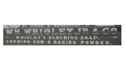
The original logo of the company was quite simple and stated the name of the company. “WM Wrigley JR & Co.” was printed using a classic, bold, serif typeface. The lettering was done in a light color, which stood out well against a darker background. The name was accompanied by several lines specifying what one could buy at the company.
1913 – 1975

The new logo looked professional and stylish. The bold red color, thick strokes, close spacing, and elegant curves gave the logo a very powerful appearance. It now said only “Wringley’s” and this minimalistic look enhanced the positive and memorable impression.
1975 – 2002
The modified version featured a darker shade of red. The letters had more spacing between them and featured a more strict typeface. Such changes reflected a stronger, more confident position of the company on the market.
2002 – 2008
The changes once again consisted of the introduction of a different shade of red and an updated font. The lettering was bold and in combination with a geometric font and wide spacing created a dashing, powerful look. The designers added an eye-catching detail with meaning – the apostrophe was styled as an arrow pointing up. It was a perfect symbol for a growing company that had ambitious goals and a desire to only move forward and get better.
2008 – now
Wrigley’s visual identity is simple and friendly. Composed of a wordmark with a tagline it looks bright due to its color and welcoming due to its typeface.
The Wrigley wordmark in all capital letters is executed in a bold rounded sans-serif font, which is perfectly balanced and looks nice and confident. The only interesting detail of the inscription and the whole logo — is an arrow-styled tail of the letter “G”.
The arrow, pointing upright, is a symbol of energy and progress, it shows the brand as the one that is constantly moving and values innovation and experiments.
The delicate tagline “A Subsidiary of Mars Incorporated” is written in a thin and light sans-serif typeface. The lettering is very small and is almost not readable, creating an abstract underline of the wordmark.
The light blue color of the Wrigley logo is a reflection of a professional and creative brand, which aims to give its clients only the best. Placed on a white background, the logo evokes a sense of comfort and happiness.


