Works of Warcraft is one of the most popular video games in the world, which was released in 2004. The MMORPG has millions of players across the globe and keeps releasing new versions, based on the original one.
Meaning and history
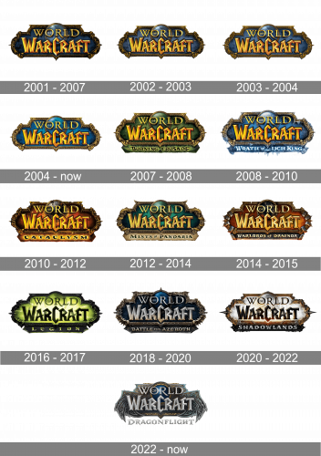
The visual identity of the famous online game hasn’t changed at all since the day of the game’s release, in 2004. Though there were several options of its color palette, introduced during the years, the composition, style, and design of the iconic emblem remained completely untouched.
2001 – 2007
The very first Wild of Warcraft badge was created in 2001, and set in a gold and dark blue color palette, with the gradient background of an ornate badge, enclosed into a thick gold frame and crossed by a two-leveled gothic lettering in the same shade of gold.
2002 – 2003
The redesign of 2002 has lightened up the color palette of the World of Warcraft badge, which made all the elements, drawn on the background, more visible, and the ornaments on the golden frame more distinctive. This version of the logo was only used for a few months.
2003 – 2004
In 2003 the World of Warcraft logo gets another refinement, with the contours of the previous version a bit cleaned up, but in general, all the elements remained the same, and the color palette was untouched. This badge stayed with the game for another year.
2004 – Today
The original badge of World of Warcraft was created in 2004 and is still used by the game today. It is a bright blue badge in an ornate gold frame with sharp elements, and two-leveled lettering in the same gold color, placed over the badge. The upper part of the wordmark, “World”, is set over a globe image in gradient blue and green, enclosed in a dark gold frame. As for the “Warcraft” part, it is written in a bold fancy typeface with sharp angles and gradient shades, which add volume and energy to the whole logo.
2007 – 2008
In 2007 the “Burning Crusade” version was released by the company, so the logo was redesigned. The basic composition remained untouched, but the blue color palette was switched to gradient green, with moss and forest shades, and the additional green banner was added to the bottom part of the banner, having black and yellow lettering on it.
2008 – 2010
The original color palette came back with the release of “Wrath of the Lich King”, and the ice-cold blue line with the additional lettering was added to the bottom part of the badge, pointing to the new chapter of the iconic game.
2010 – 2012
The gradient red and yellow color palette were used for the World of Warcraft logo in 2010, after the release of the “Cataclysm” expansion pack. The black additional lettering, placed on the bottom part of the emblem, looked frightening and evokes a sense of danger.
2012 – 2014
The emerald green color becomes the main one in 2012, with the release of the “Mists of Pandaria” game. The combination of green and gold made the logo look very elegant and chic, evoking a sense of creativity and mystery. The bottom banner was executed in gradient beige, resembling an ancient parchment.
2014 – 2015
For “Warlords of Draenor” expansion the brand used a combination of red, brown, and yellow, setting the lettering in a lighter shade of gold, and making the emblem look like a flame, redrawing its framing in a gray and copper palette.
2016 – 2017
The neon green and black color palette replaced the original one in 2016, after the release of the “Legion” chapter. The emblem featured gradient shades, which added a magical shining to the image, making it bright and memorable.
2018 – 2020
After the release of “Battle for Azeroth”, the color palette of the logo was switched to silver and blue, where blue was introduced in various gradient shades, from the darkest one to sapphire tones for the globe icon. The new dark framing featured its elements smooth and elongated, resembling the fur of wild animals, and the sharp details stood for their teeth and claws.
2020 – 2022
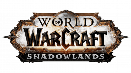
The logo for the “Shadowlands” expansion is bright and strong. Based on the composition of white, copper, and gray, it looks brutal, powerful and stylish, and has its additional lettering written in silver-gray, on a black horizontal banner under the main badge.
2022 – Today
For the Dragonflight edition of the World of Warcraft game, the new logo was created in 2022. The color palette of the badge turned colder and more mysterious with the lettering switching to cold silver. The frame was completely redrawn, getting two dragon wings on the sides.
Font and color
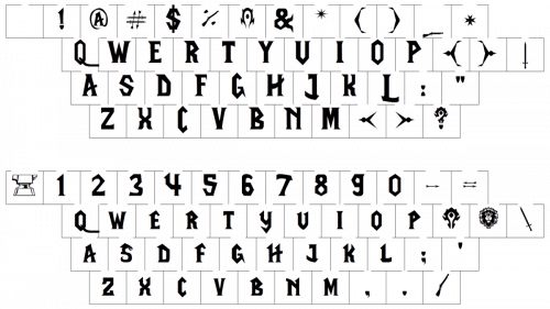
The wordmark from the World of Warcraft visual identity is executed in two different typefaces, which both look elegant, mystic, and artsy. The upper, “World”, lettering is executed in a classy and sophisticated serif typeface, which is very similar to Stempel Garamond Pro Roman, but with the bar of the letter “R” elongated.
As for the main, “Warcraft”, inscription, it uses a custom voluminous gothic typeface with wide lines, pointed peaks, and clean contours.
The main color palette of the brand’s emblem, blue and gold, looks bright and welcoming, making the gamer intrigued, interested, and excited. This combination of intense and dark colors represents the essence of the game and created a bright strong contrast, which makes the emblem stand out in the list of competitors.


