Gameloft is a European company, which specializes in video-games creation and publishing. The company was established in 1999 in France and today it is a part of Vivendi Group and has its studios all over the globe.
Meaning and history
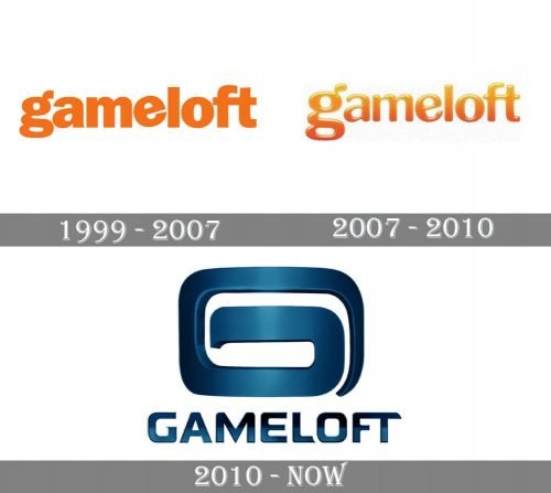
Since the day of the company’s creation, there was only one major redesign, help by the brand, but then everything was changed.
1999 – 2007
The original version of the Gameloft logo was composed of a modest logotype, drawn in bright orange color. All the lowercase lettering of the wordmark were executed in a classic sans-serif typeface with smooth thick lines and a curved tail of the “G”.
The lowercase and a sunny color made the logo friendly and welcoming, evoking a sense of creativity and progressive approach.
2007 – 2010
The redesign of 2007 refined the contours of the Gameloft lettering, writing it in thinner lines. The letters gained volume, which made the logo three-dimensional. In addition to the glossy surface, the color palette gained gradient shades, which became darker to the bottom. Now the color scheme comprised several shades from light yellow to dark orange.
2010 – Today
The redesign of 2010 has changed the whole company’s concept. Now the logo is composed of a wordmark with an emblem above it. The monochrome color palette looks strong and professional, showing the company as a powerful and stable one.
The Gameloft inscription now uses only capital letters, which are executed in a modern and sleek sans-serif typeface, where “F” and “T” are connected with their upper horizontal bar, and “L” and “T” have their lines cut diagonally, which adds a unique character to the logo.
The Gameloft emblem is a stylized capital letter “G”, resembling a swirl, which can take you into the future. It is a minimalist yet very strong symbol, which represents the company as progressive and innovative.


