

![]() Guild Wars Logo PNG
Guild Wars Logo PNG
The company that created Guild Wars, a popular online role-playing game series, is ArenaNet, LLC, which is headquartered in Bellevue, Washington, U.S. It is a subsidiary of NCSOFT, which published the game. NCSOFT, in its turn, is an international video game developer and publisher based in South Korea.
Meaning and history
![]()
The Guild Wars logo has always had a dynamic touch and also something that suggests we enter the world where magic exists.
2005 – present (Guild Wars)
![]()
The video game was introduced in 2005. Originally, it included four parts (Guild Wars Prophecies, Factions, Nightfall, and Eye of the North) sharing the same fantasy world. In addition to the initial miniseries, several other releases were introduced in subsequent years.
Technically speaking, the original logo was nothing but the wordmark. It didn’t contain a pictorial emblem and, therefore, should be considered a typographical logo. And yet, we can’t deny its unique style. The glyphs are custom artwork and, in a way, aren’t just glyphs but rather decorative elements in themselves.
The letters are glowing with shades of yellow, red, and brown. There are also white highlights adding even more depth and heat. We can see thin dark borders that put a finishing touch. Another interesting detail is the pinkish haze around the letters. It gives an impression of high temperature but, even more than that, it conjures the feeling of magic.
The shape of the glyphs reminds metal armor used by medieval knights. While it’s not that easy to put your finger on it, you can notice this theme in small details. Anyway, the letters seem to have come straight from a smithy.
The two words constituting the name of the game are positioned within a single line. They are more or less aligned, although you may notice that the lower part of the “W,” for instance, is positioned a bit lower than the lower part of the “S.” The top of the “U,” in its turn, is lower than the top of the “D,” while the top of the “A” is higher than the “S.” All this creates a certain rhythm and directs the gaze of the viewer in a specific way.
2012 – present (Guild Wars 2)
![]()
This version is different in all the details, yet it shares the overall style of its predecessor.
While the shape of the letters is a bit more regular than in the original Guild Wars logo, there’s still a medieval touch, especially in the “W.” The glyphs have lost some weight and are of a darker, more neutral color. That’s because they shouldn’t overshadow the dragon behind. Technically speaking, the dragon represents the figure “2” from the name of the game. But it is so much more than that.
What is Guild Wars
Guild Wars has been known since 2005 as an online role-playing game series. It has gained quite a few editor’s choice awards and has been won awards for the best value, as a best MMORPG, and others. It pioneered a business model, where monthly subscription fees didn’t play the main part.
The fierce and dynamic creature is the embodiment of the essence of the game. The dragon is a promise to lead you into the magic world of Guild Wars with thousands of adventures awaiting you.
Colors and font
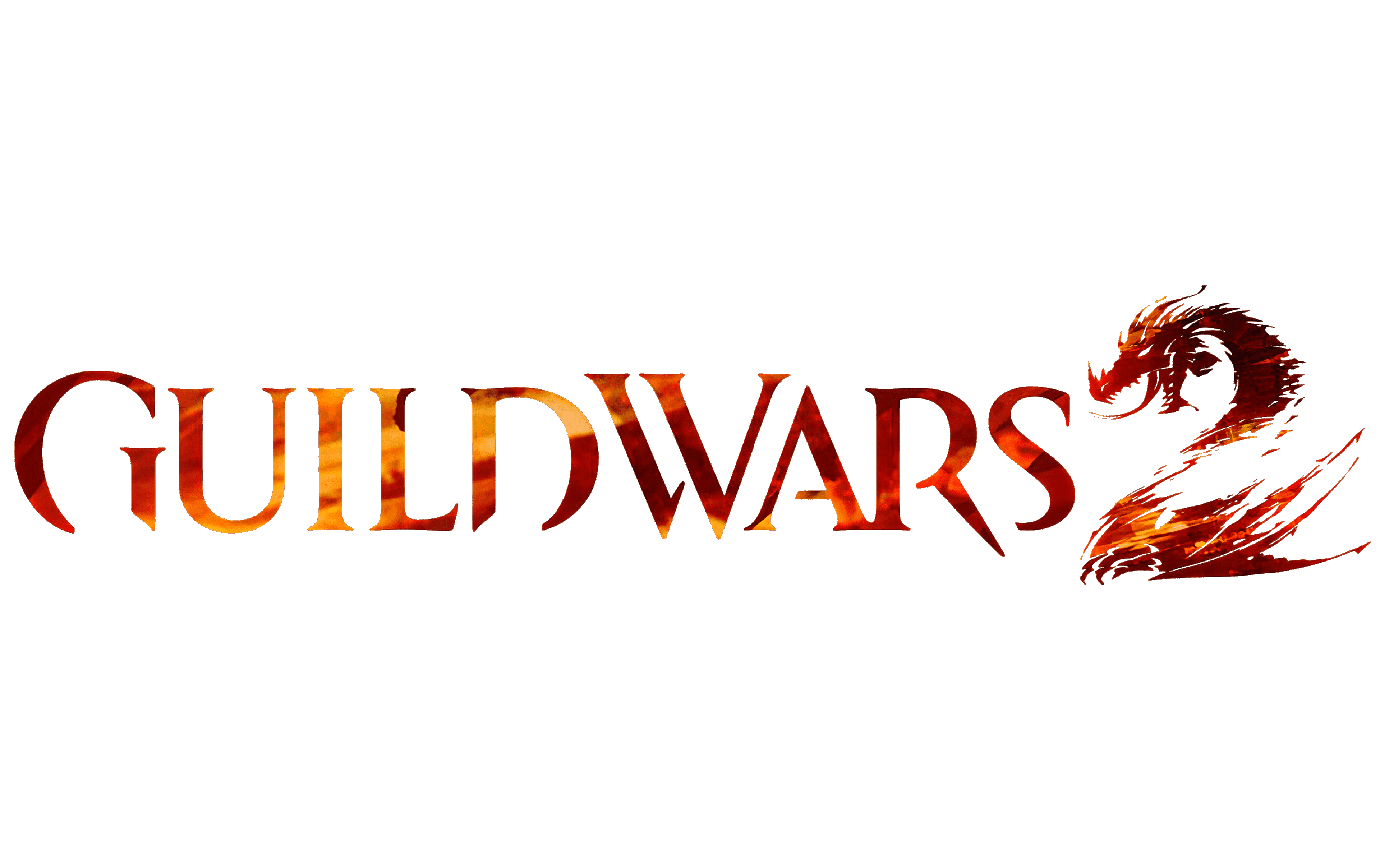
The logos for both the first releases were built on a warm fiery palette. Yet, the second logo is darker. In the default version, the dragon is red, while the letters are almost black. However, there can be other options depending on the background. When placed over a darker background, the logo can become all white.
The customized type gives the Guild Wars logo a unique touch and helps it stand out among competitors.


