World Fuel Services is among the largest suppliers of energy for aviation, marine, and ground transportation in the US. The company is headquartered in Doral, Florida. It was established in 1984 as Trans-Tec, a marine fuel brokerage company.
What is the symbol of World Fuel Services Corporation?
The symbol of World Fuel Services Corporation is a blue and white circle, which stands for an oil drop, although due to its color palette it looks clean, pure, and fresh. This is how the company decided to emphasize the quality of its products and the professional approach to the manufacturing process.
Meaning and history
Over the last few decades, the World Fuel Services logo has remained almost unchanged. While the design has been slightly refined, it affected neither its overall structure nor its meaning. We can assume that the majority of those who see this logo on a weekly basis didn’t notice the update.
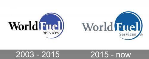
2003 – 2015
The original logo is a bit more straightforward than the current one.
The visual center of the design is a large circle. It consists of two fields. The top field is blue and houses the lettering “Fuel” in white. Below, there is a smaller white field, where the word “Services” in black is placed. The letters here are smaller and lighter. However, the typeface looks pretty similar. It is a slightly old-fashioned serif type with a pronounced variation in the thickness of the lines and curves.
There is a white highlight inside the blue part of the circle, which adds some depth. We would assume that the circle symbolizes a drop of liquid fuel. Blue is the color of natural gas, an important energy source. Also, it might be a way to remind us of the fact that the company is one of the world’s leaders in marine refueling.
Blue is associated with the water and is, therefore, regarded as a universal symbol of purity. It is doubtful whether World Fuel is fully justified to use the “purity” symbolism, though.
To the left of the circle, there is the lettering “World.” It features the same serif font but is black, which makes it stand out against the white background.
The overall look of the logo is pretty memorable, due to the addition of the blue circle with its white elements.
2015 – present
At some point in its history, the company decided to make its logo lighter and less noisy. Subtle as it was, the update affected all the elements.
The shade of the circle became slightly grayer. More notably, though, the black letters became light gray. On the one hand, the contrast between the letters and the white background is less obvious now, which may somewhat damage the legibility. On the other hand, the combination of the colors seems perfectly natural and stylish, which is an indisputable advantage of the newer logo.
What is World Fuel Services
World Fuel Services Corp. is a specialized energy provider operating in the distribution of fuel and related products and services. It works in Aviation, Land, and Marine segments. It was ranked No. 147 on the Fortune 500 list in 2021.
Not only the palette but even the typeface was updated, although the modifications are rather subtle here. In many letters, the diagonal top serifs were replaced by horizontal ones. It is more obvious at the top parts of the glyphs, for instance, the “l,” the “d,” and the “u.” Yet, the lower end of the “d” showcases the same transformation.
Other modifications of the font include the straightened middle bars of the “e” and the simplified serif at the top right end of the initial “F,” to name just a few. Also, the letters lost some of their weight.
The overall effect of these alterations is the addition of some breathing space due to both the updated palette and the typeface.
Colors and font
The color scheme includes two colors, in addition to the white background. The majority of the surface is occupied by a rather dark shade of blue, while gray serves as an accent color.
The typography used in the World Fuel Services logo may appear old-fashioned. This choice helps the company to emphasize its heritage and thus imply reliability.


