The brand Jet is used by Phillips 66, an American multinational energy company, as its filling station brand in several countries in Europe, from Austria and Germany to the UK. However, stations in many countries were sold to Lukoil and Statoil.
Meaning and history
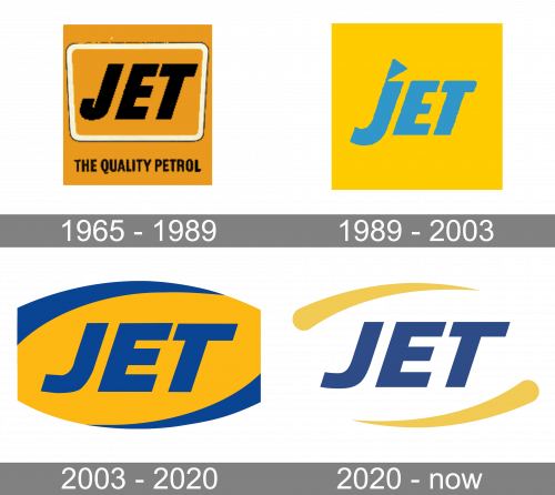
Although the Jet logo has undergone at least three notable modifications, it has been consistent in its structure and palette – there has never been a revolution in the visual brand identity. This is quite important, as this approach has provided the recognizability of the brand throughout its history.
What is Jet?
Jet is an oil and petroleum company, which was established in the United Kingdom in 1954, and was bought by the American Phillips 66 in 2002. The company operates dozens of gas stations across Europe. Today Jet mainly operates in the UK, Germany, and Austria.
1965 — 1989
The oldest logo in the list already featured the word “JET” in a bold all-caps italicized sans. The orange-brownish palette is there, too.
However, originally, the color of the wordmark was black. The text was housed inside a rectangle with rounded corners and thin white and black trim. Below, you could see the tagline “The Quality Petrol” in smaller letters.
1989 — 2003
The design grew cleaner and brighter.
The explanatory tagline was already not necessary as the brand grew recognizable enough. The box was gone, too.
The muted brownish shade was replaced by a brighter gold hue. Eventually, the black letters were replaced by blue ones, which added a vivid touch and made the logo more eye-catching and unique.
Also, the body of the “J” grew simpler (it lost part of its tail). The letter adopted a triangular top, which stood for the dot.
2003 — 2020
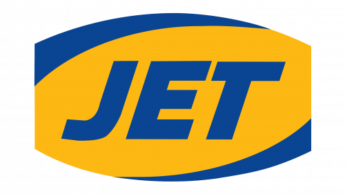
This version is cleaner and more dynamic in comparison with its predecessor.
The triangular top of the “J” is gone. The ends of all the letters have grown longer, which is especially obvious in the case of the “T.” This looks as if a freshly-painted wordmark was moved very fast, so the paint spread a little further than it should have been. The only problem here is that the direction of the motion is different in the case of the “J” and the “E” and “T.” However, the extended ends of the letters also serve another purpose – they make the logo better legible from various angles.
The blue swooshes above and below the wordmark also add some motion. The palette has been darkened, which makes it look nobler.
2003 — Today
The redesign of 2003 has simplified yet strengthened the Jet logo, switching its color palette to a lighter one, and refining the lines of the elements, making them more balanced and contemporary. The new logo boasts a white outline, with two smooth yellow arched lines on the top and bottom borders of the banner, and a calm dark blue logotype, which repeats the one frame of the previous logo, but has its color elevated and evoking a sense of serious fundamental approach and professionalism.
Font
The type is a minimalist sans with a dynamic touch. It is legible enough even when the viewer moves at a high speed, which is essential for a filling station brand.
Colors
The palette of the Jet logo makes it vivid and recognizable. And yet, the contrast between the dark shade of blue and the noble gold is enough to provide decent legibility.


