

![]() ConocoPhillips Logo PNG
ConocoPhillips Logo PNG
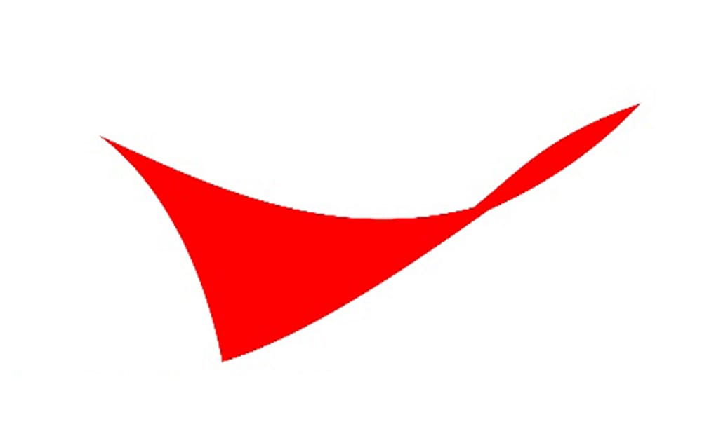
While the ConocoPhillips logo looks simple and unpretentious, the red shape above the wordmark adds a dynamic and creative touch, which makes it stand out among competitors.
Meaning and history
![]()
ConocoPhillips, a multinational energy corporation, was founded through the merger of Conoco Inc. and the Phillips Petroleum Company in 2002. The roots of the company, however, date back to the early 20th century. Conoco was originally established in 1875 by Isaac E. Blake under the name “Continental Oil and Transportation Co.,” primarily focusing on oil and kerosene. Phillips Petroleum, founded in 1917 by brothers L.E. and Frank Phillips in Bartlesville, Oklahoma, was known for its innovations in the oil industry.
Throughout its history, ConocoPhillips has achieved numerous milestones. It played a significant role in the development of the North Sea oil fields in the 1970s and was a pioneer in the liquefied natural gas (LNG) market. In the late 20th and early 21st centuries, the company expanded its operations through several strategic acquisitions and joint ventures, further solidifying its presence in the global energy sector.
Today, ConocoPhillips stands as one of the world’s largest independent exploration and production (E&P) companies, with operations in more than 30 countries. It continues to focus on sustainable energy solutions, technological innovation, and responsible environmental stewardship. The company’s current position in the market reflects its adaptability and commitment to meeting the world’s evolving energy needs.
What is ConocoPhillips?
ConocoPhillips is a leading global energy corporation, specializing in the exploration and production of oil and natural gas. As an independent E&P company, it plays a vital role in the global energy landscape, committed to innovation and sustainable practices.
1930
![]()
Conoco Inc. used to be a rather well-known US oil company. It was established in 1875 under the name of the Continental Oil and Transportation Co.
Later, the assets of Continental Oil were acquired by Marland Oil Co. The company was renamed Continental Oil Co. and adopted the red bar-and-triangle logo previously used by Marland. This emblem appeared in the company’s ads and was used as the primary logo between 1930 and 1970.
1970
![]()
Conoco introduced a red capsule logo. Here, you could see the word “Conoco” in a bold sans inside an ellipsoid. The type was unique because the “n” looked exactly like a rotated “c.”
2002
![]()
In August 2002, Conoco Inc. and Phillips Petroleum Co. merged into a single company with a single brand identity. The company was named ConocoPhillips Co.
The centerpiece of the ConocoPhillips logo is the name of the company given in an austere sans. The majority of the letters are lowercase, while the “C” and “P” are capitalized. This approach helps to break the word down into two meaningful parts. The red shape above also helps to separate “Conoco” from “Philips” as one of its angles “shows” where the second part of the word starts.


