Frederator Studios is the name of an animation studio, which was created in 1997 in the United States. Today Frederator Studios is one of the most well-known and reputable names in the industry. The company produces animations not only for its channel but also for such giants as Netflix and Nickelodeon, not to mention smaller broadcasters.
Meaning and history
Being an animation studio, Frederator has always paid a lot of attention to its visual identity, thus the number of redesigns, held to its logo throughout the years, is pretty impressive — eight refinements and recreations of the logo in two decades.
1988 – 1997
The famous animation studio was established in 1988 under the name Chauncey Street Productions, so the first logo was created in the same year. It was a pretty simple badge, with the orange and black city landscape picture hanging on a wall with a diagonal striped pattern in light gray. The lettering was set over the drawing, in black, with the “Chauncey Production” over the solid white circle, and “Street Inc” on orange background.
1998 – 2008
The company was rebranded in 1998, getting a new name, Frederator Studios, and a new logo. The new concept was based on the lettering and bright color palettes. The inscription was set in all capitals of a massive square sans-serif typeface and was placed horizontally in ¾, with the arched “Production” tagline in contrasting color. There were several options of the color scheme used by the studio for its logo, from green and red on blue, to gradient blue on red, or simply monochrome.
2001 – 2017
With the redesign of 2001, the contours of the logo were refined and the inscription started looking stronger and more voluminous. Now the sides of the letters and the edges, which made it three-dimensional, were set in colors, different from the main ones. This new concept stayed in use by the studio until 2017, along with a few more logos, created throughout the years.
2005 – 2009
The concept of 2005 was based on a silhouette of an alien, executed in solid orange, with an enlarged emboldened yellow letter “F” over its body. The stylized alien was placed above the black uppercase logotype in a simple and clean sans-serif typeface. The inscription looked light and strict, adding a professional touch to the bright contemporary emblem.
2009 – Today
The Frederator alien was redrawn for the logo of 2009. Now it was its head in bright red, with yellow sunglasses and a bold stylized logotype under it. The inscription was set in a modern sans-serif typeface with some of the angles rounded, and others — sharp. There was also a three-dimensional version created during the same years, which was used in the animations of the studio. It was a full-sized alien standing on the two-leveled logotype in two shades of acid green.
2010 – Today
In 2010 the red head above the black lettering was redrawn: the emblem now featured a pixel pattern with squares. The yellow sunglasses gained a thick black frame, which made it more visible and bright, balancing the massive logotype, which was still executed in the same sleek and stylish typeface as on the previous version.
2020
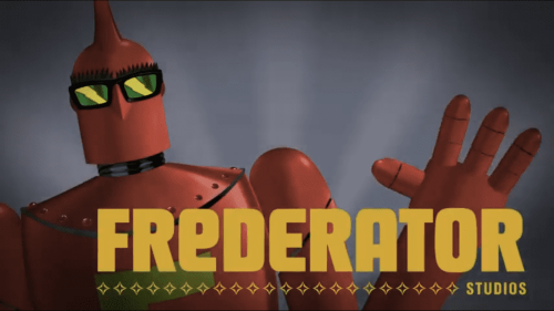
The cool three-dimensional logo from 2020 is composed of a red alien standing behind the bright yellow inscription in all capitals of the custom Frederator typeface, which by today has become instantly recognizable. The bright shade of the inscription is balanced by the lime-green bold letter “F” on the alien’s chest, and the creation’s glasses, in the same shade.
2021
The logo, used by the studio from 2021 featured the red alien waving hello and placed behind the enlarged logotype, executed in a calm and tender shade of orange. The inscription is underlined by several geometric elements placed in one horizontal line and finishing with the slightly visible uppercase “Studios” in a narrowed Sans-serif typeface.


