

![]() Wisconsin Badgers Logo PNG
Wisconsin Badgers Logo PNG
The athletic teams representing the University of Wisconsin–Madison are known as the Wisconsin Badgers.
Meaning and history
![]()
The sports division of the University of Wisconsin has a truly intense and outstanding visual identity history, which comprises eight logo versions, created since 1913. Though Wisconsin Badgers have been the members of the NCAA for more than a century, they showed themselves as a constant and confident athletic team, with a value of traditions and roots.
1913 – 1930
![]()
The very first logo for Wisconsin Badgers was introduced in 1913 and featured a fancy gothic-style “W” with smooth sides and pointed angles, enclosed in. Thick square frame with rounded angles. Both the letter and the frame were executed in red, reflecting the passion and strength of the teams.
1930 – 1936
![]()
The redesign of 1930 brought a completely different image to the university’s sports division visual identity. It was a detailed but slightly naive monochrome image of a badger, with no additional colors and lettering. The animal looked confident and powerful, showing the character of the Wisconsin Badgers and their willingness to fight and win.
1936 – 1948
![]()
The badger was redrawn in 1936. Now the animal was moving to the right and had its contours and lines strengthened and thickened. Another element was added to the logo — a white bold “W” in a thin red outline was hidden behind the monochrome badger.
1948 – 1957
![]()
In 1948 a cartoonish badger replaced the serious and realistic one. Now the funny animal was walking on his two legs wearing a sweater with the bold “W” on it. Another “W” in white and red was placed behind the animal. This was the most vivid and welcoming logo of the teams, created throughout the history of the Badgers.
1957 – 1962
![]()
The era of minimalist design for Wisconsin Badgers’ visual identity started in 1957 with the simplest and the most modest logo created. It was a clean and straight sans-serif letter “W” executed in Ted and placed on a white background, without any additional elements.
1962 – 1970
![]()
In 1962 the laconic “W” was placed in a circular frame, which featured the same red color and balances the straight lines and angles of the letter, softening them and adding more contrast to the emblem.
1970 – 1991
![]()
The style of the “W” was elevated in 1970, by drawing it in a square serif typeface with thick lines and straight cuts. The massive serifs added some power and confidence to the logo look, and the contrast between red and white became more distinct due to the solidness of the letter’s shape.
1991 – Today
![]()
A more modern version of the Wisconsin Badgers logo was adopted in 1991. An extra-bold red “W” with a delicate black shadow has its contours slightly waved on its right side, which created a small arch and adds uniqueness and individuality to the badge.
Wisconsin Badgers Helmets
![]()
Throughout its long history (the athletic program of the University of Wisconsin – Madison was formed in the 1880s) Wisconsin Badgers has changed the design of its helmets quite a significant number of times. Yet starting at the beginning of the 1970s, the concept was chosen, and until today the program follows the design principles chosen back then.
1967 – 1969
![]()
In 1967 the Wisconsin Badgers athletes were wearing solid red helmets with a small gray grille and a white image on the side. The image depicted the mascot of the athletic program, Bucky Badger, wearing a striped sweater with a large “W” on the chest.
1970 – 1971
![]()
The concept of the helmet design was completely changed in 1970. The red background turned white, and the image of the mascot was replaced by a laconic geometric emblem. It is a solid red circle, slightly extended to the sides, with a bold capital “W” in white. The only thing that didn’t change was the shape of the helmet and its grille, which was still metallic gray.
1972 – 1974
![]()
In 1972 the shape of the helmet was modified: it became more brutal and the grille got larger, providing more safety. As for the colors and visual elements, everything remained untouched.
1975 – 1977
![]()
Another redesign of helmets happened in 1975, with the grille turning red. This simple move has made the helms of the Wisconsin Badgers super bright and visible on a field.
1978 – 1987
![]()
Significant changes were made to the Badgers’ helmet design in 1978. The main color and the grille remained untouched, however, the wide red stripe was added to the center of the helmet, and the logo was redrawn. The white “W” on a solid red oval was replaced by just a red “W” in the same style but a slightly larger size.
1988 – 1989
![]()
In 1988 the red stripe was removed, but the logo and the overall design remained the same as on the version from 1978. This helmet design was in use for just one season.
1990
![]()
For the season of 1990, the wide red stripe got back to the white Badgers’ helmets again: the red grille and the enlarged red logo on the side started looking more balanced.
1991 – 2017
![]()
The redesign of 1991 introduced the Badgers’ helmet design, which stayed unchanged for more than two decades. The “W” logo was rewritten in a more elegant font and a thin black shadow was added to it; the wide red stripe was replaced by three — a thin white enclosed between two reds.
2017 – Today
![]()
In 2017 the Wisconsin Badgers started using a new shape of helmets — a more brutal and progressive one. As for the design, it was slightly refined, with all the contours strengthened and modernized.
Wisconsin Badgers Stadiums
The University of Wisconsin does its best to give its athletes all the conditions and facilities for training. The Badgers have several different stadiums and arenas to train on:
Kohl Center
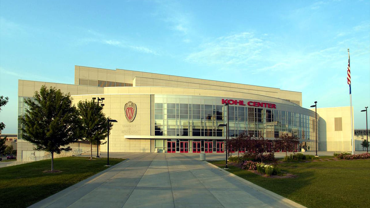
Kohl Center is a stadium, that opened its doors in 1998, and since then has served as a home arena for Wisconsin Badgers men’s and women’s basketball clubs and the men’s ice hockey team. Sometimes the stadium hosts NCAA events, as it has quite a large capacity — up to 17,3 thousand.
Wisconsin Field House
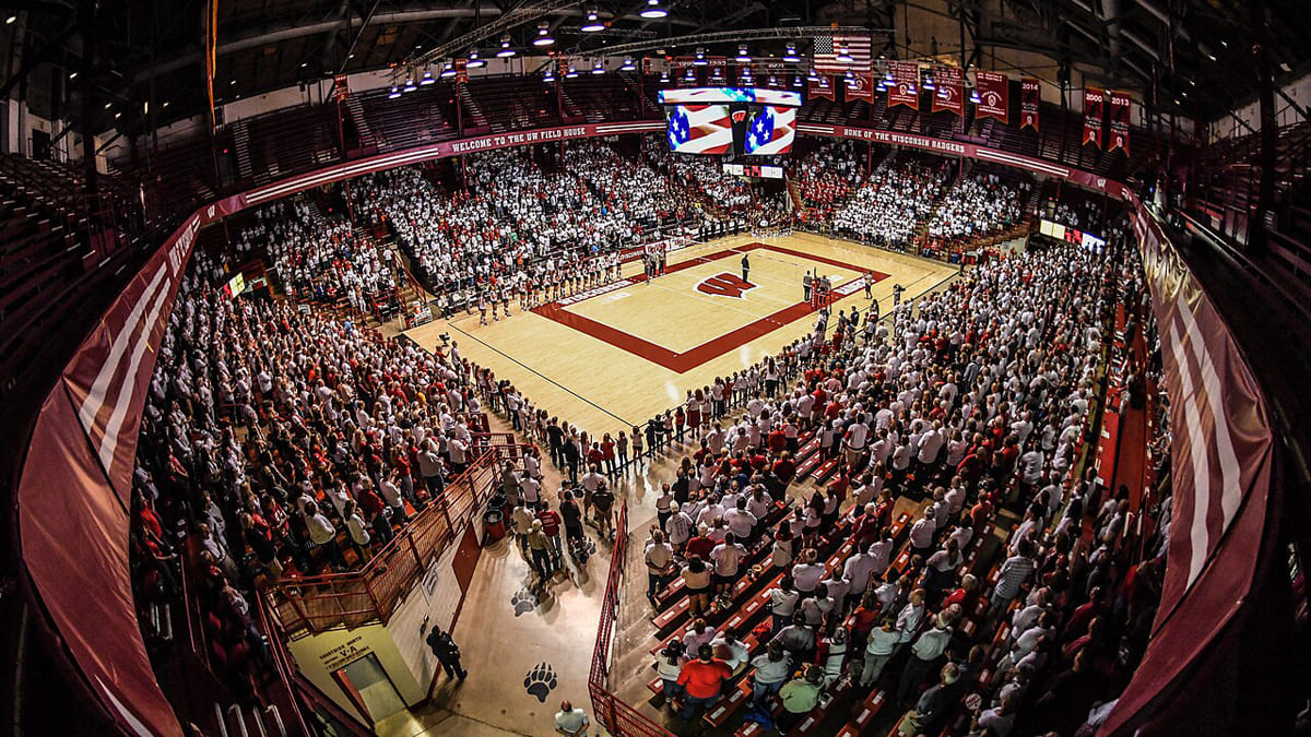
Built in 1930, in 1998 the Wisconsin Field House was added to the National Register of Historic Places. The field is a home ground for wrestling and volleyball teams of the Wisconsin Badgers athletic program. The stadium has a capacity of 7,5 thousand seats and sometimes hosts state events.
Camp Randall Stadium
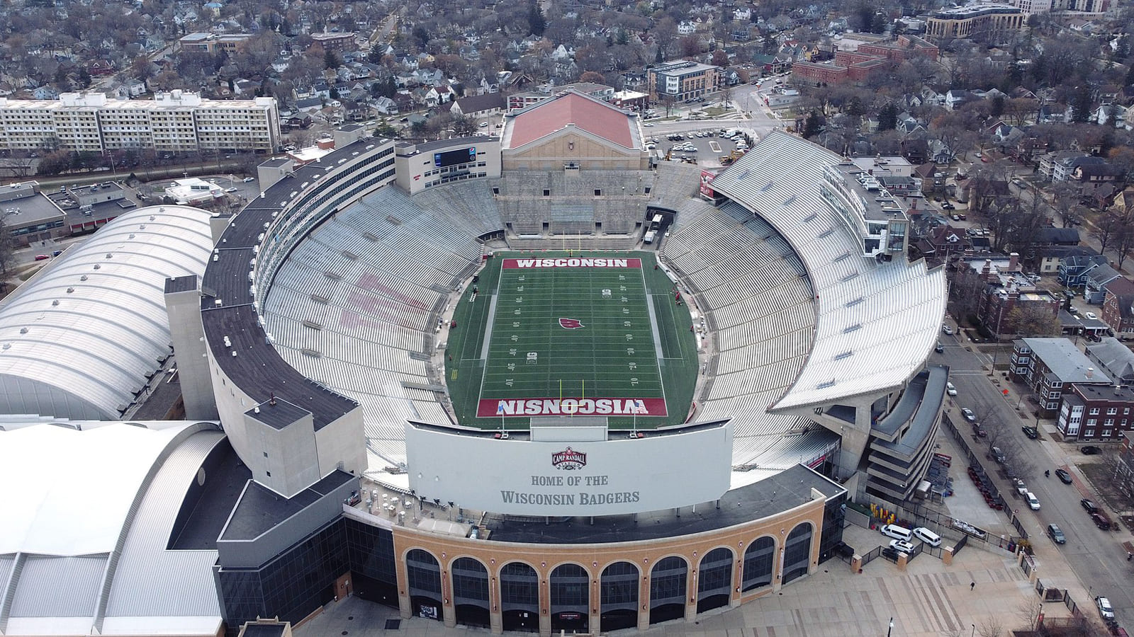
The home arena of the Wisconsin Badgers football team is Camp Randall Stadium, which was opened in 1917 and renovated twice throughout the years: in 2004 and 2022. Today the stadium has a capacity of 75,8 thousand seats, which makes it one of the top 5 largest Big Ten Conference arenas.
LaBahn Arena
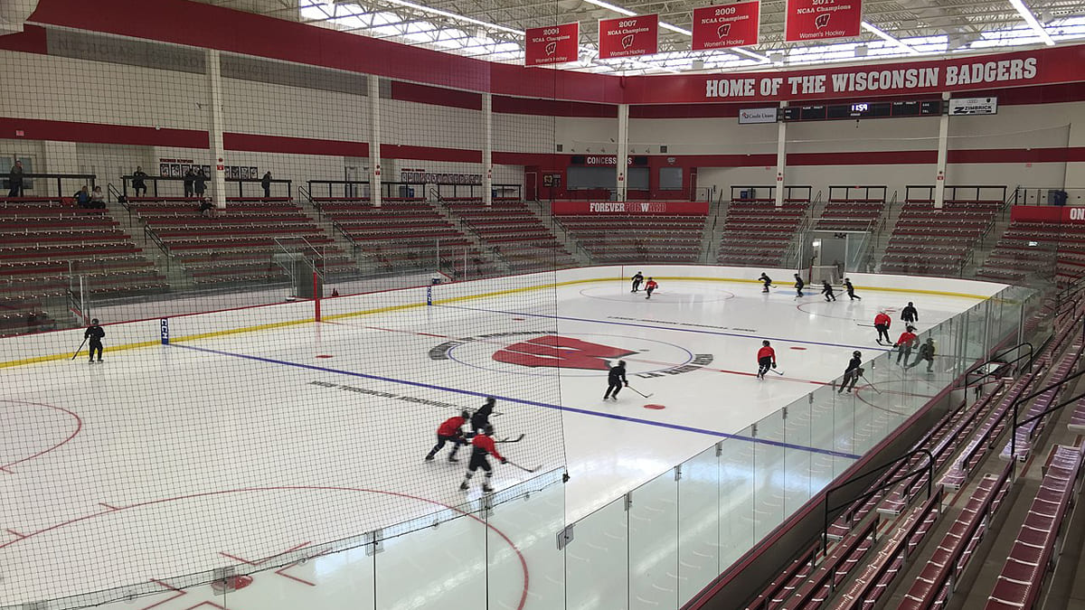
The Wisconsin Badgers women’s ice hockey team trains at the LaBahn Arena, which is connected to the Kohl Center through a tunnel. The facility was constructed in 2012, and hosted the men’s Badgers team for a season, in 2020. LaBahn Arena has a capacity of almost 2,3 thousand seats.
Wisconsin Badgers Uniforms
All uniforms of the Wisconsin Badgers athletes are quite simple in their design, but bright and strong due to the official color palette of the athletic program, red and white.
Wisconsin Badgers Basketball Uniform
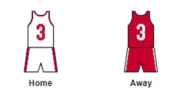
The uniforms for the Badgers basketball players are composed of white t-shirts with red numbers and red collar lines, and white shorts with wide red stripes on the sides. When the teams play away they wear red t-shirts and shorts with white detailing.
Wisconsin Badgers Football Uniform
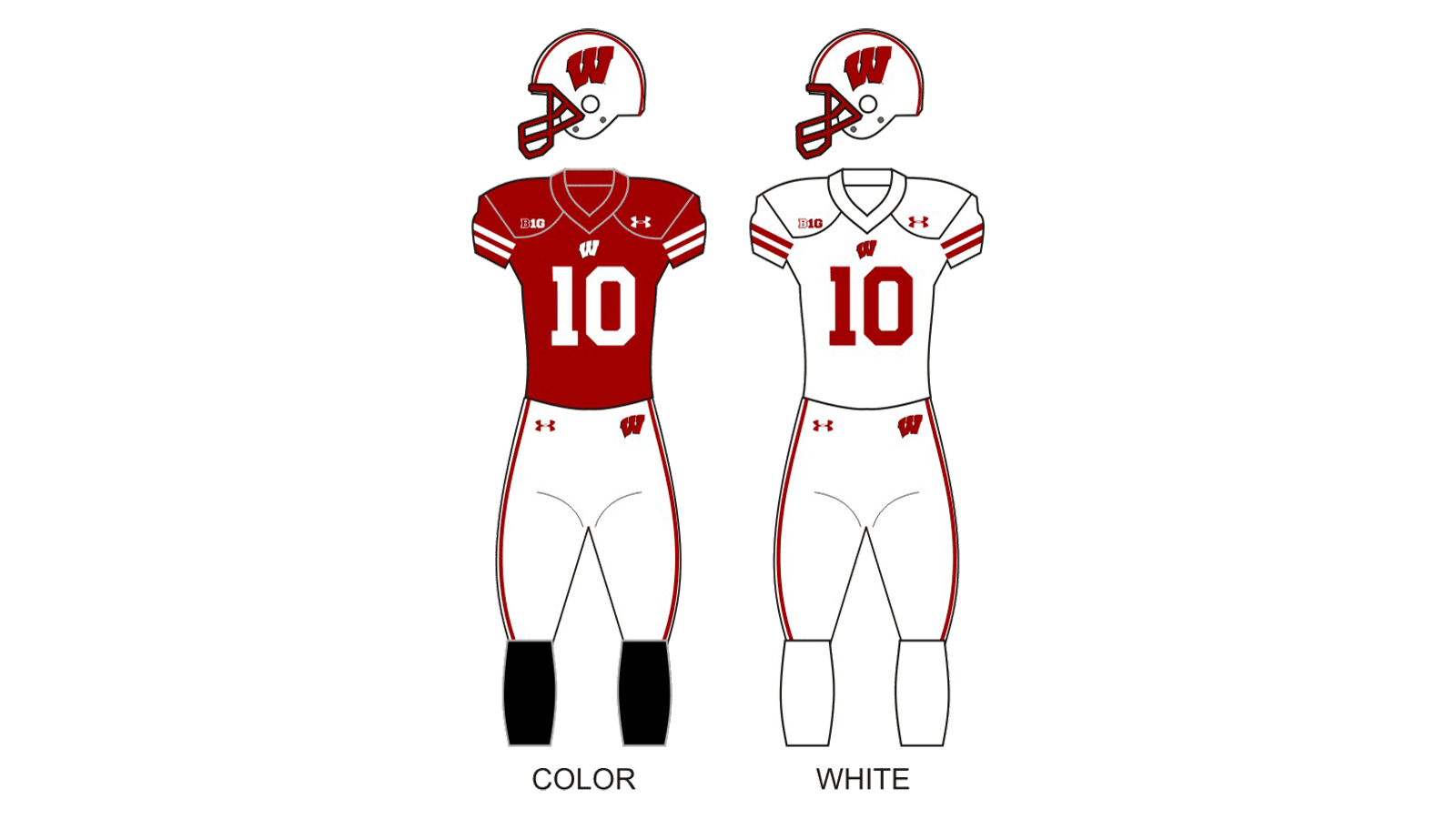
The football uniform of the Wisconsin Badgers program is also quite modest: the color version features a solid red jersey, decorated with small white details, and white pants with red stripes on the sides, accompanied by black gaiters. As for the white version, it has the same white pants and white gaiters, and the jerseys are made of white fabric too, with red small logos and large numbers.
Wisconsin Badgers Ice Hockey Uniform
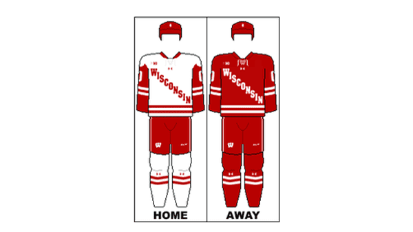
When playing at home, the Badgers hockey team wears white jerseys with long red sleeves and a red “Wisconsin” lettering written on them diagonally. The pants are red, just like in the uniform the players wear when they are away. In that case, the jerseys also turn red, and the gaiters (which are white in the primary version) as well.
Wisconsin Badgers Soccer Uniform
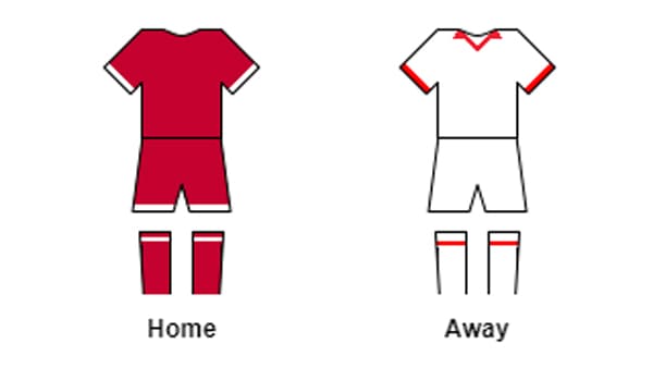
The Badgers soccer uniform has minimum details: solid red jerseys and shorts with thin white stripes on the sleeves and shorts for the primary, home version; and the white t-shirts and shorts with the triangular red collar line and stripes on the gaiters, for when they play away.
Wisconsin Badgers Mascot

The first image of Bucky Badger, the Wisconsin Badger mascot, was created in 1940 by Art Evans. It was a caricature black-and-white badger in a large cardinal-red sweater with thin white vertical stripes and a large geometric “W”. The animal in the image looks very strict and determined, walking with its fists clenched. The first papier-máchê Bucky Badger appeared in a game in 1949, and since then, never left the Badgers athletes.
Wisconsin Badgers Colors
BADGER RED
PANTONE: PMS 200 C
HEX COLOR: #C5050C;
RGB: (197, 5, 12)
CMYK:(3, 100, 66, 12)
WHITE
HEX COLOR: #FFFFFF;
RGB: (255, 255, 255)
CMYK: (0, 0, 0, 0)


