The most notable logo redesigns the basketball team the Washington Wizards has gone through were the result of the changes of the team’s name.
Meaning and history
Though the Washington Wizards basketball club was officially born only in 1997, the team’s history dates back to 1962, when the Chicago Zephyrs club was established. After that, the team relocated and changed its name several times throughout the years, redesigning its logo with enviable consistency.
1961 – 1962
The very first logo of the team, used for just one season in 1961, featured a depiction of a classic orange basketball with a contoured image of a bull’s head on it. The emblem was executed in a very progressive and minimalistic style, which made the whole badge look strong and confident. No lettering was added to the composition.
1962 — 1963
The original Chicago Zephyrs logo, designed in 1962, featured a simple and light Sanz-serif lettering, placed diagonally from the upper left corner to the bottom right. The wordmark was executed in gold-beige shade and outlines in thin blue. This logo only stayed with the club for several months.
1963 — 1968
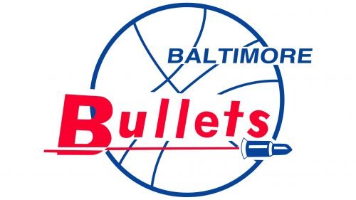
In 1963 Zephyrs relocate to Baltimore and become Baltimore Bullets, with the new logo introduced in the same year. It was a white basketball outlined in blue with a red sans-serif “Bullets” lettering and smaller size blue “Baltimore” above it.
1968 — 1969
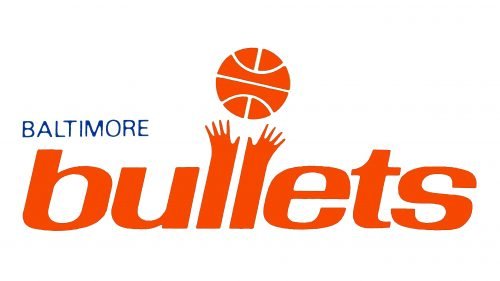
The redesign of 1968 created a new emblem for the club. It was a bold stylized inscription in the lowercase, where the smooth red lettering had its double “L” drawn as two hands with a bright red basketball above them. The blue “Baltimore” inscription was placed above the main logo.
1969 — 1971, 1972 — 1973
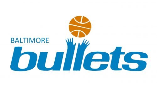
In 1969 the color palette of the emblem was switched to bright blue and gold, with all the elements except the basketball drawn in blue and evoking a sense of reliability, energy, and loyalty.
1971 — 1972
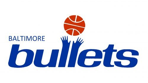
For one year, in 1971, the club used its emblem drawn in dark blue and red, with both parts of the wordmark in blue, and the red basketball above two stylized hands. It was a powerful and professional logo look.
1973 — 1974
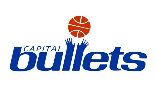
The name of the club was changed to Capital Bullets in 1973, after their relocation to Washington. As for the emblem, it remained the same, only the “Baltimore” lettering was replaced by the “Capital”, executed in the same blue color.
1974 — 1987
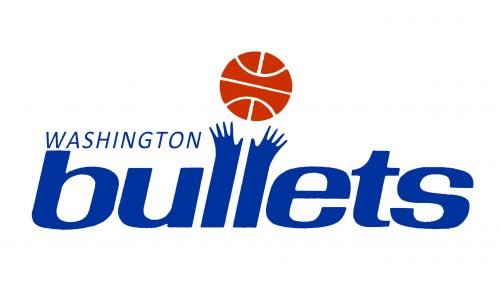
The name of the club was changed to Washington Bullets in 1974. The badge remained untouched, as well as its bright blue and red color palette, just the “Capital” wordmark was replaced by the “Washington”.
1987 — 1997
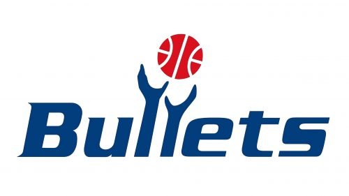
In 1987 the Washington Bullets logo was redesigned. Its iconic lowercase inscription was switched to a title case, and the contours of two “hands” were redrawn in a more minimalist and smooth manner.
1997 — 2007
The name of the club changed to Washington Wizards in 1997, and the completely new logo is being introduced in the same year. The new emblem features a stylized image of a wizard in a light blue color palette, with a gold moon on his left, having a pattern of a basketball, and a gold and black ball above his right hand. The “Wizards” wordmark was placed under the image written in all capitals of a modern serif typeface.
2007 — 2011
The redesign of 2007 only changed the gold shades to a lighter one, keeping all the other elements untouched. The emblem started looking fresher and more elegant in comparison to the previous version.
2011 — 2015
The color palette of the Washington Wizards’ visual identity was changed to navy-blue and red in 2011. The wordmark was now executed in an italicized sans-serif typeface with rounded angles and some tails of the letters sharpened.
2015 — Today
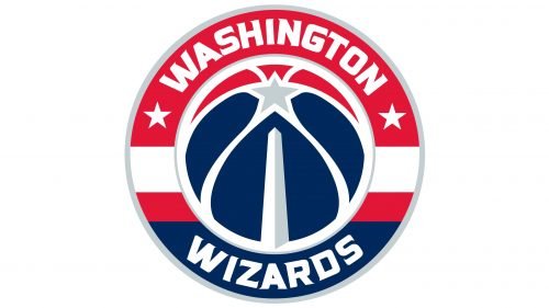
The redesign of 2015 brought a new look to the Wizards’ emblem, and now it is a circular badge with a stylized blue and white basketball enclosed in a thick red and blue frame with white lettering around its perimeter. The inscription is executed in a fancy sans-serif typeface with bold smooth lines.
Font
The lettering seen on the Washington Wizards new logo appears to have been inspired by Friz Quadrata Bold, which is a glyphic serif typeface created by Ernst Friz in collaboration with Victor Caruso. The same font was the basis of the wizard/crescent logo, too. It has been heavily modified for the newer logo, though.
The Washington Wizards logo font is bolder and narrower, while the italicized effect is gone. The letters in the current version don’t have enough “breathing space” and, because of it, the insignia isn’t particularly legible at smaller sizes.
Colors
All the colors of the official palette – red (PMS 186), navy blue (PMS 289), and silver (PMS 877) – can be seen on the logo Washington Wizards use as the global one. White is used as an additional color.
NAVY BLUE
PANTONE: PMS 289 C
HEX COLOR: #002B5C;
RGB: (0,43,92)
CMYK: (100,64,0,60)
RED
PANTONE: PMS 186 C
HEX COLOR: #E31837;
RGB: (227,24,55)
CMYK: (0,100,81,4)
SILVER
PANTONE: PMS 877
HEX COLOR: #C4CED4;
RGB: (196,206,212)
CMYK: (5,0,0,20)


