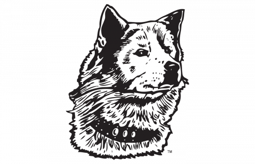
For much of its history, the Washington Huskies logo has featured the husky, which is quite natural for the team of such name. The current emblem has eliminated animalistic symbolism.
Meaning and history
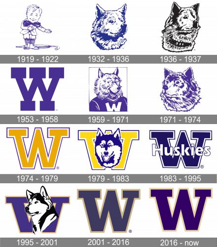
The team from Washington has a pretty intense history of its logo redesigns, including nine different logo versions created during the Huskies’ existence. Though almost all of the emblem had an image of a dog on them, and the color palette was only slightly switched throughout the years, it is easy to trace the evolution of the team itself, looking at its logo timeline.
What is Washington Huskies?
Washington Huskies is the name of an athletic program, which represents the University of Washington. The program consists of 22 men’s and women’s teams, which compete in various sports disciplines and are affiliated with the first division of the National Collegiate Athletic Association.
1919 – 1932
The original logo of the Washington Huskies had nothing in common with the name of the team and depicted a man without age (as his face looked childish and outfit — pretty fancy and elegant), standing in the full length and an umbrella laying on the floor behind him. The image was executed in a purple and white color palette, where all the contours and the bow were purple, and all the other elements featured white bodies.
1932 – 1936
The first image of the husky dog appeared on the team’s emblem in 1932. It was a pretty detailed and realistic portrait of the dog, which was looking slightly right. The color palette of the emblem was blue and white, which made the logo look like it was drawn by pen.
1936 – 1937
The redesign of 1936introduced a badge, which was only used by the athletic program of the University of Washington for one year. It was fully based on the previous version of the logo, but this time the justly was drawn in plain black lines against a white background.
1953 – 1958
In 1953 the ambler was replaced by a bold letter “W” in a custom typeface with massive square serifs. The letter was executed in a tender purple shade and placed on a white background, creating a strong contrast and evoking a sense of creativity and progressiveness.
1959 – 1971
In 1959 the Washington Huskies visual identity was redrawn again, bringing back the image of the dog but more funnily — the animal was now wearing a jersey with the letter “W” on it. The color palette remained the same, and the solid purple jersey was balanced by a white and purple furry smiling face of the husky.
1971 – 1974
The logo used by the team in 1971 looked pretty much the same as the version of 1932, but on this one, the husky changed its direction and started looking to the left. As for the color palette, it was still based on purple and white, adding some tenderness and a sense of tranquility to the image.
1974 – 1979
The capital geometric “W” was brought back to the logo of the Washington Huskies teams in 1974 but in a new style and color palette. Now it was a yellow letter in a double white and purple outline, withthinner and longer bars, giving more air to the symbol. This version of the logo was active for five years.
1979 – 1983
The husky head was redrawn in a more modern and bright way in 1979. Now the bold and stylish image, executed in purple and white, was placed on a delightful yellow letter “W”, outlined in white and purple. The “W” was written in a traditional serif typeface with straight lines and square shapes.
1983 – 1995
The Washington Huskies badge, introduced in 1983, was set in a simple yet confident blue and white color palette, with the enlarged “W” in a double white and blue background, and a bold title case “Huskies” written across it in a traditional sans-serif font, with each character outlined in blue.
1995 – 2001
The color palette of the logo was slightly changed in 1995, keeping the purple and yellow combination for the “W”, which got its serifs slightly elongated, and switching the colors of the dog to monochrome. The husky was now turned more to the left and looked graceful and noble.
2001 – 2016
After the sleek and elegant emblem, designed in 2001, the team decides to go more minimalist and strict and introduces a new logo version in 2007. Now the Washington Huskies’ badge features a strict geometric letter “W” in a traditional serif typeface with clean lines and straight angles of the letter. As for the color palette, the “W” is executed in intense purple and has a thin double outline containing yellow and white.
2016 – Today
Washington Huskies softball
The school sponsors 22 varsity teams in a variety of sports, from baseball to beach volleyball. One of the most successful of them is the softball team. They became the NCAA Tournament champions in 2009. As of 2019, the number of the NCAA Tournament appearances has reached 26.
Basketball
The basketball teams are members of the NCAA Division I and compete in the Pac-12 Conference. The highest achievement of the men’s team has been competing in the NCAA Tournament Final Four in 1954. They have competed in the NCAA Tournament 17 times. The women’s team also has had a single appearance in the NCAA Tournament Final Four, only it took place more recently (2016). They have had 19 NCAA Tournament appearances.
Washington Huskies Colors
PURPLE
PANTONE: PMS 2685 C
HEX COLOR: #4B2E83;
RGB: (51, 0, 111)
CMYK: (93, 100, 18, 21)
GOLD
HEX COLOR: #B7A57A;
RGB: (232, 211, 162)
PANTONE: PMS 7502 C
CMYK: (0, 13, 43, 13)
METALLIC GOLD
HEX COLOR: #85754D;
RGB: (145, 123, 76)
CMYK: (30, 35, 60, 0)
PANTONE: PMS 871 C


