Warface is a first shooter multiplayer video-game, which was created by Crytek in 2013. The game offers a PvP experience in its versions available for Nintendo, PlayStation, and Xbox consoles.
Meaning and history
2013
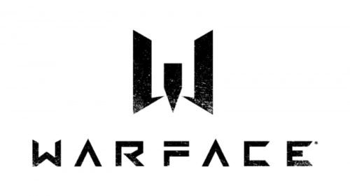
The Warface visual identity was redesigned only once, in 2016, but it was a complete remake of the existing logo. The current Warface logo is composed of a wordmark with an emblem above it, which is also used by the game’s icon.
The Warface nameplate in all capitals is executed in a custom sans-serif typeface with futuristic mood and shapes. The letter “A” had no horizontal bar, and the “F” had its vertical bar shortened.
The Warface emblem is a stylized letter “W”, which resembles an original Warface shield, designed in 2013.
It was a three-dimensional badge, with two sharp geometric wings and a circle with the star. The current emblem has no framing or any graphics on it, but the shield can still be seen in it.
The white and black color palette of the Warface logo allows placing in my on various backgrounds, where it looks strong and modern.
The current Warface visual identity is a huge step forward after its original version, which was traditional and even boring. Today’s logo is instantly recognizable across the globe, it shows the progressive and innovative approach of the developing company and makes the game stand out from the list of competitors.


