Wii U is a Nintendo brand of an eights-generation video game console with a touchscreen. It was released in 2012 and discontinued in five years. Nintendo is one of the leading gaming companies in the world and has a market value around $40 billion.
Meaning and history
Wii U is one of the consoles from the Nintendo portfolio, which was kept a secret by the developers until the start of the sales. The first version of the console was designed in 2011, and for users from all River the world the console got available only at the end of 2012.
It was, actually, a slightly modified version of the Wii console, released by Nintendo earlier. Wii U is only a bit larger than its predecessor and noticeably smaller than the Xbox 360 and PlayStation 3. In general, the design has not changed fundamentally compared to the Wii.
The main peculiarity of Wii U is a touchpad (Wii U Gamepad), which was added to the traditional gaming remote. The display has a resolution of 854×480 pixels, its diagonal is 6.2 inches.
What is Wii U?
Wii U is the Name of a Nintendo console, which was created in 2011, and went on sale only at the end of 2012. The console was available in two options: Basic and Premium. The basic package came with 8 Gb of internal memory and a white gamepad, while the Premium — with 32 Gb of memory, a black gamepad, a stand, and a docking station.
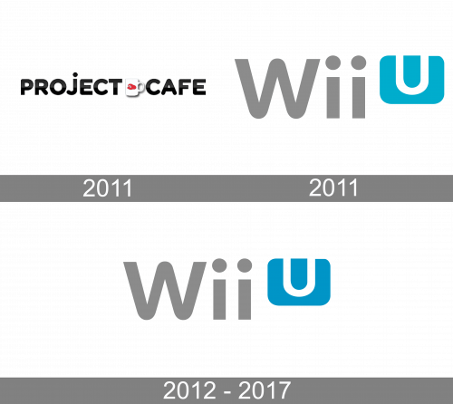
2011
The very first logo for the brand was introduced in 2011 and only stayed active for a few months, as the trial name of the company was Project Cafe. The badge was composed of a bold black uppercase logotype, with the two words separated by a shadowed image, depicting a white coffee cup with a red cap drawn on it.
2011
With the new name adopted later in 2011, the new logo was created for the console. It was a stylized gray “Wii” lettering in a bold sans-serif typeface with clean distinctive contours of the letters, and traditional circles above both letters “I”. The inscription was followed by a rectangular horizontally oriented logo with softened angles. The banner was set in solid blue with the white “U” placed in its upper part and cutting the upper border with its vertical bars.
2012 – 2017
The Wii U was not the most successful Nintendo console, there were only 15 million units sold worldwide, when PlayStation sells around 60 million per year. But the brand is recognizable and well-known in the gaming industry.
During the console’s pre-launch it was known as “Project Cafe” and used black, red and white colors in its logo.
The Wii U was released in two versions — basic and premium. The difference was in the memory capacity and design (white color for the basic version and black — for premium).
Color and font
The brand made its logo universal to suit different backgrounds — its gray and blue color palette symbolizes technological progress and innovations.
The wordmark of the logo is identical to the previous Nintendo console — Wii, the only difference between two emblems is a blue square icon with rounded angles and a letter “U” on it.
The color scheme of the Wii U logo was changed once. In the first version the square icon had a green tone of blue and the same gray.
The Wii gray color is calm and elegant, capable to balance almost any color accent and background. It adds a feel of confidence and strength to the brand.
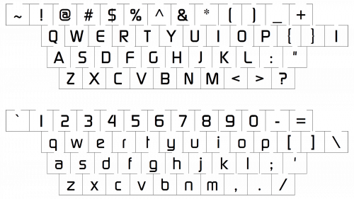
The typeface of the wordmark is bold and smooth, with the rounded lines of the letters and a slightly extended “W”. The closest font to the Wii U logotype is Continuum, designed by Brøderbund Software.


