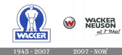
The Wacker Neuson logo is based on the “NW” emblem. It is the centerpiece of both the logos of the Wacker Neuson Group and the Wacker Neuson brand itself.
Meaning and history
The history of the company started in 1848. Today, it is among the world’s leaders in designing, manufacturing, and marketing of concrete technology, compaction equipment, and compact construction equipment. In 2007, Wacker Neuson SE was listed on the SDAX.
Wacker Neuson Group’s logo
The roundel emblem combines the letters “N” and “W” by putting them one over the other. It is done in such a way that you can read it as either the “W” or “NW.”
While the roundel does not occupy the majority of the surface, in a way, it steals the limelight. One of the reasons is that it features the only bright spot on the whole logo – part of the “NW” is given in a bright shade of red. Also, it has a pronounced 3D effect due to the gradient.
To the left, there is the writing “Wacker Neuson” in a sans serif type (only the initials are capitalized). The word “Group” below comes in slightly larger but lighter letters.
Wacker Neuson brand’s logo
The “NW” emblem and its position are the same as in the previous emblem. The type used for the text “Wacker Neuson” is absolutely different, though. It is a heavy all-caps sans. The first two letters in the word “Wacker” resemble the style of the “NW” emblem.
Below, there is the tagline “all it takes!” in a handwriting-inspired script.


