Vogue Pay is an online money platform, which was established in 2012 in order to help people from all over the world to transfer and receive payments using their devices. The company was formed by the owners of two international businesses, Nigerian and British.
Brand Overview
Vogue Pay is a free-to-register online platform, which offers multiple online payment solutions for small businesses across the globe. The company offers customizable services for each and every e-commerce website in order to get more benefits and simplify the payment process.
Besides business customers, the company also serves individual clients across the globe, offering them easy and fast solutions for sending and receiving money online.
The company has two main offices, in London and Lagos, and serves thousands of people worldwide, helping them in purchasing, sending and getting funds with maximum protection.
Meaning and history
The company’s visual identity is sleek and stylish. Its modern logo is composed of a remarkable emblem with a wordmark in its right.
The white emblem with lettering is placed in a bright turquoise background, symbolizing energy, reliability, and creativity of the company, along with loyalty and protection. For the icon, the platform uses an emblem in turquoise inside a white square with rounded angles.
The emblem of the company is composed of a triangle with its peak facing down and its angles rounded. There are also three diagonal lines coming through the upper right corner of the figure. The symbol reflects progress and innovations, showing the actively developing company, which values growth.
The sleek contemporary emblem is accompanied by minimalist and modest lettering, which balances it and makes the whole image look professional and confident.
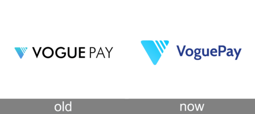
Old

The older logotype introduced the downward triangle shape they’ve been using ever since. It is a rounded figure with three hash cutouts near its top right corner, whereas the coloring is a blue gradient with a darker area at the bottom. The wordmark featuring the company’s name is located immediately to the right with the exact same height as the emblem.
They wrote these letters in a regular simplistic sans-serif font with clean lines and a generally tall proportion. The ‘Vogue’ part is visibly bolder by comparison. All of these letters are capitalized.
Today

The newer logo still uses the old emblem, although with a new turquoise look without the gradient. It’s a lot bigger compared to the wordmark, which also changed. It now says ‘VoguePay’ without any gaps and with both lowercase and uppercase letters. The font changed little, but the whole wordmark is now dark blue.
Font and Color
The wordmark in all capitals is written in a modern sans-serif typeface, which is very similar to Paneuropa Retro Soft with straight lines and solid shapes. The “Vogue” part uses a semi-bold style, while the “Pay” lettering is executed in lighter and thinner lines, adding freshness to the inscription and not overloading it.
The company uses a lot of blue for their branding, including all of their logotypes. It’s been particularly prevalent in the recent years, with the introduction of the newer logotype that uses a lot more blue.


