Gojek is the name of the online service platform, which was established in Indonesia in 2009. The company specializes in providing its customers with such services as online money transfers, delivery, e-commerce, and vehicle rentals. Today Gojek is available through the website and mobile app not only in Indonesia but in all neighboring countries.
Meaning and history
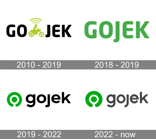
The Gojek visual identity concept is based on brightness and progressiveness. The logo of the modern Indonesian company has a modest yet delightful palette, a young spirit, and a lot of energy in it. Being redesigned twice throughout the short history of the brand, the Gojek badge is still recognizable and memorable.
What is Gojek?
Gojek is the Indonesian online platform, designed to help customers with a various range of services from online payments to online shopping. The service was launched in 2009, and by today has grown into one of the segments leaders in its region.
2010 – 2019
The very first logo for Gojek was designed in 2010 and featured a minimalist and stylish composition of the lettering and a graphical emblem placed between “Go” and “Jek”. The name of the company is a derivative from Ojek, which means “motorcycle” in Indonesian, so the initial emblem of the online service depicted a man riding a bike. Above the man’s head, there were three arched lines, standing fir with-do connection, and reflecting the purpose of the application. The light green color of the graphical part represented success and growth, while the whole image looked progressive and friendly.
2018 – 2019
The redesign of 2018 simplified the logo to just a single wordmark, which was written in the same typeface as the previous version, but with lines and contours slightly narrowed, and the “J” elongated vertically. The absence of graphical elements was compensated by the bright green color of the lettering, which evoked a sense of energy and progress, making the logo friendly and welcoming.
2019 – 2022
The visual identity of the online service company from Indonesia has refreshed again in 2019, keeping the color palette of the original version, but darkening the shade of green. The new design concept includes a black lowercase logotype in a smooth and solid sans-serif typeface, which looks very similar to Madison Neue Extended, placed on the right from the green emblem, which is composed of a solid green spot enclosed intro a circular frame, open at its bottom point. The new logo symbolizes services available through the internet and the company’s s loyalty to its customers.
2022 – Today
Several minor changes followed in 2022. Chief among them are new colors: the green became visibly lighter, whereas the letters turned from black to dark grey. The emblem also uses a slight gradient effect, although it’s not that prominent. They’ve also shifted the default layout to both emblem and text being on the same level.
Font and color
The bold and slightly extended lowercase logotype from the official Gojek badge is set in a modern and stable sans-serif typeface with the removed dot above the “J”. The font, used for the Gojek insignia, is something in between Carmen Sans Extra Bold and Siberian.
As for the color palette of the Gojek visual identity, it is based on a combination of black and green. Black stands for confidence and professionalism, while green is the color, symbolizing wealth, growth, and development, and this is exactly what the platform was designed to help with.


