One of the oldest baseball teams in the California League the Visalia Rawhide have resided in Visalia, California since 1946, the year of their foundation. The team’s name has been changed several times. The current one has been in use since 2009.
Besides being original, the new name represents the surrounding area which a rich agricultural region known for its dairy production. It is connected with baseball as well, as it is a slang word for baseball gloves and baseballs made of rawhide.
Meaning and history

The franchise has managed to create an utterly new identity since its name was changed. The logo and colors were the first to undergo changes.
What is Visalia Rawhide?
Visalia Rawhide is the name of the baseball club from California State, which was established in 1946. Today the club competes in the Minor League Baseball and is managed by Shawn Roof.
1995 — 2008

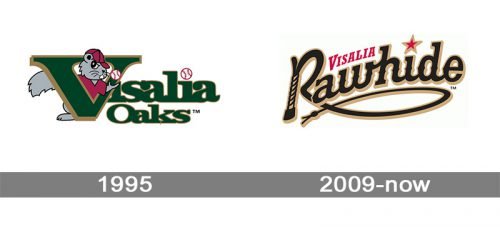
The very first logo for Visalia Rawhide was created in 1995 when the name of the club was Visalia Oaks. It was a calm and dark badge, composed of a logotype and a graphical part with a caricaturish badger in gray, wearing the burgundy jersey and a baseball cap and jingling a white ball in its hand. The badges were placed behind the first letter of the nameplate, “V”. The text part of the logo was set in two lines, written in a title case, with the “V” enlarged. The inscription was set in an extra bold serif typeface and featured dark green as the main color and gold as the color of the outline. The dot above the second “I” in “Visalia” was replaced by a white and red baseball. And the dot above the first “I” was supposed to be replaced by the ball in the badger’s hands.
2009 — Today
 The Rawhide’s logo adopted in 2009 consists of two words ‒ the word “Rawhide” in a westernized script and the word “Visalia” in capital letters. “Visalia” is above between the letters “R” and “h”. A red star outlined in tan serves as a dot for the letter “i” in the word “Rawhide”. The letter “R” looks as if it is made from a bull whip that underlines the logo. For this detail the logo is often referred to as “Roping “R” logo. The color scheme includes black, scarlet and metallic gold/ tan.


