

![]() Virgin Galactic Logo PNG
Virgin Galactic Logo PNG
The logo of Virgin Galactic is neither minimalist nor easy-to-reproduce. While it goes in the opposite direction than some design trends, it looks contemporary and conveys a powerful message. It catches your attention and, eventually, is a great marketing tool. “Take your chance and see the Universe,” – it seems to invite.
Meaning and history
![]()
Virgin Galactic was established in 2004 as a spaceflight company within the Virgin Group.
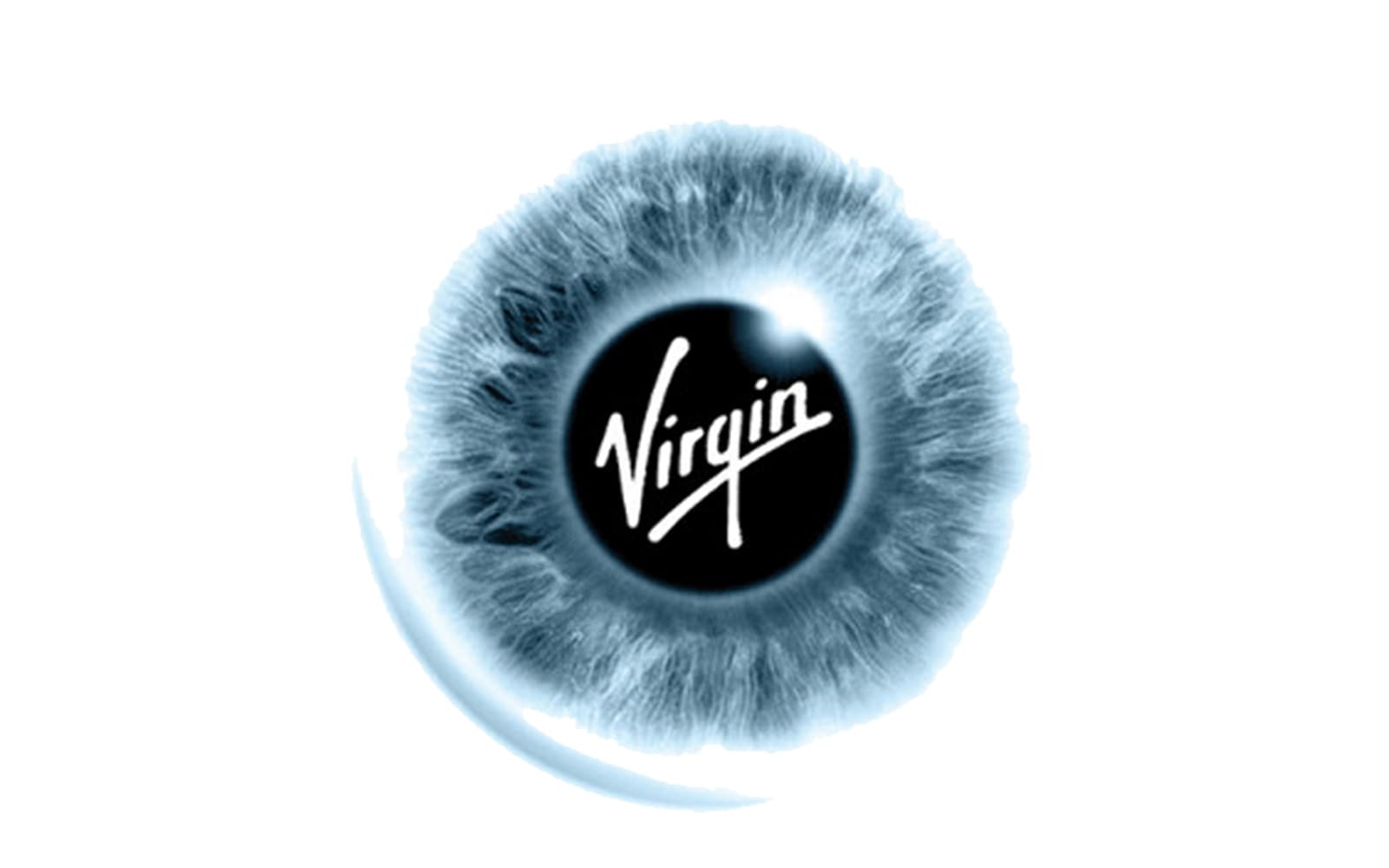
What makes the Virgin Galactic logo unique is the very true-to-life depiction of an eye. The pupil is very dark and deep. In addition to representing just the pupil, it also stands for the universe and depicts the black abyss of the night sky.
2007 – 2022
![]()
The iris is blue and features a lot of realistic details. It looks like a precious stone, with its multiple shades and highlights.
In the middle of the eye, there is the lettering “Virgin,” which is, in fact, the logo of the parent company. The word “Galactic” can be placed either to the right of the eye or below it. What makes the writing look unusual is that with each letter the type goes somewhat lighter. This helps to add a dynamic touch.
2022 – Today
![]()
The 2022 logotype uses many of the brand new elements. The key detail is an emblem featuring a rocket in a very minimalistic style. The name ‘Virgin’ is written in the middle in exactly the same way it’s depicted on the previous logotype.
Beneath this rocket is a big word ‘Galactic’, written in all capitalized letters of a new angular sans-serif font. The text bit is a lot wider compared to the emblem above it. Both elements share a gradiented purple coloring with a lighter area in the approximate center of the logotype.
Virgin emblem
As the emblem of Virgin is part of the Virgin Galactic logo, we should say a couple of words about its history, too.
The original design developed by artist and illustrator Roger Dean depicted naked Siamese Twins and a dragon by their side. The cluttered design was soon replaced by a handwritten logo. The overall style of the logo has remained unchanged, although there have been at least three modifications.
Font
The font used for the main wordmark of the brand, ‘Virgin’, is an elegant hand-written style typically depicted at an angle. A thin line usually underpins the word. As for the fonts used with ‘Galactic’, the most recent one uses big bold letters with angular sans-serif letters. The earlier variant utilized even more angular, square-shaped characters.
Color
Since the 2022 logo released, Virgin Galactic largely used purple in their branding, as does the logotype. Before then, the main colors were black, blue and grey.


