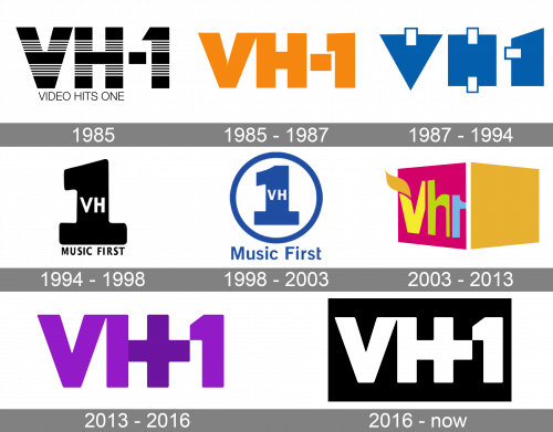
VH1 is a local American cable telecasting network, launched in 1985. Now it’s based in NYC and owned by Paramount Global. The main specialization of the channel is related to music, targeted primarily towards 18-35 audience. They stream video clips, as their sister channel, MTV. But they’re mostly focused on reality broadcasting with individual singers. They also broadcast shows for African American audience groups. They also have a website, containing their shows’ recordings, and music videos.
Meaning and history
The channel was established by Warner-Amex Satellite Communications in the mid-80s, targeting to popularize the bright and soft side of pop-music, not only from the United States, but also from abroad. Their original segment of their audience were people from 18 to 35 years. VH1 is an acronym from Video Hits One, the channel’s original namesake, used in the 80s and 90s.
What is VH1?
VH1 is an American TV channel, which was launched in New York City in 1985 by Warner-Amex Satellite Communications. Showing reality music shows and clips, the channel has its main specialization in pop-music, released in the second part of the 20th century. Their target audience is the people from 20 to 35 years.
1985
The original logotype barely has a different style than the modern one. It features the ‘VH-1’ inscription, having a striped pattern, with the one part of the pattern black and the other one black and white. Below the initialism, they wrote the nameplate in all sans-serif capitals.
1985 – 1987
Then, they removed the full name caption, changed the text caption font, and painted it orange. All symbols received a bolder style. The ‘1’ number got an angular style. The ‘v’ was drawn with a larger space between its bars. It was also connected to the following ‘h’.
1987 – 1994
The wordmark was reinvented in 1987. The symbols were replaced by blue geometrical figures – a triangle, a rectangle, and another rectangle with the right bar elongated. The only thing pointing that these were actually letters was the white rectangles spread at the top of the first triangle, upper and lower parts of the second shape, and the left side of the third element.
1994 – 1998
With the brand’s renaming to VH1: Music First, they changed the logo as well. It now figured the large ‘1’ number, which had the ‘vh’ letters placed centrally on it. Below the symbol, they put the ‘music first’ inscription in a capitalized font without serifs.
1998 – 2003
They Placed the symbol in a circle, painted it blue, and wrote the ‘music first’ lettering above the circle. The letter had the similar script, but all characters except ‘m’ and ‘f’ were lowercase.
2003 – 2013
Removing ‘music first’ caption, they developed a new brand logo. They unleashed two italicized rectangles, neighboring with one another. They formed an optic illusion of a box. The right shape was orange, while the left one was pink, and it showed the brand’s name with the ‘v’ having a leaf going from its left bar. All letters were wavy and inconsistent.
2013 – 2016
The later wordmark slightly reminds the original logotype. It depicts the uppercase acronym, which now has a custom ‘+’ sign, incorporated in the ‘h’.
2016 – today
The modern logo has these initials on a rectangular background.
Font
The text’s font depicts bold sans-serif characters with small intervals in between. The most notable element in the logo is the ‘+’ sign, sewed in the antecedent ‘h’. The symbol means the new age in the channel’s history, when it’s broadcasting reality music shows, plus showing video clips in the first half of the day.
Color
The 2013 logotype is painted violet for the letters/numbers, and dark violet for the ‘+’. In the modernized variant, they painted the whole text white and put it on a black rectangle.


