Vestel is a Turkey-based manufacturer of home and professional appliances. It includes 24 companies (as of 2020) and is part of the Zorlu Holding.
Meaning and history
Vestel is one of the most globally recognizable Turkish brands, which was established in the middle of the 1980s, and today its offices are located all over Europe, Scandinavia, and the United States.
Throughout its history, the company has absorbed a large number of its competitors. Some of them are based in other countries, due to which the manufacturer entered neighboring markets.
The Vestel Group consists of 19 companies specializing in the development, production, marketing, and distribution of consumer electronics, and small and large home appliances. As one of the market leaders in Europe for electronics and home appliances, the company has representative offices in such countries as France, Germany, Iberia, Italy, Great Britain, Scandinavia, and Romania. Production and research facilities are also concentrated in many regions of the world.
At present, the Vestel Group is part of the large multinational holding company Zorlu, headquartered in Istanbul, Turkey.
What is Vestel?
Vestel is the name of a Turkish company, which was founded as Vestel Electronics in 1984. Today the company is the leader among Turkish manufacturers of consumer electronics, with its products distributed in dozens of countries across the globe.
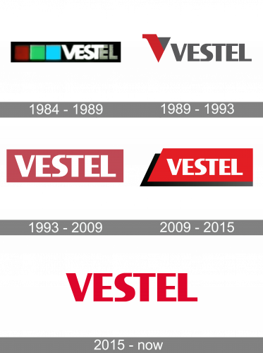
1984 – 1989
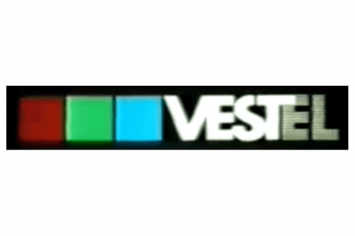
The first Vestel logo used a long black rectangle with the company’s name written on the right. The letters were big, bold and largely white. On the left side, there were instead three squares of red, green and blue respectively, occupying the whole half of the figure.
1989 – 1993
In 1989, they adopted a new font for the wordmark, which they kept using ever since. Here, it was dark grey and without any sort of geometric background. There’s also now a new emblem – a downward triangle with a little serif of sorts sticking out of the left side. It was half red and half grey (like the wordmark).
1993 – 2009

The 1993 emblem used the same wordmark, but colored white. This time, it was put on a long red rectangle for background.
2009 – 2015
In 2009, the rectangle was redrawn into a trapezoid (a rectangle with a slope on the left side), as well as its black copy behind.
2015 – Today
In spite of its minimalism, the Vestel logo is memorable and eye-catching enough. It showcases the name of the company in a bright red color that has been scientifically proved to catch people’s attention and have positive associations with energy and optimism.
The glyphs don’t have serifs and combine strokes of various widths, which add a touch of refinement. The two identical “E’s” create a visual rhythm, while the curvy “S” (the only rounded glyph) adds dynamics.
Font and Color
The bold geometric lettering from the primary badge of Vestel is set in a clean and heavy sans-serif typeface with a custom contour of the letter “S”, which makes the whole inscription look unique and elegant. The closest fonts to the one, used in the Vestel insignia, are, probably, Formal Dance JNL, or Titanium Motors Std Regular, but with some minor modifications of the letters’ contours.
As for the color palette of the Vestel visual identity, it is based on an intense shade of red, which evokes a sense of power and professionalism, also representing passion and warmth, attention, and caress. The hue of red elevates the look of the badge, making it look more elegant and chic.


