Veikkausliiga is the name of the highest-tier football league in Finland. The league was established in 1990, and today is composed of 12 clubs from all over the country, which compete in the league, affiliated with the UEFA.
Meaning and history
Veikkausliiga is the highest tier of the football association in Finland, which was established at the beginning of the 1990s under the name Futisliiga. The current name came to the league after its first season, in 1991.
Today the Professional football league is composed of twelve clubs from all over Finland, with the winning teams moving further to the UEFA Championships.
What is Veikkausliiga?
Veikkausliiga is the most prestigious and reputable football association in Finland; which was founded in 1990. Today the part of the UEFA Confederation, Veikkausliiga consists of 12 professional football clubs, competing for its title annually.
1990 – 1998
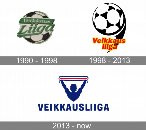
The league’s original logo depicted a soccer ball. On it, the event’s name was written in two bits. ‘Veikkaus’ was featured in white italics on a strip of green near the top. ‘Liiga’ was shown in a similar font, but colored green and without any additional background. The latter was placed in the center, and its letters were visibly larger.
1998 – 2013
The 1998 design also depicts a soccer ball, but this time in a generalized shape and colored black and white. There was also a claw-like trail extending towards it from below, which hints the ball is mid-flight. ‘Veikkausliiga’ was written below the ball proper in red letter with yellow outlines. There were two lines of text, with ‘liiga’ placed below the rest.
2013 – Today
The logo of the most known football league in Finland, Veikkausliiga, was inspired by the intense emotions that are experienced by players and fans alike. The Veikkausliiga logo depicts a human torso holding his hands up. He’s stretching a flag with red and dark blue stripes high above his head as a sign of victory or fan’s support.
Below, the name of the league in dark blue (the color of the Finnish flag) can be seen. It’s given in a simple, solid sans serif font. Due to the choice of type, as well as the fact that the lettering is rather large in comparison with the picture, it’s perfectly legible both at smaller and larger sizes.
Font and Color
The smooth yet heavy and brutal uppercase inscription from the official badge of Veikkausliiga is set in a modern sans-serif typeface with softened contours of the characters. The closest fonts to the one, used in this insignia, are, probably, CrossFit Bold or Bio Sans Soft Extra Bold, but with some slight modifications of the letters.
As for the color palette of the Veikkausliiga visual identity, it is based on a sleek and fresh blue, white and red tricolor, which is one of the most often used combinations not only in the world of sport but also in politics and large businesses. This palette stands for confidence, loyalty, and passion, reflecting the strong points of the organization and its reputation.


