The word “vaseline,” which is often used as generic for petroleum jelly, comes from the name of the US brand of petroleum jelly-based products that belongs to Unilever. Taking into consideration the 150-year history of the product, it is only natural that the Vaseline logo has been updated more than once.
Meaning and history
Vaseline is, actually, one of the world’s oldest cosmetics brands. It was established at the beginning of the 1870s in the USA, and the name, given to it by its founder, Robert Chesebrough, is derived from two words in German and Greek, Wasser, standing for “Water”, and Elaion, standing for “Oil”.
Since 1987 the American brand is owned by the British Unilever Group, and the Vaseline products can be found in any grocery store or supermarket all over the globe.
What is Vaseline?
Vaseline is the name of an American brand, that specializes in the production of products, based on petroleum jelly. The brand was established at the beginning of the 1970s and was acquired by Unilever in 1987. Today the name of the brand is synonymous with all the petroleum-jelly-based products, irrelatively of the label.
1870 – 1872

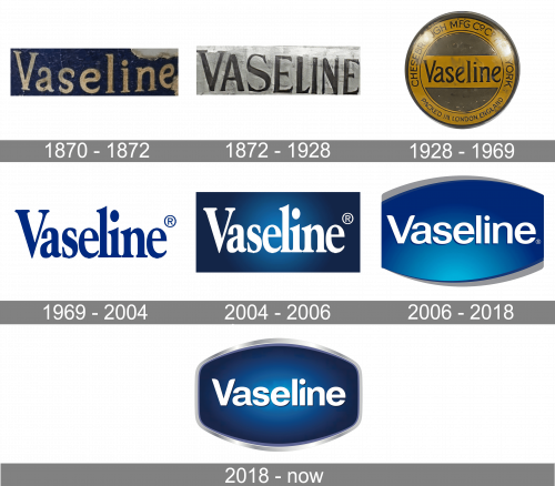
The very first logo for Vaseline was created in 1870 and featured a smooth and elegant golden lettering in the title case, set over a solid black background. It was a professionally executed badge, which looked pretty strong for its times.
1872 – 1928
The original design featured the word “Vaseline” in an all-cap type with elegant serifs.
1928 – 1969
Now, all the letters except the initial were lowercase. The name of the brand was placed over a yellow stripe. The stripe was placed inside a thick yellow ring with the gray filling.
1969 – 2004
The Vaseline logo is blue and white. The roundel is gone, while the capitalization stays the same. During this period, you could come across a logo with or without serifs.
2004 – 2006

In 2004 the Vaseline badge keeps its typeface and sizing but plays with the colors of the logo. Now the inscription is executed in bold white letters, and placed on a horizontal rectangle with a gradient blue background, featuring the lighter part in the center.
2006 – 2020
In 2006 the vaseline logo was redesigned in a more modern and strong manner, with the white logotype being rewritten in classy sans-serif, with a slight shadowing of the letter, the background getting lighter blue shades, and its upper and bottom lines arched from the center. The badge also gained a flat gray outline.
2020 – Today
The white wordmark featuring a simple sans is placed over the blue ellipse with its left and right sides cut.
The redesign of 2020 has switched the gray outline of the Vaseline badge to a voluminous silver one, enhanced the colors on the badge’s background, adding darker shades of blue, and made the lines of the white title case lettering bolder, and the shapes of the letters — slightly narrower.
Font and color
The traditional and professionally executed Baseline visual identity uses a simple yet confident and stable sans-serif typeface for its white title case logotype. The font of the Vaseline wordmark is very close to such fonts as Hypersans Extra Bold and Langtone Heavy. The lettering looks dynamic and vivid due to the light gray shadow and a slight gradient.
The blue and white color palette of the Vaseline visual identity stands for expertise, professionalism, and reliability of the world’s famous brand, reflecting such company’s qualities as trustworthiness and protectiveness.


