Since 1976, the Body Shop logo has gone through at least three updates. In all the designs, we can notice the green color (different shades) and a circle emblem with “feathers” or “drops.”
Meaning and history
The famous cosmetics brand, The Body Shop, was founded in London in the middle of the 1970s, and for the first decades was only sold in its country. Although, after the acquisition of the brand by the international giant L’Oreal in 2006, The Body Shop started expanding with an incredible speed, and soon has already been known all over the globe.
In 2017 L’Oreal sold The Body Shop to another international group, Natura. By that time the brand has already had almost three thousand selling points in dozens of countries across the world.
What is The Body Shop?
The Body Shop is the name of a popular skincare brand, which was established in the United Kingdom in 1976, and today is selling its products all over the globe, through more than three thousand branded stores. The range of the brand’s products includes body care, perfumes, and cosmetics.
1980s – 1990s
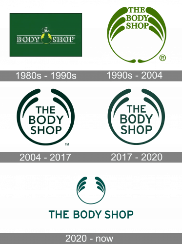
The original design (1976) was dominated by the words “Body Shop” featuring white and green glyphs with shades. The two words were separated by the iconic roundel emblem in yellow.
1990s – 2004
In 1990s, the roundel emblem grew larger. It now featured a warm shade of green. The words “The Body Shop” were now seen between the ends of the “feathers.”
2004 – 2017
The Body Shop logo was simplified. To begin with, the number of the “feathers” was reduced – there were now only two “feathers” instead of three. The name of the brand moved lower, inside the open circle, and it was now given in a sans serif type. The lowest gap between the parts of the ring was closed. The color grew much darker.
2017 – 2020
The redesign of 2017 has remained almost unnoticed, as was mainly about the slight enhancement of the color palette and the typeface of the lettering.The green became a bit lighter, gaining some sea-green shades, while the inscription was still set in a traditional full-shapes sans-serif, but with the letters slightly taller and narrower than on the previous badge.
2020 – Today
The redesign of 2020 made the logo of the famous cosmetic manufacturer more elegant and feminine than ever. The lettering moves out of its wreath frame and is now written in one line under it. As for the wreath itself, it got one additional petal on each side, which makes it three on the right and the left now, creating a very tender image, resembling a goddess crown. The color palette remained untouched, and the badge is still set in dark turquoise or sea-blue, but it’s a lighter hue. As for the lettering, the uppercase sans-serif inscription has all of the letters in one size now, but the style and contours do not differ much from the previous logo, designed in 2005.
Font and color
The visual identity of the famous cosmetic brand uses a pretty simple and modest sans-serif typeface for its logotype. Though despite its laconic and minimalist style, the wordmark on the logo adds a sense of stability and professionalism, which is precious for the products, aiming to help your body skin stay soft and hydrated. The Body Shop inscription is executed in a font that is very close to Ricaro Bold and FF Yoga Sans Pro Medium.
The forest green and white color palette of the brand’s logo is a reflection of nature and its power. This shade of green also stands for life and health, and in combination with white, it gives a sense of reliability and protection.


