The Grizzlies had early difficulties, just like the majority of expansion clubs. Unfortunately, this prompted a move and a need for a new start on the way to success. In the last two seasons at their new location, the Grizzlies have made it to the playoffs, but they have not yet won a championship. There are around 3.2 million fans and followers combined on social media. It is not a well-known fact, but Bob Kerstein, the Grizzlies’ then-CIO, launched the franchise’s website in 1995, making the Grizzlies the first NBA team with one.
Meaning and history
In 1995, the Vancouver Grizzlies team started playing as an expansion team. The nickname was chosen for a reason. Besides being a local animal, the grizzly bears are known for their strength, ferocity, fearlessness, and power. They are quite intelligent and will go to any means to protect their offspring and territory. The team proved that it can overcome obstacles and reach the success and fame it deserves. Their failure and very little luck in their original home city of Vancouver did not stop them from moving and trying their best again in the new place. After moving to Memphis in 2001, their name changed to reflect their new location.
What is Vancouver Grizzlies?
Based in Vancouver, the Vancouver Grizzlies were a professional basketball club representing Canada. The team relocated to Memphis after just six seasons, and it has been there ever since.
1995/96 – 2000/01
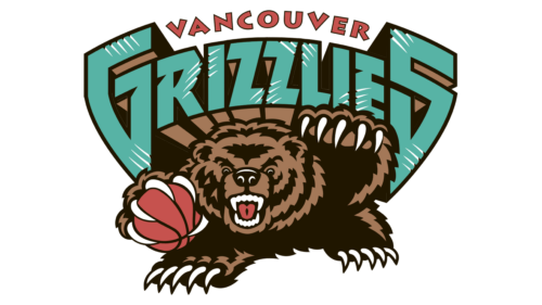
The logo was first drawn by Josh Davis in 1995 and is still used by the team. Although there are alternate logos, a fierce grizzly bear with a ball in his claws is the image that comes to mind when talking about Vancouver Grizzlies. The name is printed in no less bold and daring way. The letters are extremely large and have a dramatic geometric shape with a three-dimensional effect. In addition to creating a very exaggerated 3D effect, the designers were able to make the inscription very symmetrical, enhancing the grand look of the logo. The inscription is done in red, which complemented the ball and red mouth, and quite a rare and unexpected color choice – a teal color. Besides an extraordinary font and color palette, the designers added white streaks to the letters that looked like the bear scratched them.
Font and Color
The brown color is not only a natural color of grizzlies but also a color that symbolizes strength and confidence. It does a perfect job reflecting the fact that Grizzlies fiercely protect their territory and do so in a bold, daring, and fearless manner. There is also a powerful, energetic, and passionate red. The teal color is used to signify reliability and commitment. The color is a contrasting image of the raving bear and red color as it is supposed to calm, stabilize, and help to concentrate. Accordingly, the two elements are balanced out.
The logo features two different fonts. The first word features a rather simple and flat font without serifs. The second word is printed using a three-dimensional font that sets the logo apart from many other modern logos. The font is custom, which allowed the creation of a symmetrical inscription.


