The Baltimore Bullets were a professional basketball team, which existed from 1947 to 1954. The franchise was named “Bullets” because it played not far from an ammunition factory. Another team, the Washington Wizards, also used the name the Baltimore Bullets. However, it happened from 1964 to 1997, after the original team stopped playing.
Meaning and history
The Baltimore Bullets, a distinguished name in the realm of professional basketball, were founded by Jake Embry in 1944. This team originally played in the American Basketball League (ABL) and later became a part of the Basketball Association of America (BAA), which eventually merged with the National Basketball League (NBL) to form the modern-day NBA. The Baltimore Bullets hold the notable distinction of winning the 1948 BAA Championship, a remarkable achievement that stands out in their history. This victory was a testament to their skill and strategy on the court, solidifying their reputation in the basketball world.
As the team evolved, they underwent various changes, including relocation and renaming. The franchise moved to Washington D.C. in 1973, becoming the Capital Bullets for a season before being renamed the Washington Bullets. Under this new identity, the team continued to demonstrate their prowess, notably winning the NBA Championship in 1978. This period marked a pinnacle of success, showcasing their ability to compete at the highest level and leaving a lasting impact on their fans and the sport.
In recent years, the franchise has undergone another transformation, becoming known as the Washington Wizards in 1997. Despite these changes, the legacy of the Baltimore Bullets lives on, remembered for their early contributions to the sport and their enduring influence in the basketball community. The current position of the company, now the Washington Wizards, reflects a rich history of evolution and success, continuing to be an integral part of the NBA landscape.
What is Baltimore Bullets?
The Baltimore Bullets was a professional basketball team, known for its early dominance in the American Basketball League and later in the NBA, marked by a 1948 BAA Championship win and a profound legacy in the sport.
1962 — 1963

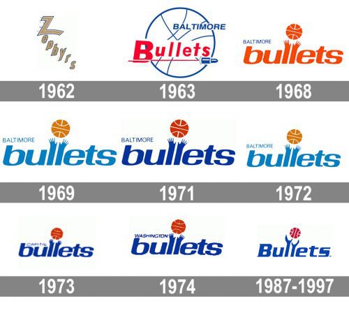
The Baltimore Bullets was established in 1962 under the name Zephyrs, so its first logo was based on the original name of the club. It was a gold and white lettering, set diagonally from the upper left corner to the bottom right. This logo stayed for only one year, as the new name for the team came up already in 1963.
1963 — 1968
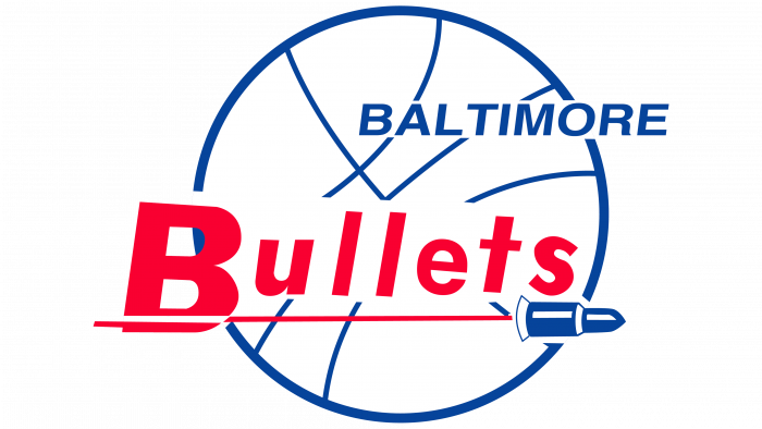
The initial logo for billets boasted a contoured blue ball with a red inscription over it. It was a simple and airy badge, which looked pretty usual, and the only interesting detail on it was the blue bullet, coming to the right from the blue underline of the lettering.
1968 — 1969
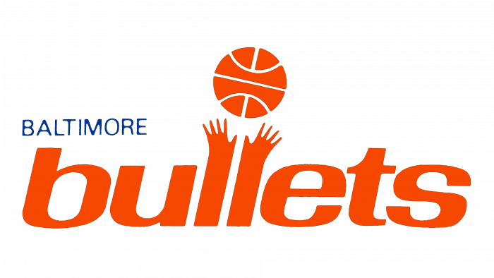
The prototype of the Today iconic logo of the team was introduced in 1968. It was a lowercase inscription in orange, executed in a bold Sans-serif typeface with two letters “L” stylized as two hands stretched up. Above the hands, there was an image of an orange and white ball.
1969 — 1971
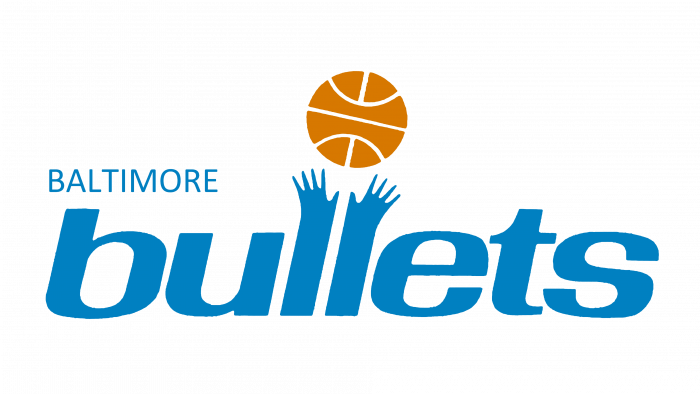
The color palette of the logo was changed to blue and calm orange, while the contours of the composition remained untouched. The “Baltimore” was set in all capitals in the left from the all, above the first part of the main wordmark.
1971 — 1972
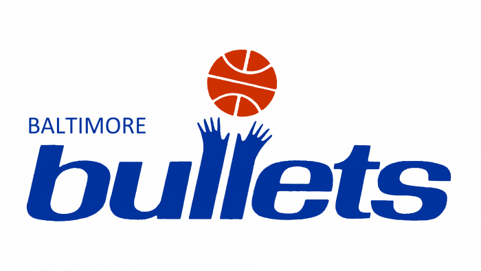
The light blue color was intensified in 1971. The new shade was close to electric blue, while the basketball was redrawn in red and white. The new color scheme made the logo look brighter and more powerful.
1972 — 1973
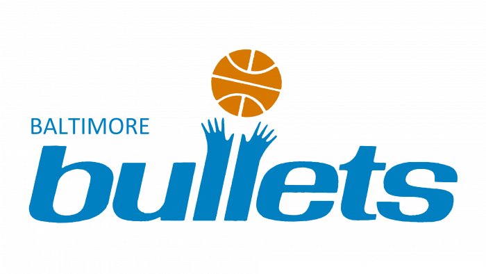
In 1972 the club comes back to the color palette from 1969, and rewrites its iconic logotype in a smaller size, making the whole image look more delicate and fine.
1973 — 1974
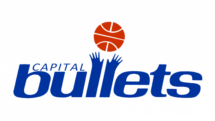
The color palette from 1971 came back, and the “Baltimore” part of the logotype was changed to “Capital”, which was now written in the uppercase of a light italicized Sans-serif, in the same shade of blue, as the “Bullets”.
1974 — 1987
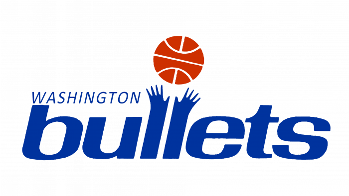
In 1974 the blue became darker and the “Capital” was replaced by the “Washington”, set in the same style and color. No further changes were made to the logo.
1987 — 1997
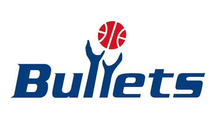
The additional lettering was removed from the Bullets visual identity and the contours of the mail logotype were refined in 1987. Now the inscription was set in the title case, and the hands were redrawn in a more sleek and modern way.


