The logo used by the ice hockey team Utica Comets is a striking combination of a sports logo and an emblem that could have been used for a space mission.
Meaning and history
The Utica Comets were founded in 1932 as the Quebec Beavers. Today, the team is the AHL affiliate of the NHL’s Vancouver Canucks. The Utica Comets logo, though, doesn’t show this link and is a completely independent emblem.
1936 — 1951

As a club with a very rich history, Utica Comets has had a huge variety of logos designed for its throughout the years. The badge from 1936 was created when the team was called Springfield Indians, and the main symbol of the insignia was a profile of a Native American man executed in black contouring. It was a clean and simple drawing with a strong character and even evoking a sense of danger because of the man’s eyes.
1954 — 1955

The logo design of 1954 kept the original black and white color palette and the portrait of the Native American man as the main symbol. Though the drawing was completely changed and was now accompanied by a modern sans-serif “Springfield” inscription in white capitals arched on a black background from the left from the man’s profile.
1955 — 1967

In 1954 the Indians’ badge was redrawn again. The lettering was removed from the badge, and a very small body in a hockey uniform with a hockey stick was added to the black enlarged head of the Indian man, drawn in profile looking to the left. It was an interesting and very recognizable badge, which stayed with the club for almost a decade.
1967 — 1974
For a bit, more than six years the club changed their name from Springfield Indians to Springfield Kings, so the need for the new logo appeared in 1967. It was a bright yellow crest in a double purple outline with a large purple crown in the center and lettering on top of it. The inscription was set in two levels, with the “Springfield” in small caps executed in a simple sans-serif font, and “Kings”, also in the uppercase, written in a fancy serif with some lines elongated and curved.
1974 — 1979
The Indians came back to the name and visual identity of the club in 1974, and this time stayed for longer. The first badge from the new era featured a bold slanted letter “S” in navy blue, and an image of a Native American man in a hockey uniform, dancing in the ice skates with a hockey stick in his hand. The uniform was drawn in white, red, and blue colors.
1979 — 1980

The redesign of 1979 introduced a new badge of the Springfield Indians club. It was a sharp geometric image of a Native American man in profile facing to the right. The image, formed by several sharp elements was executed in solid blue with green outlines and looked cool and very progressive. This badge stayed with the club for several months only but became a basis for future redesigns.
1980 — 1981

The Springfield Indians logo from 1980 was executed in a fresh and airy yellow and white color palette with all elements outlined in black for better visibility and contrast. The sharp abstract profile was now placed on a circular background resembling a wheel. Even though this badge was only used for less than a year it was one of the most memorable club emblems ever created.
1981 — 1982

The Indians came back to the design from 1979 to 1981 but switched the color palette of the angular portrait badge. The profile of the Native American man was now executed in solid blue, with each geometric element outlined in thick red. The new color palette looked powerful and evoked a sense of strength, determination, and even danger.
1982 — 1984
In 1982 a more traditional logo was created by designers for the Springfield Indians hockey club. A more detailed and realistic portrait of a man drawn in profile facing to the left was executed in black and red and placed on a white background in a thin red circular frame. The feathers in the man’s hair were in all three colors of the palette, which made that headpiece the most eye-catching element of the badge. No lettering was added to the logo.
1984 — 1990
In 1984 the Springfield Indians start using another logo concept, and this design stays with the club till the end of the Indians era. It was a blue letter “S” in a modern and slightly italicized sans-serif typeface, with a red outline. The new profile of a Native American was drawn over it, in light pink skin color, with white and red feathers in his black hair.
1990 — 1993

The redesign of 1990 switched the color palette of the Springfield Indians visual identity l to green and blue. The pinkish face of the man was now drawn in white, while the body of the enlarged letter “S” turned green, and into outline became blue. All accents on the portrait were executed in black and blue, which looked very fresh and stylish, showing the progressive growth of the club and making it look powerful and professional.
1993 — 1994
The last logo from the Springfield Indians era was created in 1993 and only stayed for several months. It was actually the same badge like the one used by the club in the 1980s, a blue and red “S” with a portrait on it, but with the contours of all elements cleaned and strengthened. The contrast between the colors was very strong, which made the badge look bright on almost any background.
1994 — 1996
The name of the hockey club was changed to Worcester IceCats in 1994. The new visual identity concept was built around a blue and green color palette and a caricature of a dangerous creature, looking more like a bear than a wild cat. The animal picture was executed in green and placed on a light gray background with mountains and triangular peaks. The “Worcester” in narrowed serif was written above the head of the creature in sold blue, and the “IceCats” was set in a sans-serif typeface and placed under the badge, separated from the cat by a light gray hockey stick in a blue outline.
1996 — 2002

The redesign of 1996 kept the animal image but modernized it a bit and placed it on a plain white background with a two-leveled inscription under it. It was an emboldened and enlarged “IceCats” in all capitals of a smooth serif typeface with sharpened angles, executed in blue and outlined in gray and blue, and a “Worcester” tagline in a clean sans-serif font, written under the main logotype in blue, with lots of space between the letters.
2002 — 2005

The redesign of 2002 introduced a new logo for the Worcester IceCats hockey club. Though the color palette was still built on green and blue, the shades were brightened up, and the green became more turquoise now. The cat was no longer drawn in profile but was taking almost all space of the badge, dangerously smiling. The head of the creature was placed above the diagonally set inscription in the same turquoise and blue color palette, executed in a custom rounded typeface with full-shapes letters. That was the last badge for the team with the name Worcester IceCats, the club was renamed in 2005.
2005 — 2013
For the Peoria Rivermen hockey club the new logo was created in 2005. The emblem stayed untouched for eight years and featured a navy blue and yellow composition with captains holding the steering wheel of a ship. Under the image, the “Rivermen” wordmark in an elegant serif typeface was waved and outlined in yellow, while the “Peoria” was set on a white circle inside the steering wheel, and accompanied by a yellow City landscape.
2013 — Today
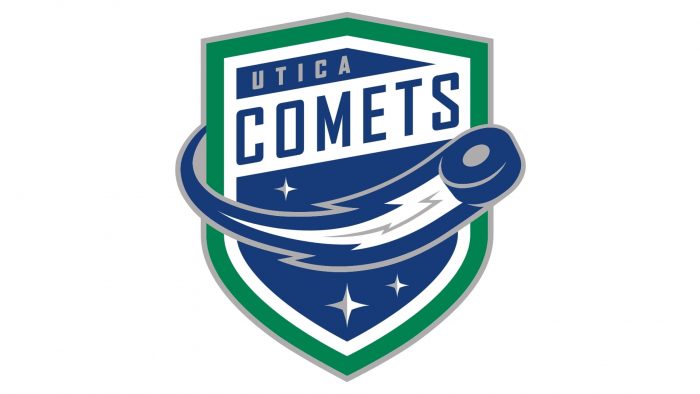
The logo features a hockey puck flying at high speed. The pluck leaves a “tail” behind it that makes it look like a comet.
Colors
The palette seems to fit the design itself perfectly. The sky is blue, with silver and white stars, while the outline is green.


