

![]() Uponor Logo PNG
Uponor Logo PNG
Uponor is a Scandinavian plumbing systems manufacturer, which was established in 1918 in Finland. Today the brand also produces heating and cooling systems and is present all over Europe and North America with almost 4 thousand employees. The main customers of the company are construction corporations and building service professional businesses.
Meaning and history
The Uponor visual identity is minimalist and modern, yet perfectly reflect the company’s essence and purpose, due to the use of the right color palette. The Uponor logo consists of a single wordmark, which is bold and confident, showing the brand’s professionalism and stability.
The blue and white color palette of the corporate visual identity is composed of blue and white colors, which represent the company’s industry — water-connected, and also evokes a sense of authority and reliability.
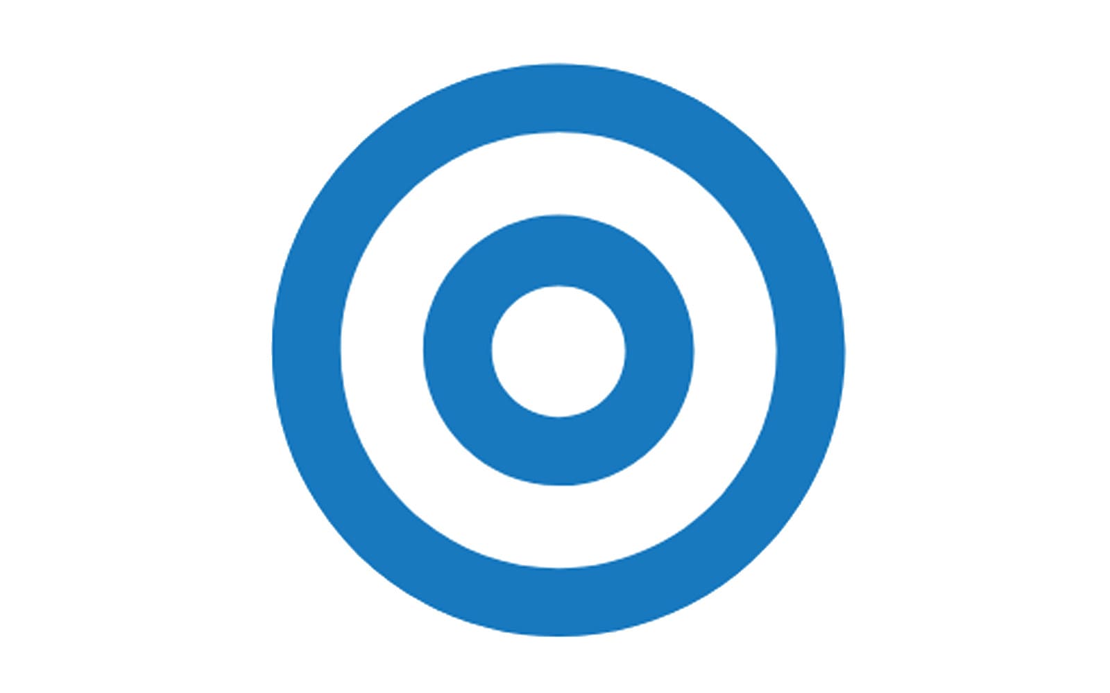
The previous Group’s logo was composed of a blue wordmark with a delicate graphical symbol above the letter “U”. The emblem depicted a small circle inside a bigger one, resembling a target-sign, showing the company’s ability to solve different problems and provide various solutions for a better work of plumbing systems.
What is Uponor?
Uponor is a Scandinavian construction company, which was established in 1918, and is specialized in the manufacturing and distribution of building materials, mainly for indoor climate and plumbing. The company is headquartered in Finland but has its subsidiaries in North America and Europe.
Font
The previous label’s wordmark was written in all the lowercase letters, using a traditional stencil typeface, which is close to Neue Plak Condensed Black font with the letter “U” modified — its lines elongated and slightly curved, like embracing the circular emblem above it.
The new wordmark kept the lowercase lettering, and the friendly sense it creates but changed the typeface to a more modern and solid one. The current nameplate is executed in a font, which is similar to Mic32 New Rounded Bold with thick lines and smooth angles.
It looks contemporary and soft, evoking a sense of safety, protection, and responsibility. The typeface of the inscription also represents the company’s value system, where the customer is the main figure. The softened lines symbolize comfort, which they aim to provide their clientele with.
![]()
Review
Uponor is one of the world’s leaders in plumbing and indoor climate systems manufacturing. The company provides commercial and residential buildings with the best possible infrastructure solutions, focused on innovations and sustainability. The company develops its products according to the principles of energy-efficiency, helping to reduce the use of water.
The Scandinavian group has its subsidiaries in Europe and North America and provides customers across the globe with its water-delivery systems and heating and cooling solutions. The company also offers fitting and installation accessories for water heating and ventilation systems, as well as various services, including water pipe systems maintenance and gas transportation.


