

![]() Duravit Logo PNG
Duravit Logo PNG
Duravit is a German company, which specializes in the design and manufacturing of bathroom furniture and accessories, as well as sanitary ceramics and shower cabins. The company was established in 1817 and was focused on sinks and toilets production for more than a hundred years. In the middle of the 20th century, the company expanded its range to accessories and furniture and today is one of the world’s most known manufacturers in its segment.
Meaning and history
The current Duravit visual identity has been in use by the company since the 1980s. The brand’s emblem is instantly recognizable today and is synonymous to the sanitary ceramics and bathroom accessories.
The label’s logo is composed of a unique emblem and a wordmark on its right. The emblem is a stylized image of a wood grouse, coming out from the circle and facing left. The bird is a symbol of the brand’s product quality, which has been a part of the famous ceramics manufacturer logo since the 1930s.
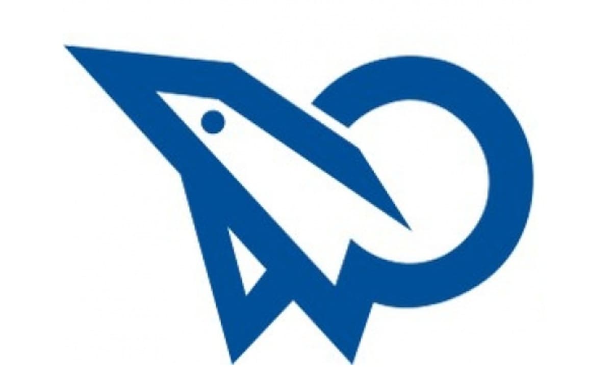
The iconic Duravit bird also resembles a rocket with its sharp angles, which symbolizes progress and innovations, and even a dolphin, the friendliest of all water creatures. The label’s emblem is interesting to look at and guess its meaning, as there can be many options of what is depicted on it, but only one right answer. Anyway, the emblem has become iconic by today and is strongly associated with a powerful European brand.
The blue and white color palette of the Duravit logo is a perfect representation of the company’s purpose and essence. Where blue, the color of water, symbolizes also the professionalism and high-quality of the brand, and white shoes the company’s loyalty to its customers and its transparency.
What is Duravit?
Duravit is a famous European brand of furniture and accessories for bathrooms, which was established in Germany in the 19th century, constantly developing and implementing the latest technologies in its production processes.
Font
The company’s wordmark in all capitals is the most modern and stylish part of the company’s logo. Executed in a clean sans-serif typeface, which is very similar to Futura Pro Heavy, it has its letters “A” and “V” modified — with its peaks pointed and the last bar of “V” elongated.
![]()
These two letters look similar to the ones, used in the KAPITAL font family, a strong and sharp geometric typeface, which is contemporary and sleek.
Font and color
The bold narrowed lettering from the primary Duravit logo is set in a custom geometric sans-serif typeface with stable and clean capital letters. The closest fonts to the one, used in this insignia, are, probably, Subscription JNL and Nordeco Bold, but with some contours modified.
As for the color palette of the Duravit visual identity, it is based on an intense shade of blue, a color, which is most often associated with the bathroom, freshness, and water. Another meaning of this shade is reliability and safety, and these are also the distinctive features of the Duravit products.
Review
Duravit is one of the world’s most famous manufacturers of sanitary ceramics, which has been on the market for over 200 years. The two main principles of the company are simplicity and effectiveness, and the brand does everything to make the maintenance of its products easy for the customers.
During its long history, the group has presented several revolutionary ideas and keeps moving in the innovative and research direction. The company is also well-known for its collaborations with the world’s most popular architects and designers, including Philippe Stark and Frank Huster.
The label’s product range includes washbasins, bathtubs, toilets, and urinals, which are used not only in the private houses and apartments but also in huge public buildings, such as airports, stadiums, and theaters all over the globe.
One more unique characteristic of the brand is that Duravit aims to conserve water usage, so it produces its items with eco-friendliness in mind, trying to keep the planet safe and clean.


